Timeline
January 2022 to May 2022
Programs Used
Photoshop, Illustrator, InDesign, Adobe XD
Skills & Practices
Interaction Design, Prototyping, Web Design, UX Research, Interviewing
Given
Logo mark, Color Palette, Photos, Copy
What I Designed
Page Layouts, User Flow, Interface, Prototypes
The Climate Disaster Project records stories about climate disasters from people who've experienced them around the world, and compiles those stories and information into an archive that is accessible to anyone who wishes to view.
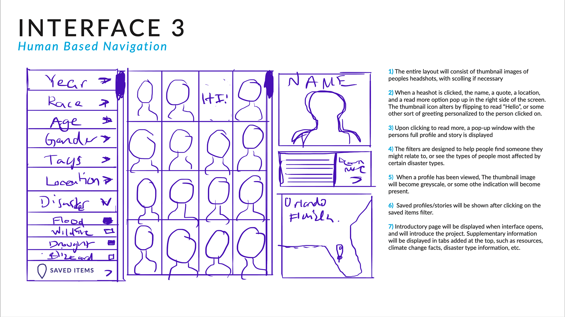
This project is a hypothetical website designed to be an interactive database of climate catastrophes around the world. The challenge was figuring out how to organize all of the information I was given into a database that was sleek, simple, fit the serious nature of the content, and allowed the user to sort and experiment with data in many unique ways.
Final Work
Design Flow
A quick look into the user flow I created for this project.
Final Designs
All Pages Quick Preview

About
All Pages
This section covers the intention behind the designs of every page.
Home Page
The home page works as a brief introduction to the project, with small factoids around the content and the reasons the database was made. It encourages the viewer to look at the content by making alluring claims. The photos appeal to the pathos of a visitor.

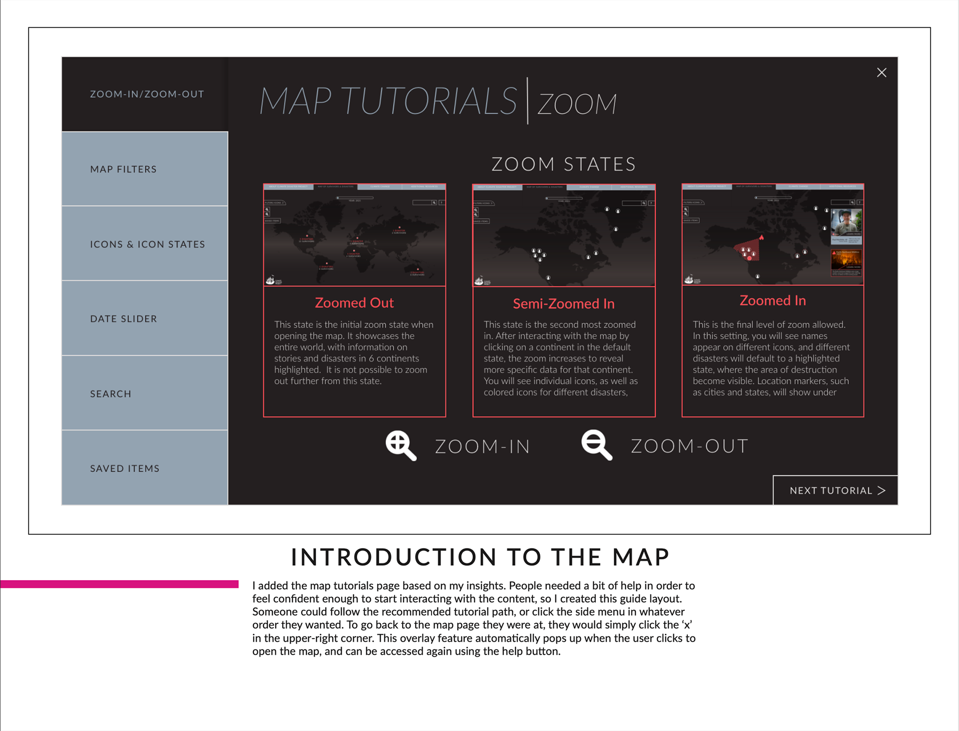
Map Tutorial
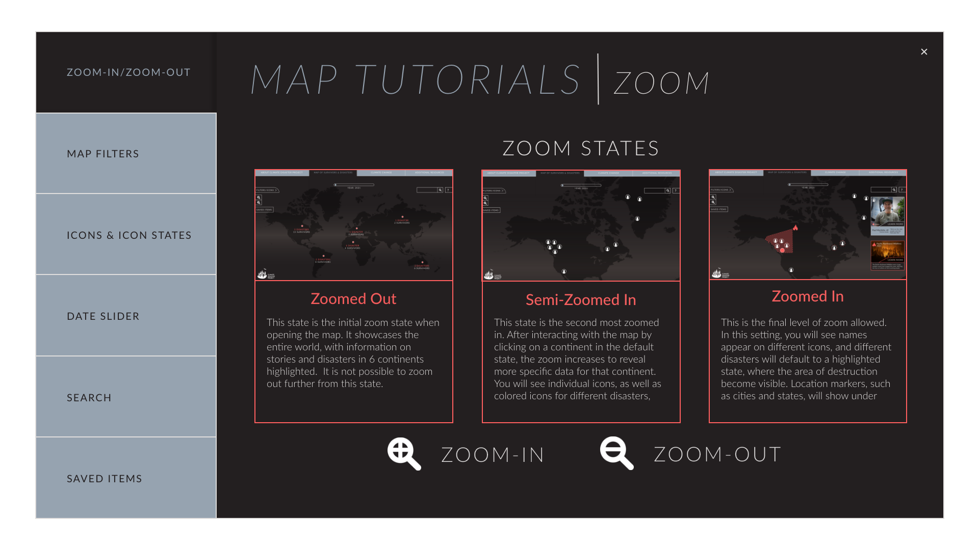
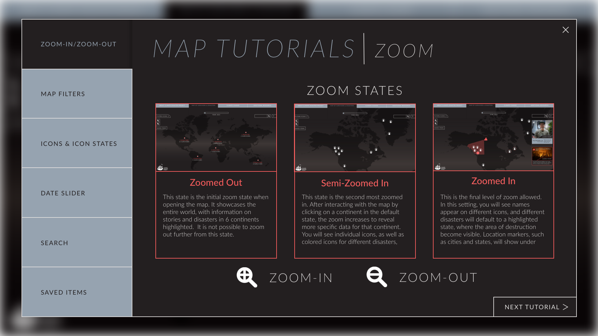
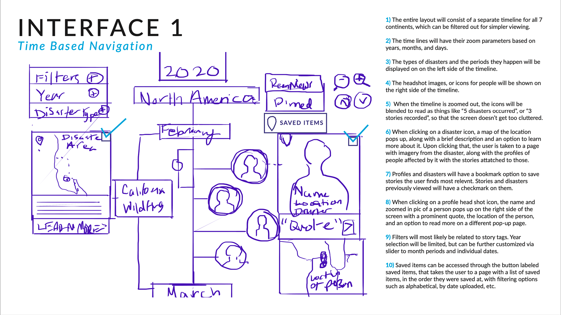
The tutorial was designed after interviewing people and learning that many were lost when they initially opened the map screen. The tutorial is a simple pop-up that showcases the different map states, icons the user can toggle, and ways the user can archive content to refer to later on if they want to use the database for research or journalism.
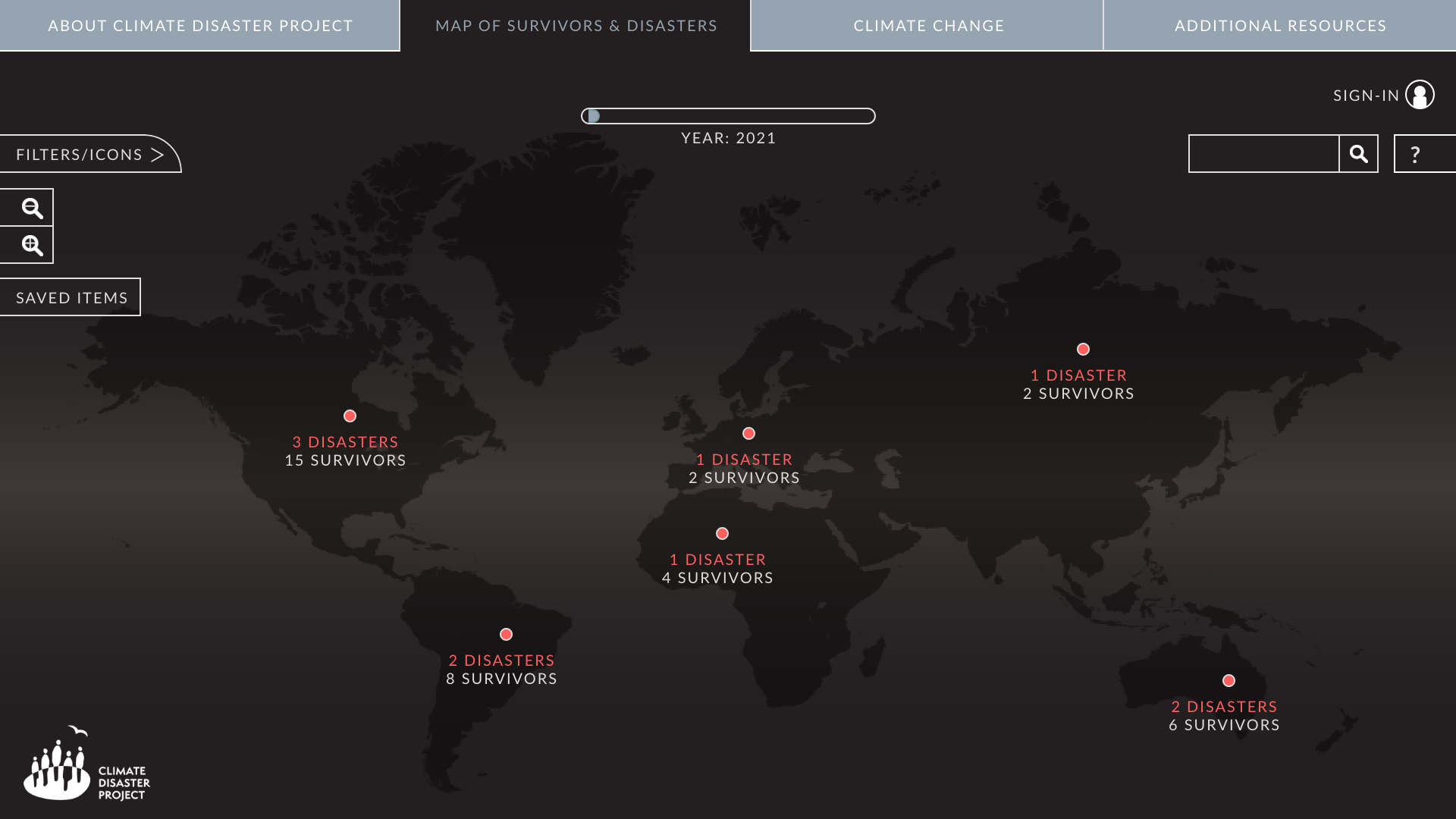
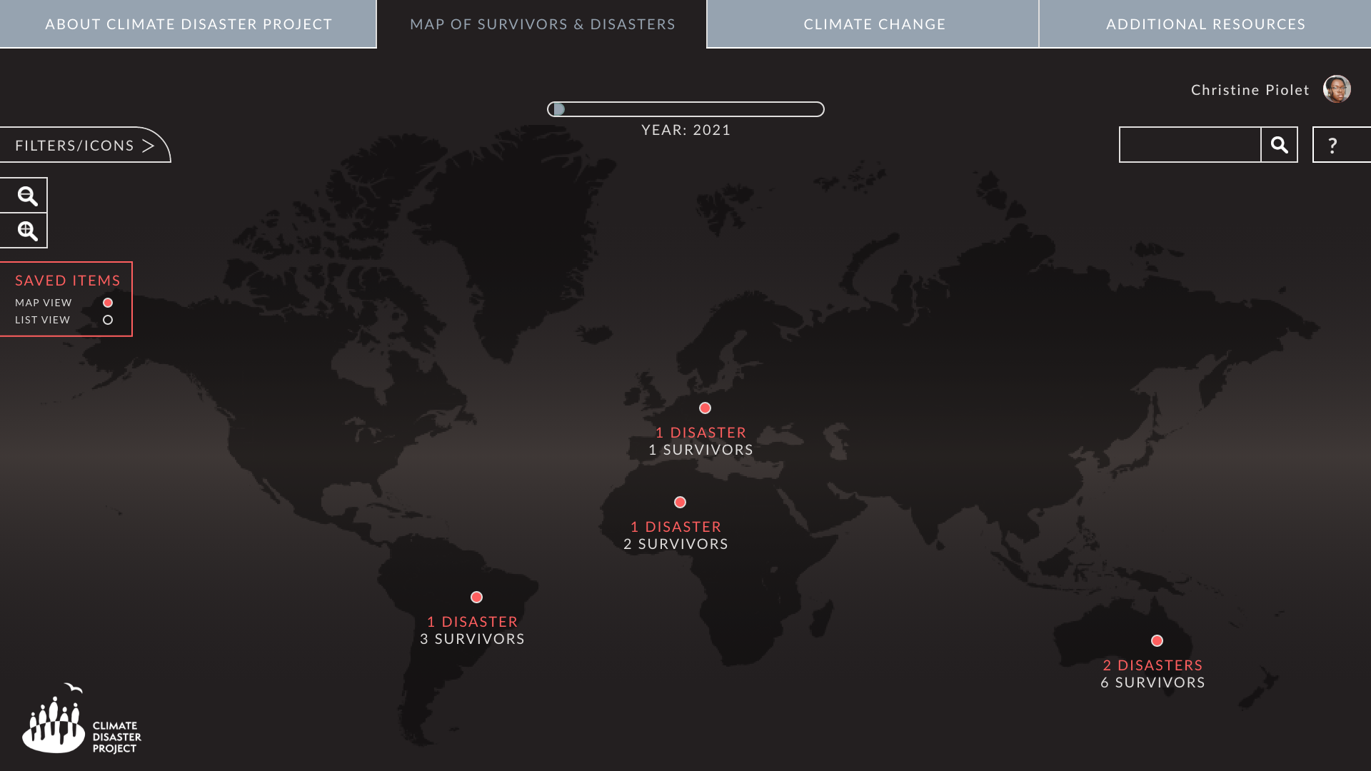
Map Landing Page
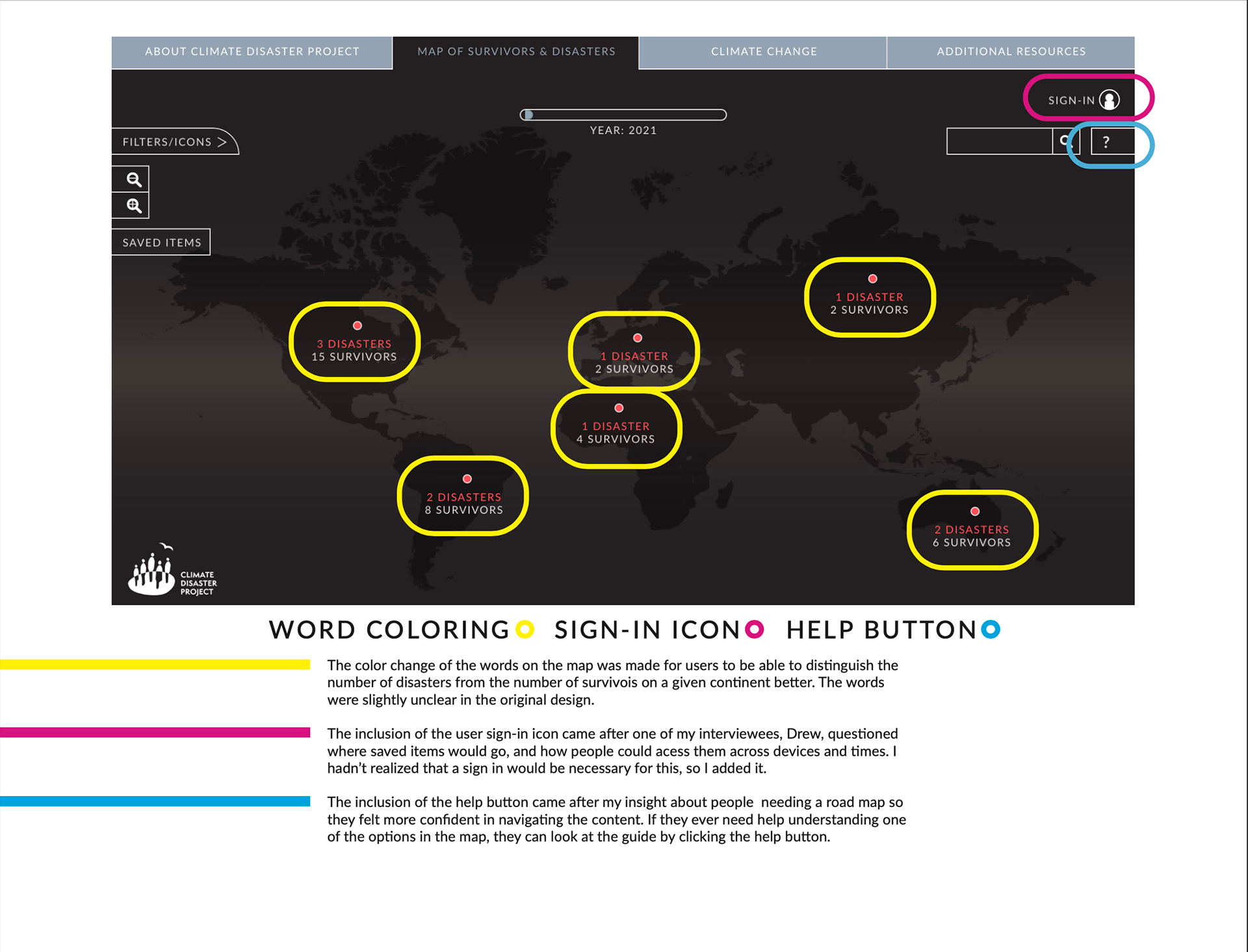
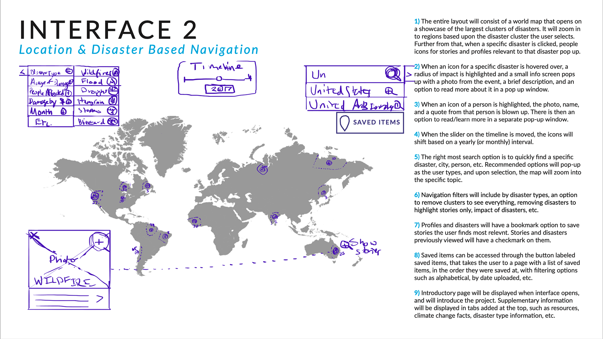
The landing page gives an overall world view, highlighting disasters and survivors by continent. Before digging in further, the user has the option to manually look for content, alter the year the data is extracted from, and choose from an assortment of filters. This screen was designed this way to give the user a view of every data point in a year without cluttering the screen with tons of icons.

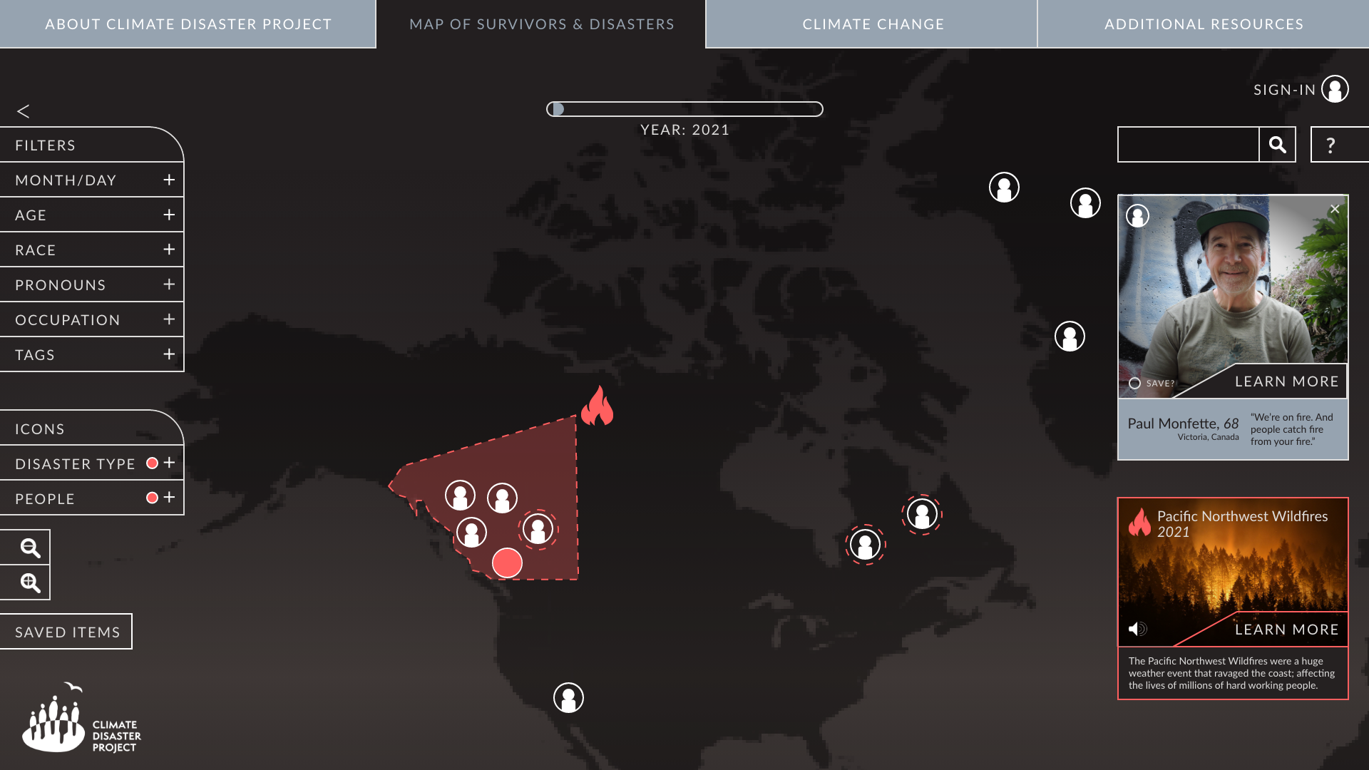
Map with Filters & Selected Items
The filters allow a user to sift through information so there aren’t as many points on the screen, and so they can observe data with relation to a specific group of people. Disasters are highlighted depending on which persons’ icon a user picks. The default map setting was made to only feature icons until a user clicks on one, revealing the disaster that corresponds, and related profiles. This centers the content around the people affected, rather than on the disasters.
There is also the added option of audio clips with every profile selected. This was done so that a user can empathize more with the content, and be able to explore the map with different senses. Icons on the map were made anonymous so that users can pick one unbiased to see a unique perspective.

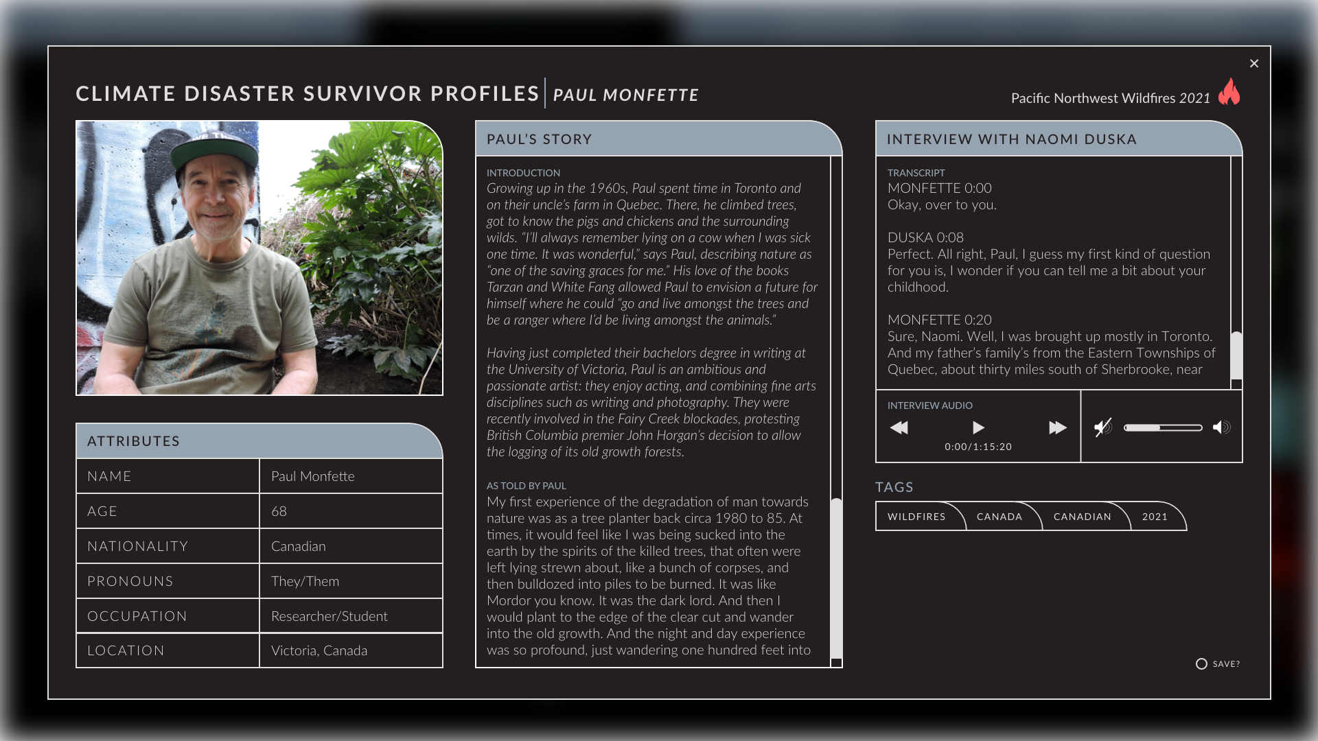
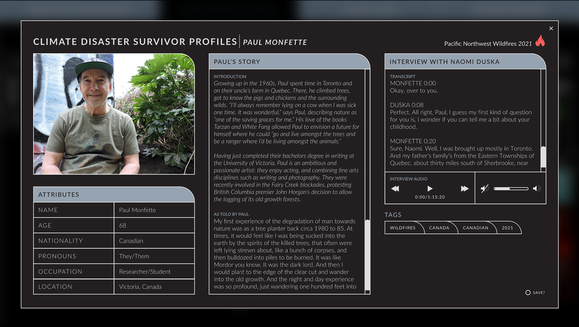
Survivor Profile
When listing out the survivor profiles, I wanted to give the user the option to look at the text of what a survivor said, but also to be able to hear their voice as well. People connect with a story and remember it better the more personified it is.
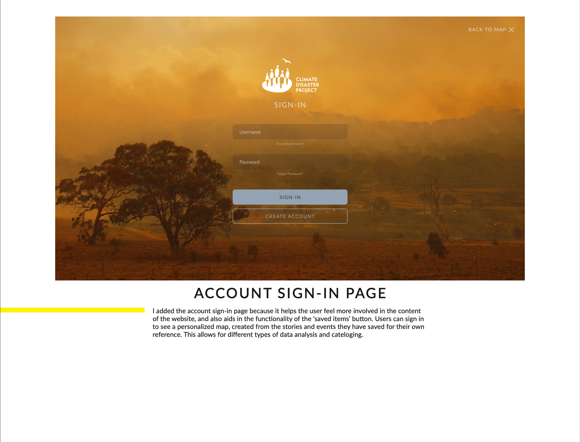
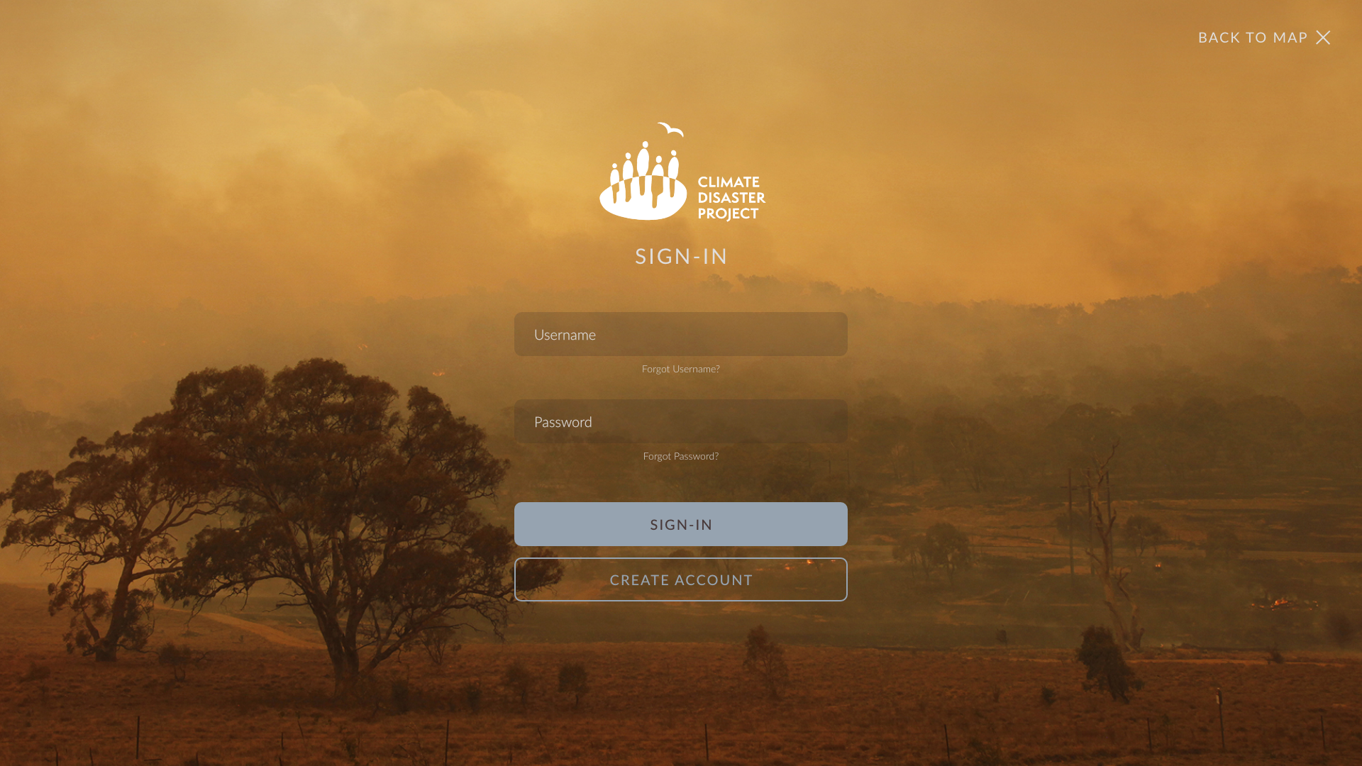
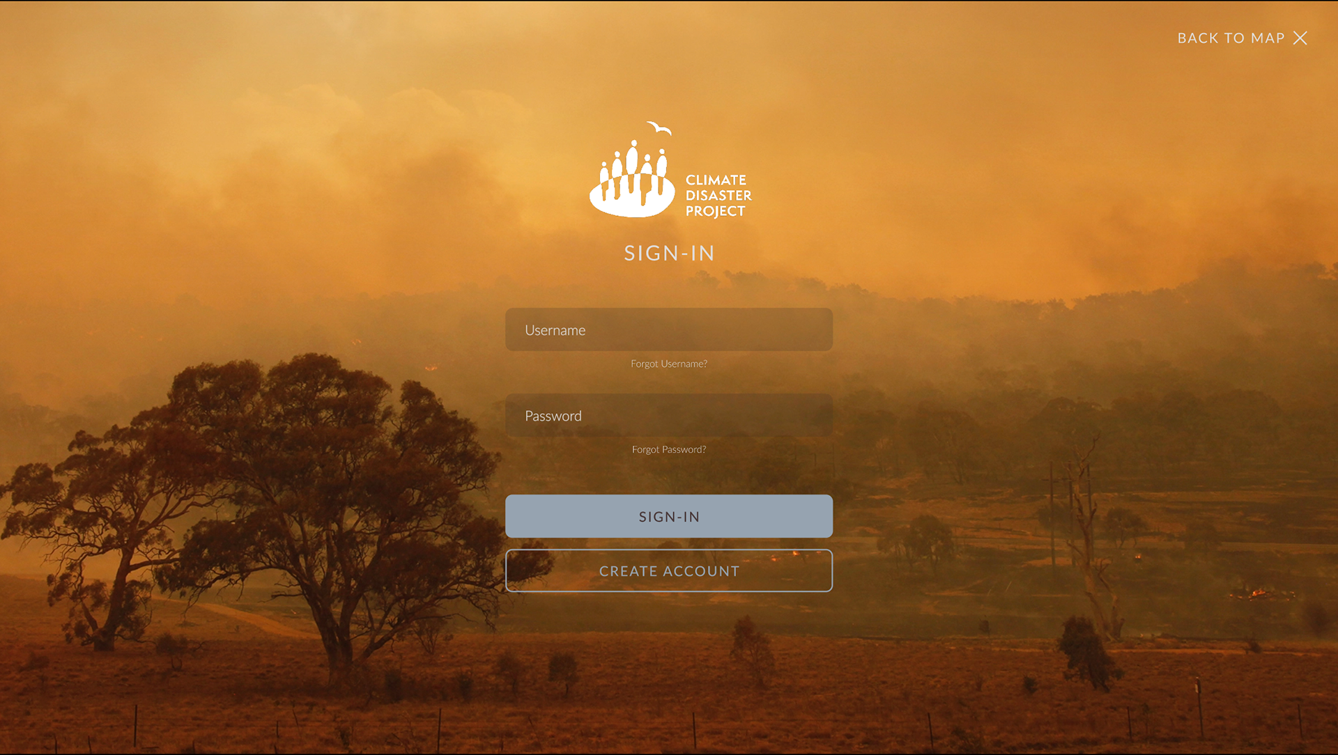
User Profile Sign In
To encourage people to continue interacting with the database, users can create a profile that they can use to save stories. This was implemented after interviewing potential visitors and learning that they would prefer to come back to the stories and disasters they found the most interesting and informative without having to sift through the map and filters again.
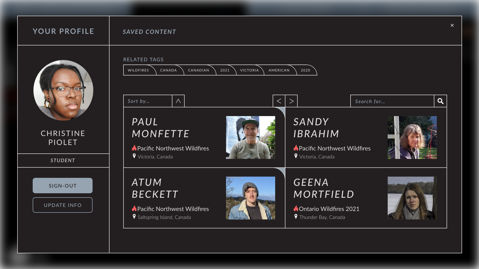
Profile & Saved Items
Upon making a profile, a users saved stories appear in a customized list and map. This can be accessed from the profile icon at the top right of the map (after signing in), or by signing in, clicking on saved items at the bottom left corner of the map, and filtering the view as either map view, or list view. Disaster profiles can be found by clicking on the personalized content map, or by clicking on the profiles listed on the users page.
Before the Final Product
Promo Page
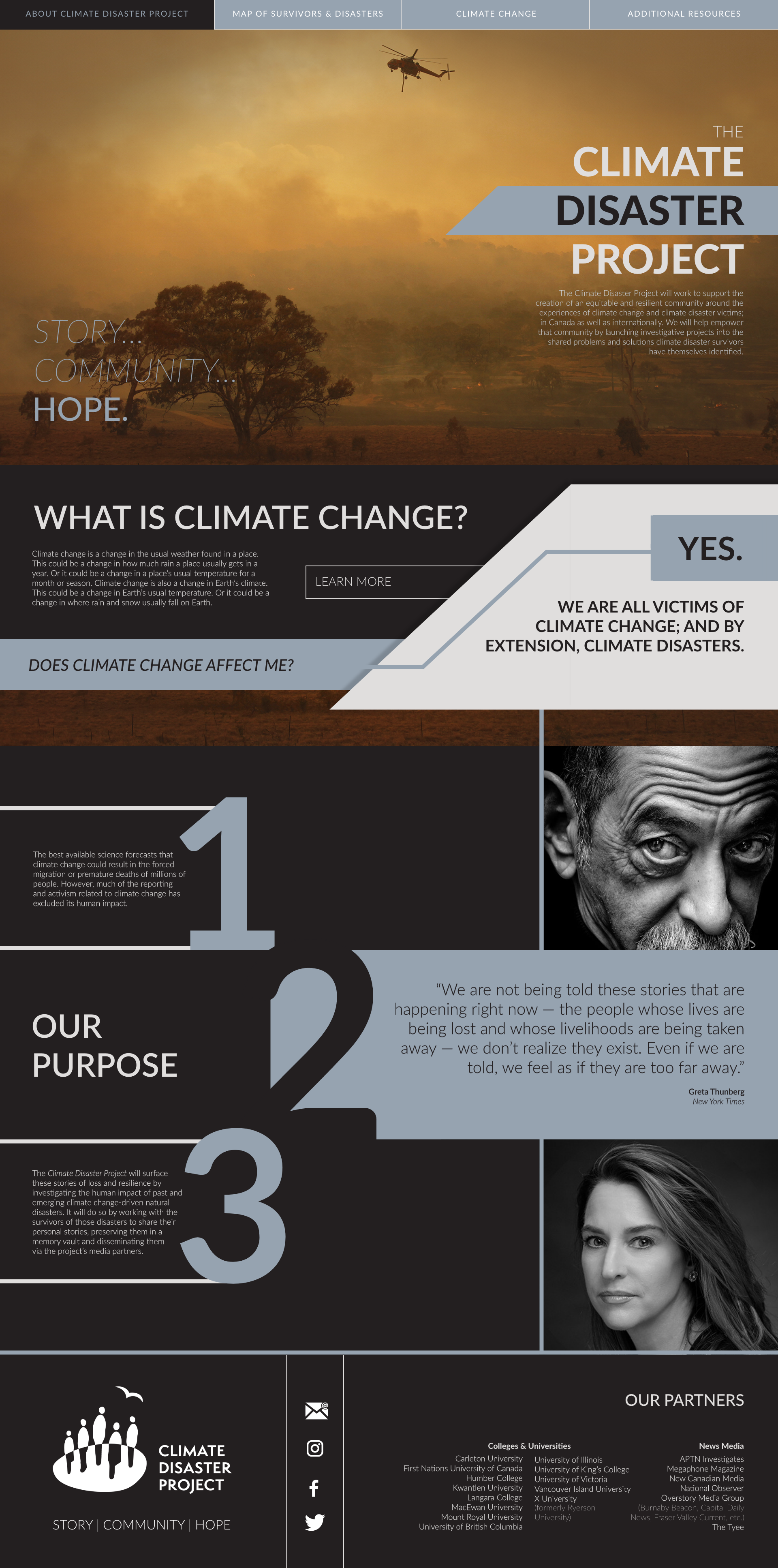
Before I created the final designs, I made a promotional website that had the basic feel of the content, and advertised the entire project to a potential audience. In real life, if someone looked up Climate Disaster Project before the content officially launched, this website page is what they would find.
This promotional website got a lot of positive feedback; so much so that I decided to take the design and reuse it as a part of the final homepage design in the completed interface.
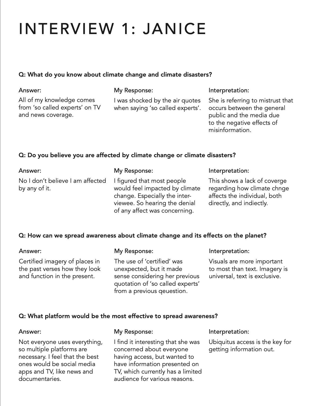
Research
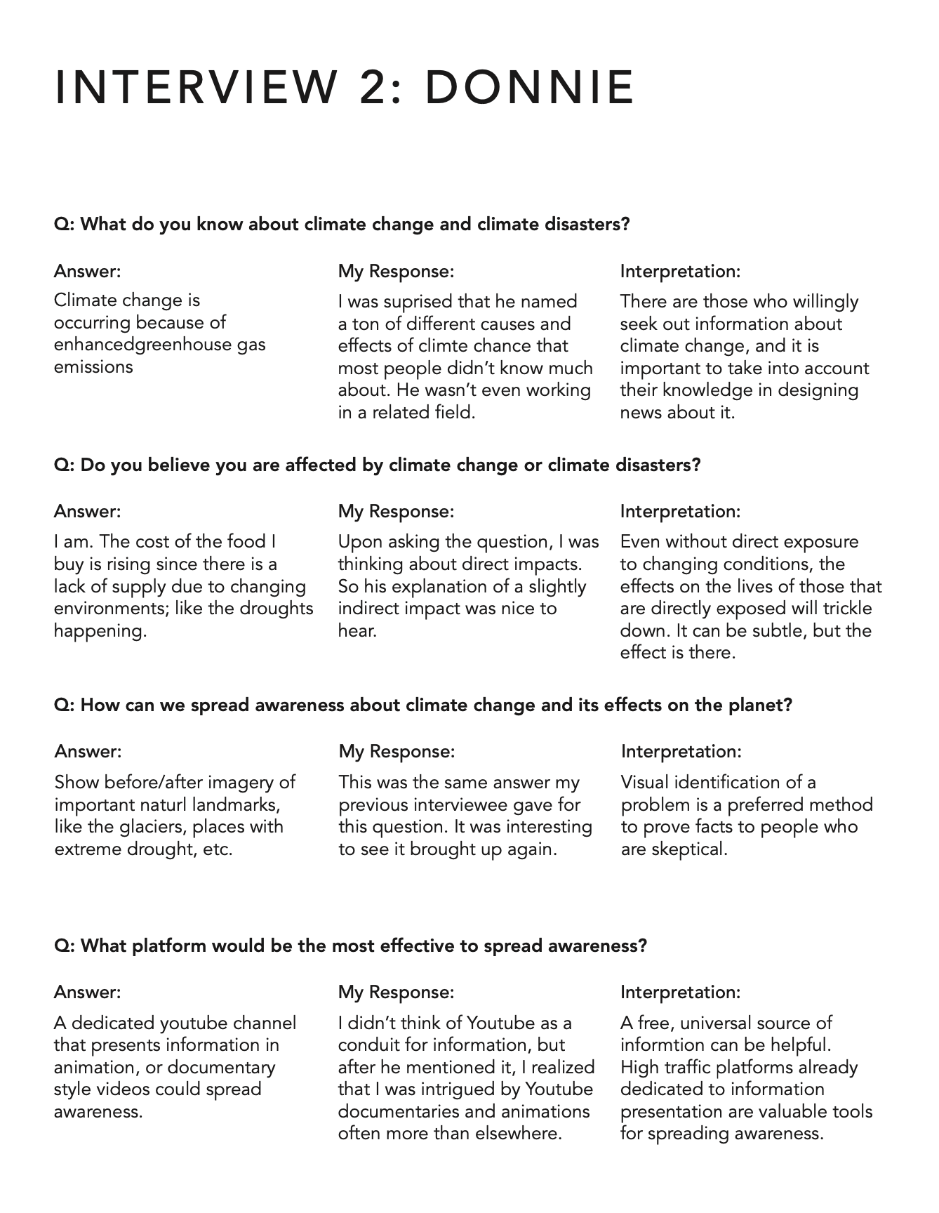
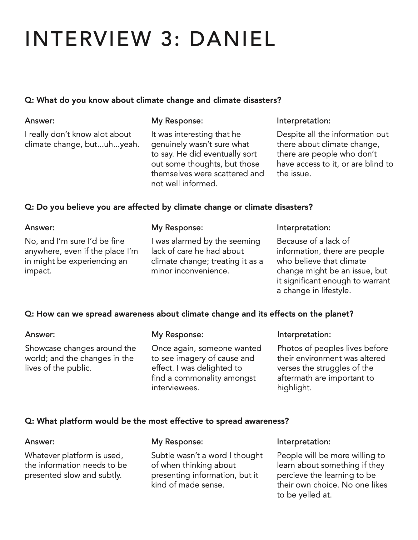
Before starting the project, I conducted a round of interviews about what people of different ages know about the potential content. This helped inform how I could craft the initial promotional website.
g
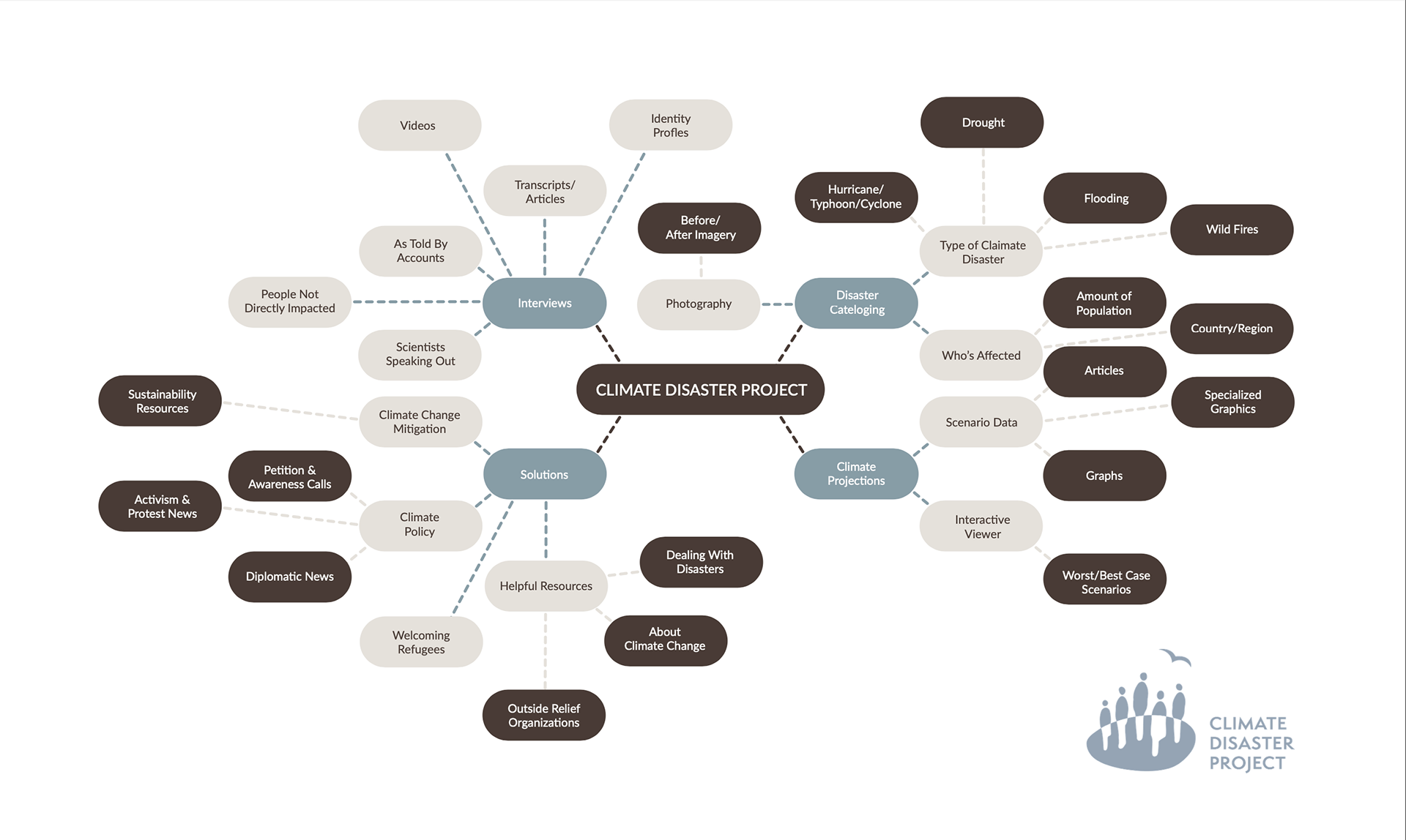
Next, I made a mind-map surrounding the photos, stories, audio, video, and the content that I was given. This helped me begin planning what I wanted to center the promotional website around. I then went ahead and made some layout ideas.
g
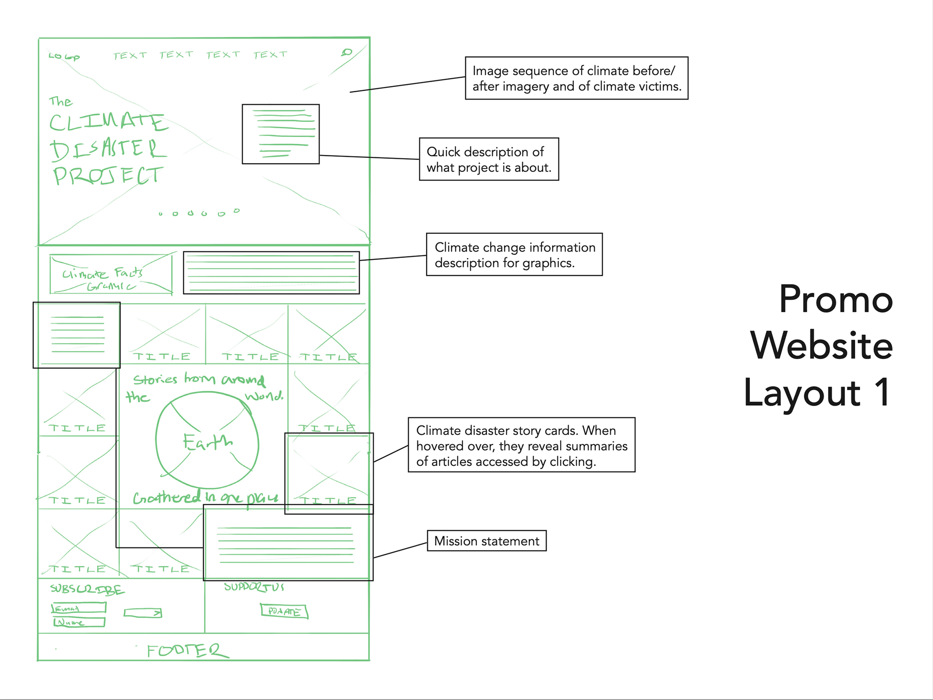
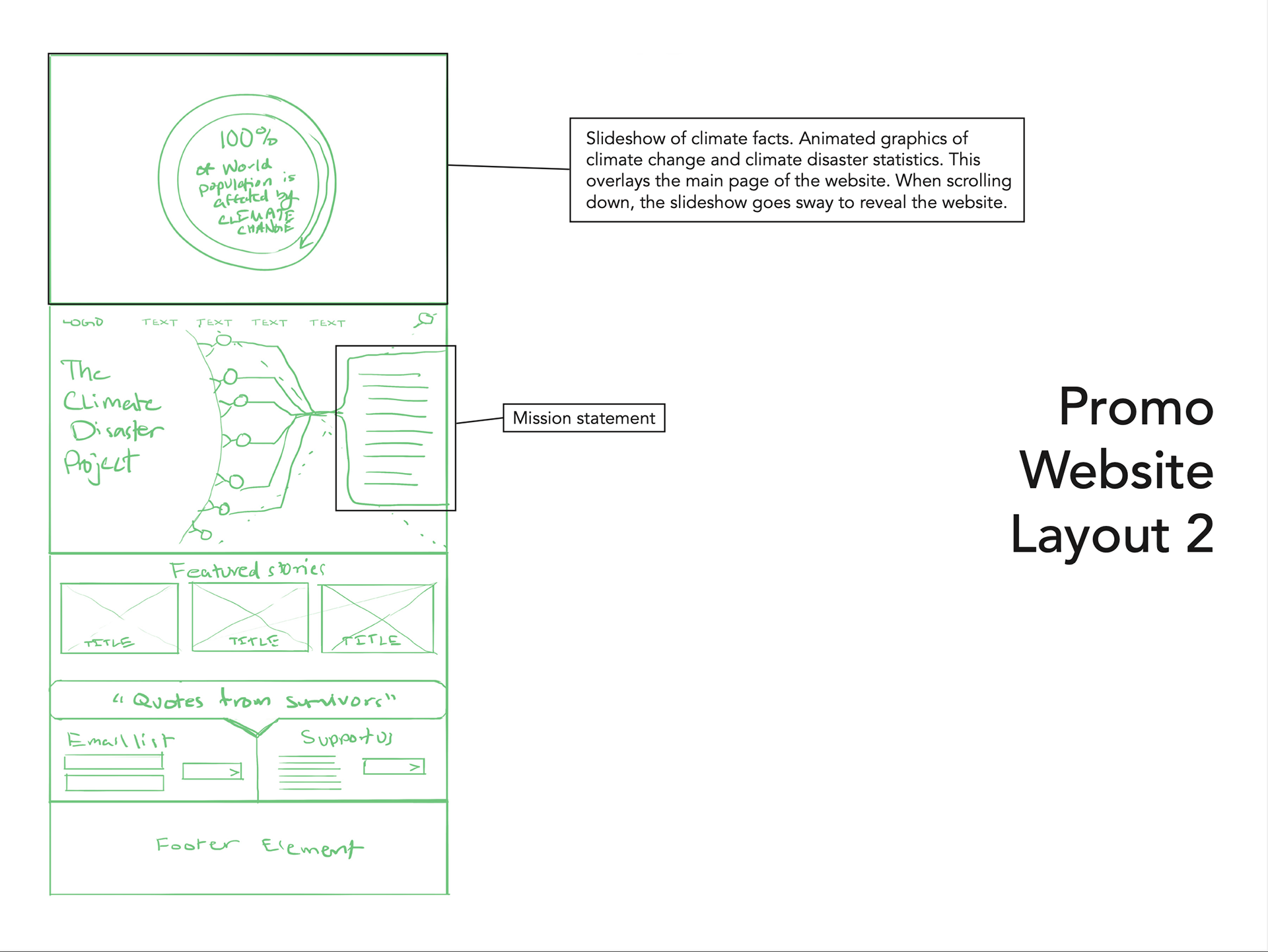
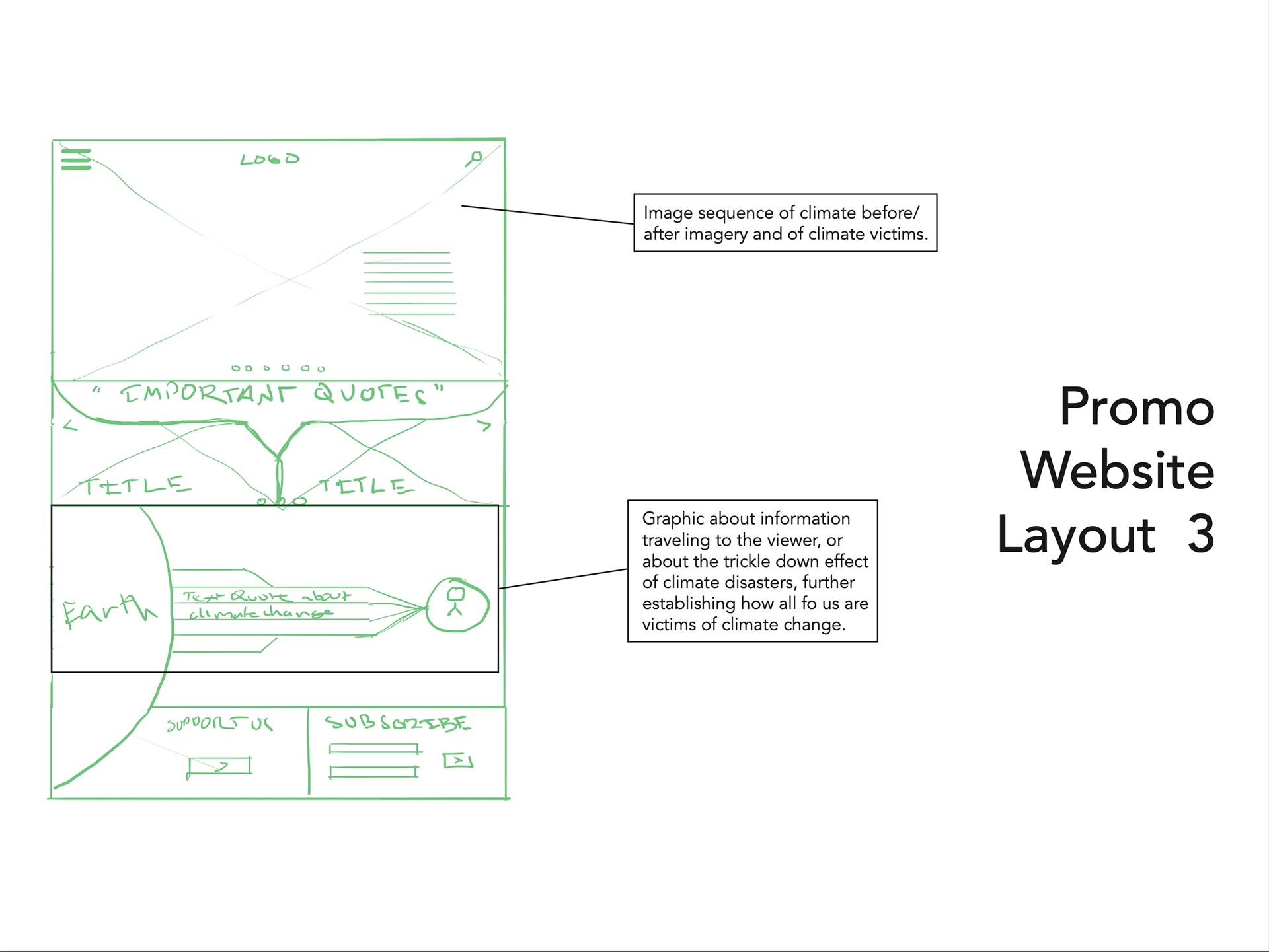
After I sketched the promotional website, I thought about what type of interface I wanted to create and highlight in the promotional website. I decided to go with option 2, because I felt that a design like that would be the most versatile and easy to navigate for the type of content.
g
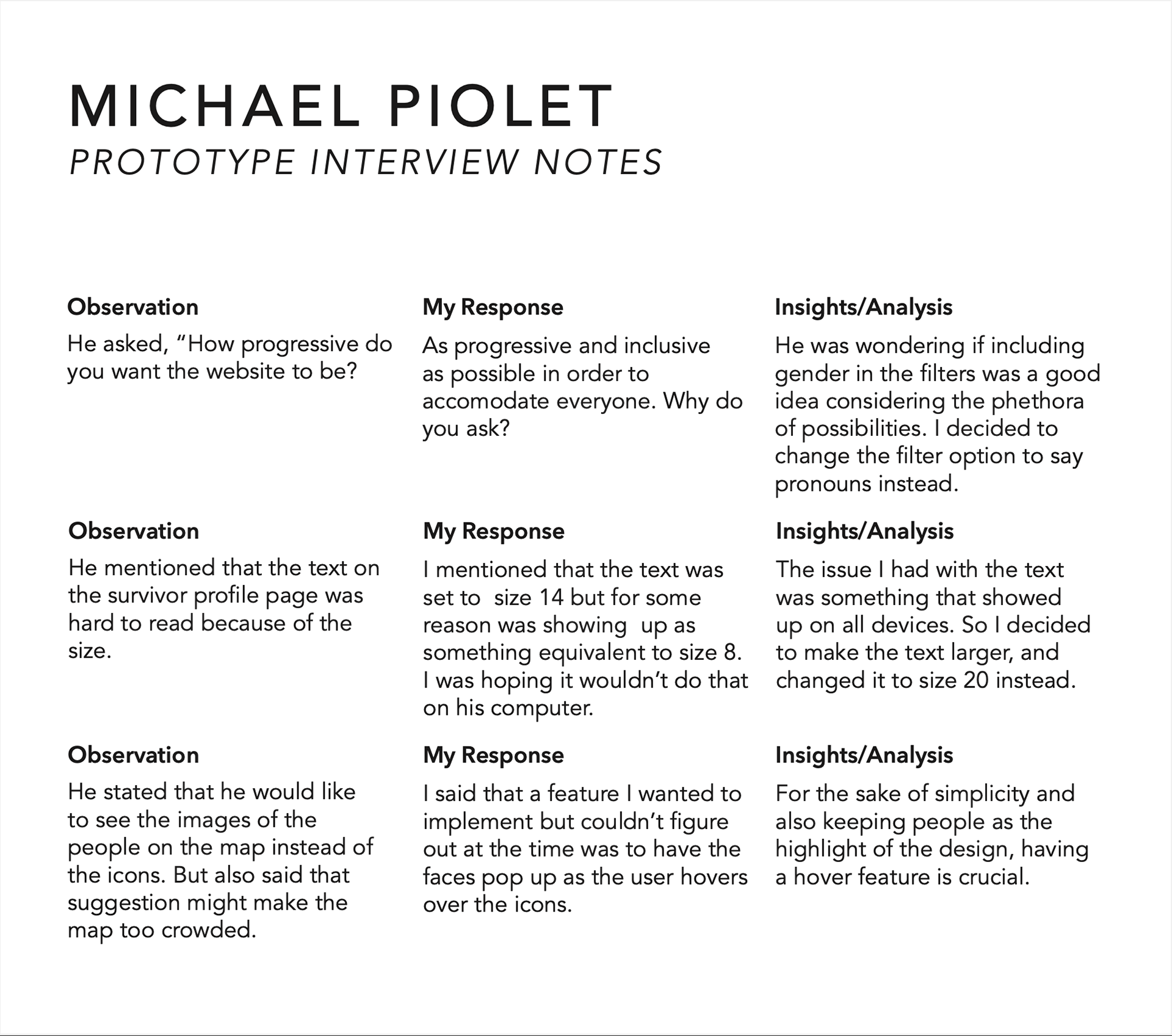
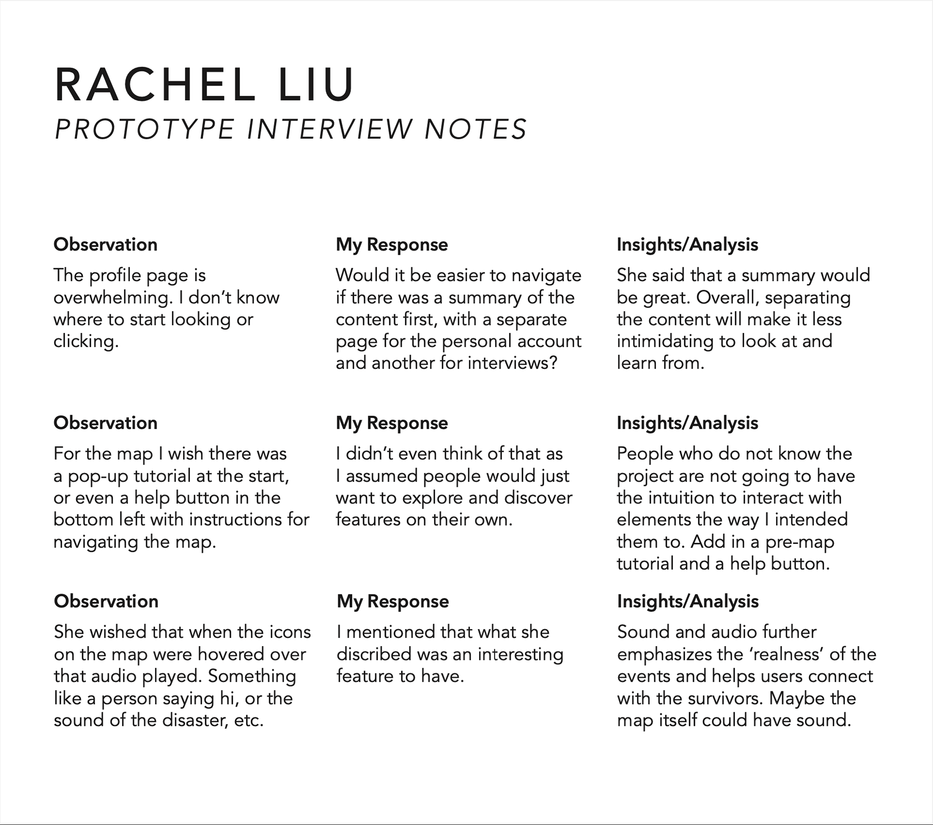
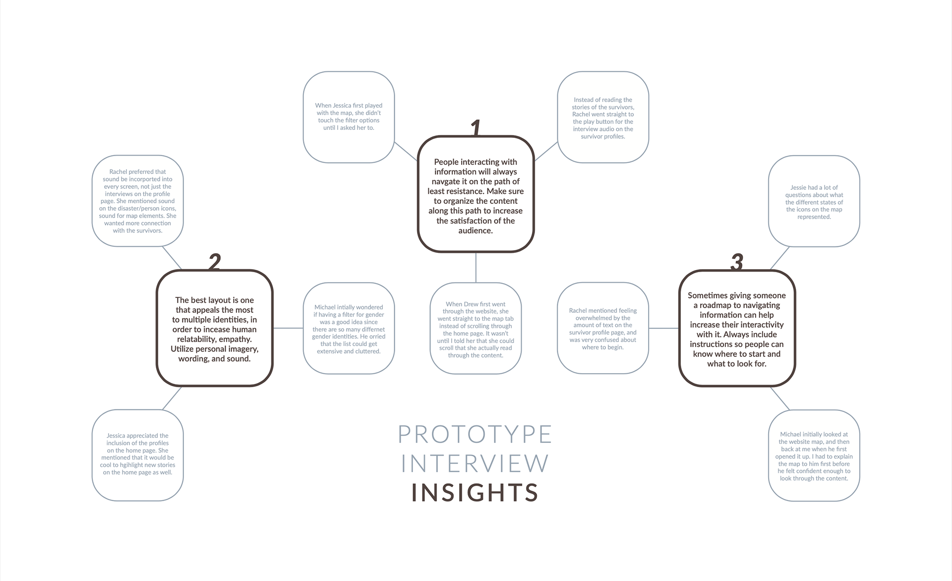
After I made the promotional website and prototyped the actual interface, I conducted a second round of interviews after doing user testing. This helped to inform any alterations and changes that were needed to make the content more accessible and easy to use.
g
Next I collected and analyzed my data from the interviews and came up with three insights about the design.
g
This final step involved implementing my insights in new features and revised website page layouts.