Timeline
Jr. Brand Designer from March to May 2023
Tools Used
Photoshop, Illustrator, Figma, After Effects
Skills & Practices
Branding, Photo Editing, Motion Design
With season 3 of the Climify Podcast on the horizon, brand designer Ellen Keith Shaw linkedin.com/in/ellenkeithshaw and I were recruited to conceptualize a way to update Climify's look and streamline the creation of visual assets for the brand.
We created a library of elements, defined with carefully considered shapes, uses of color and type, photo, and began to play with the use of motion as another brand element for suture seasons.
Ultimately, we created an increased presence on the brands instagram page, encouraged guests from the show to share content, and made easy to edit templates that the graphic designer could easily follow to maintain brand consistency via multiple channels.
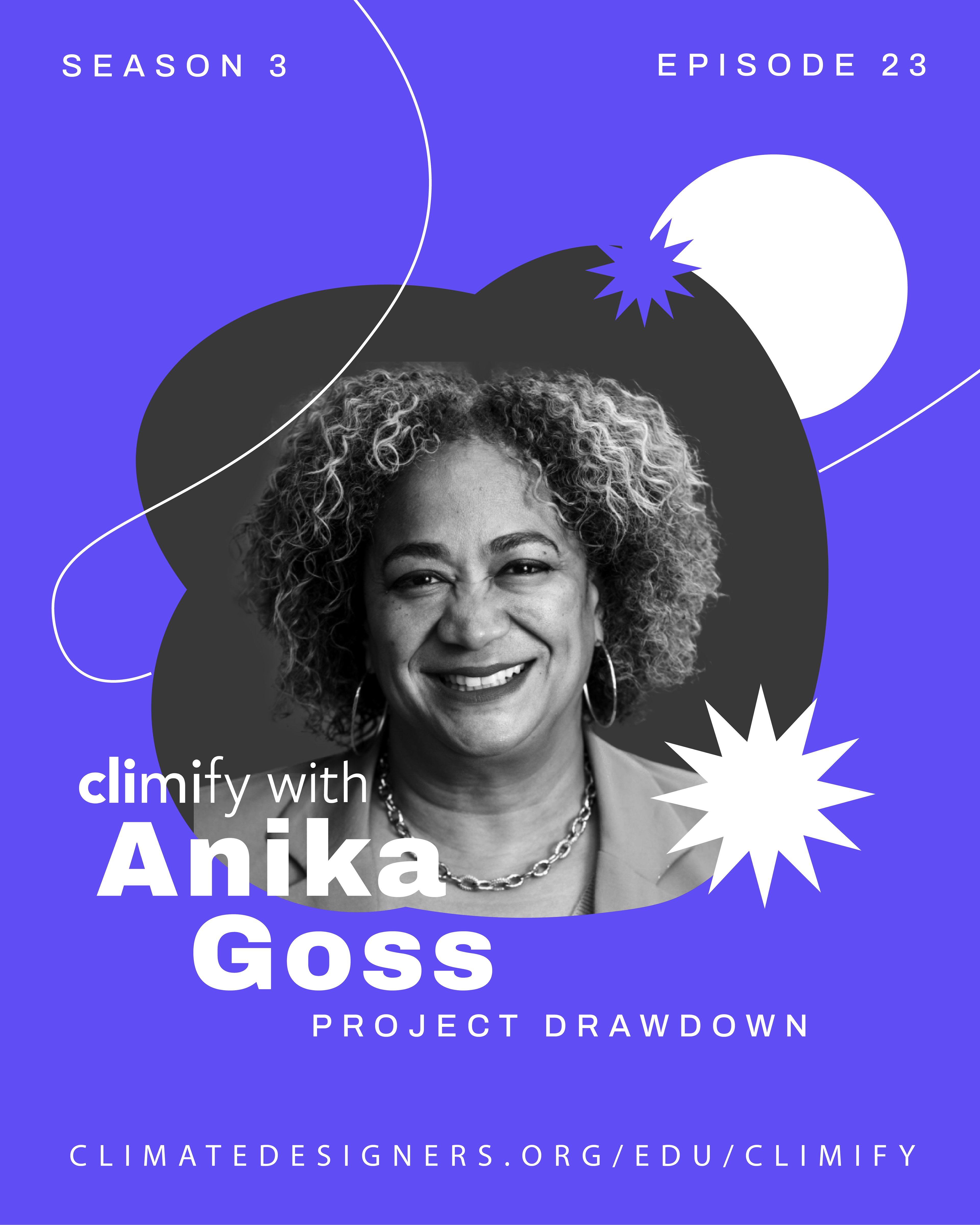
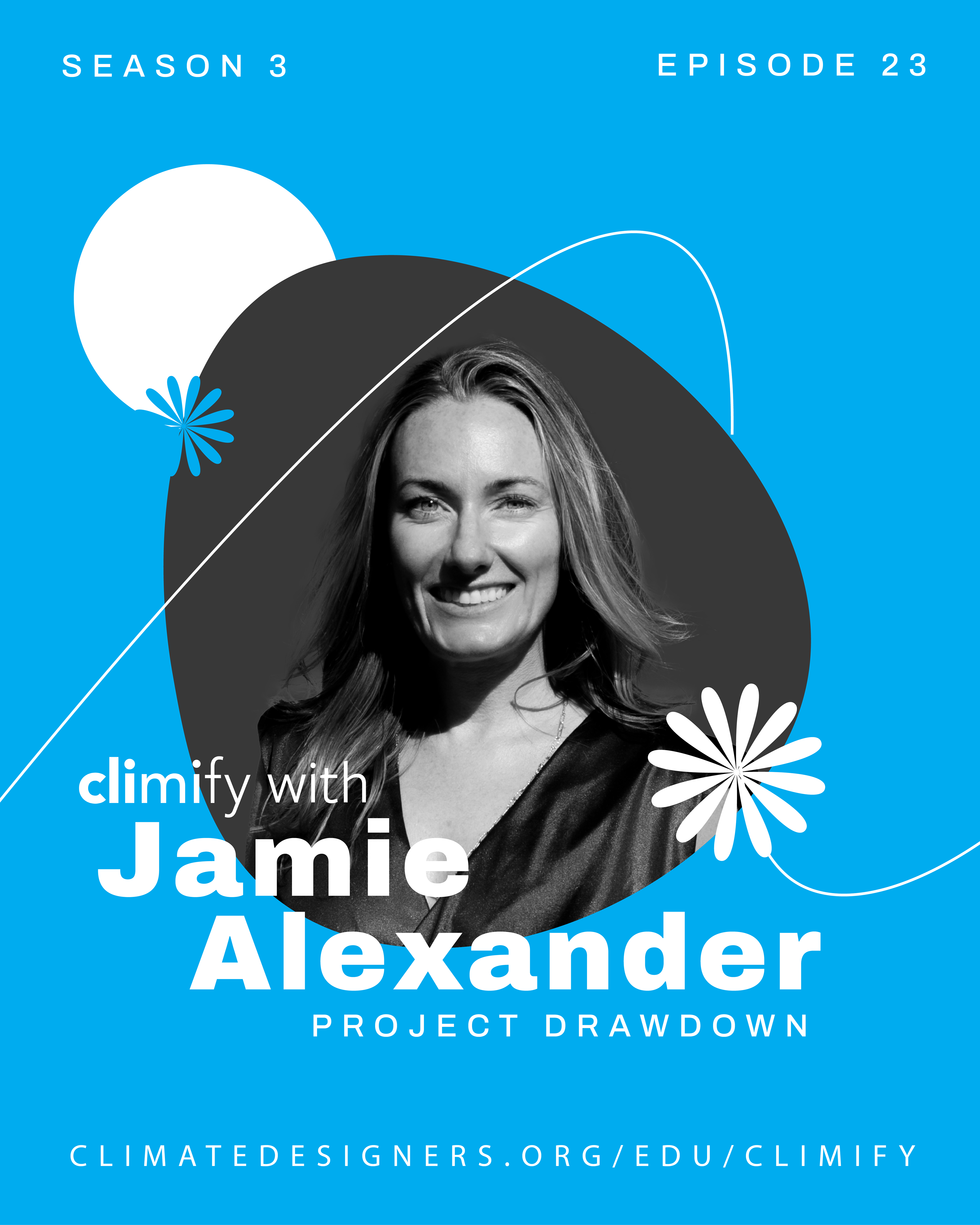
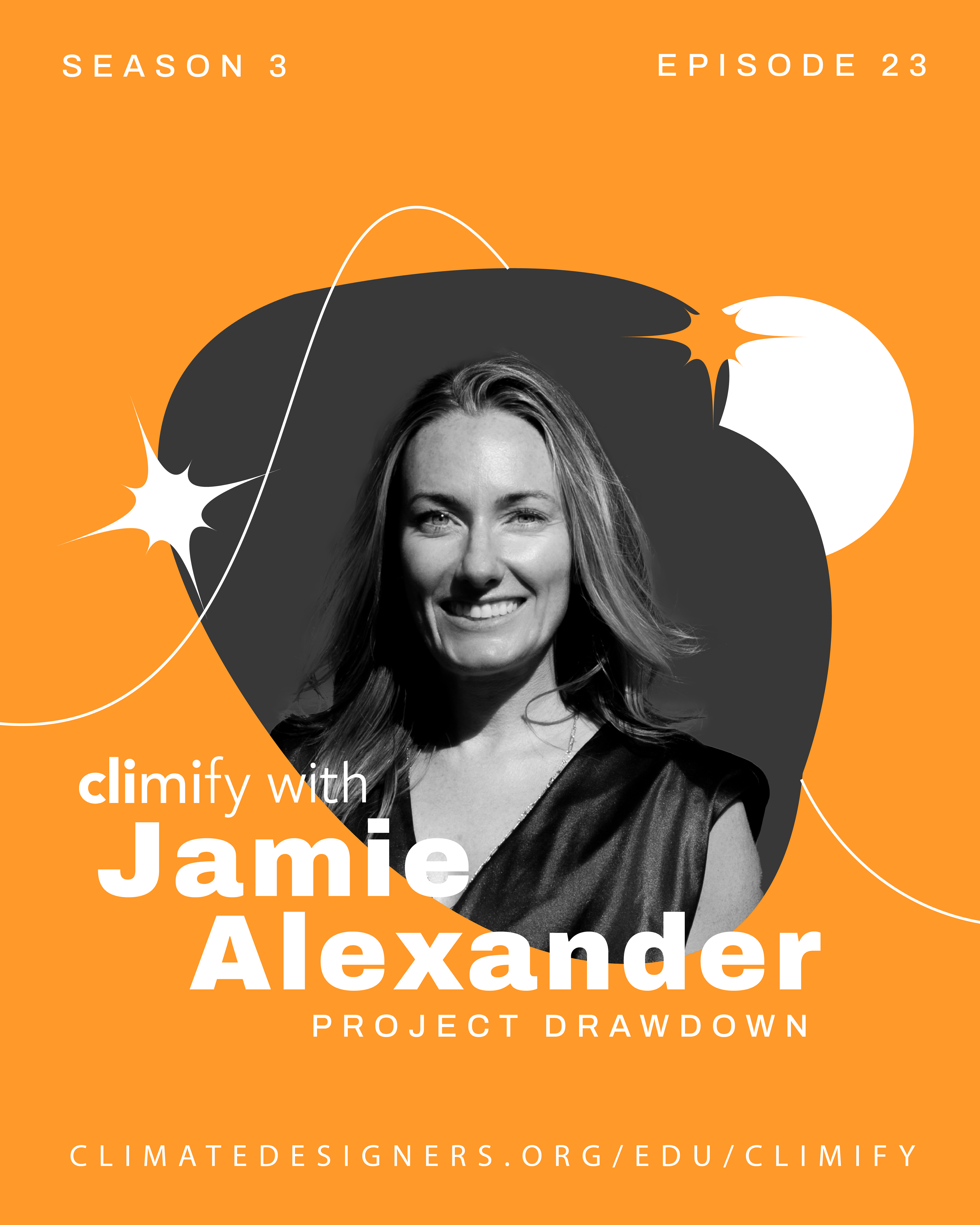
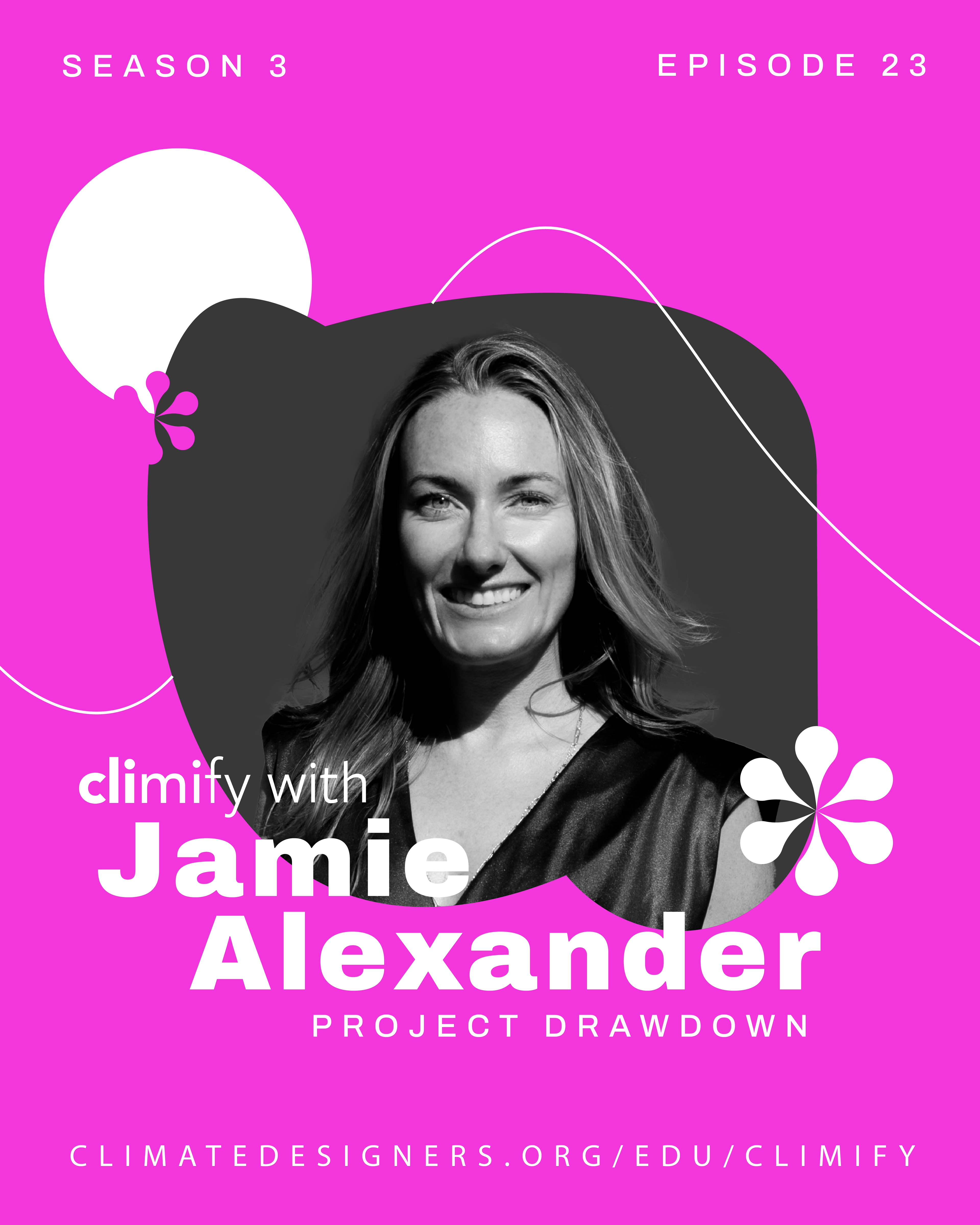
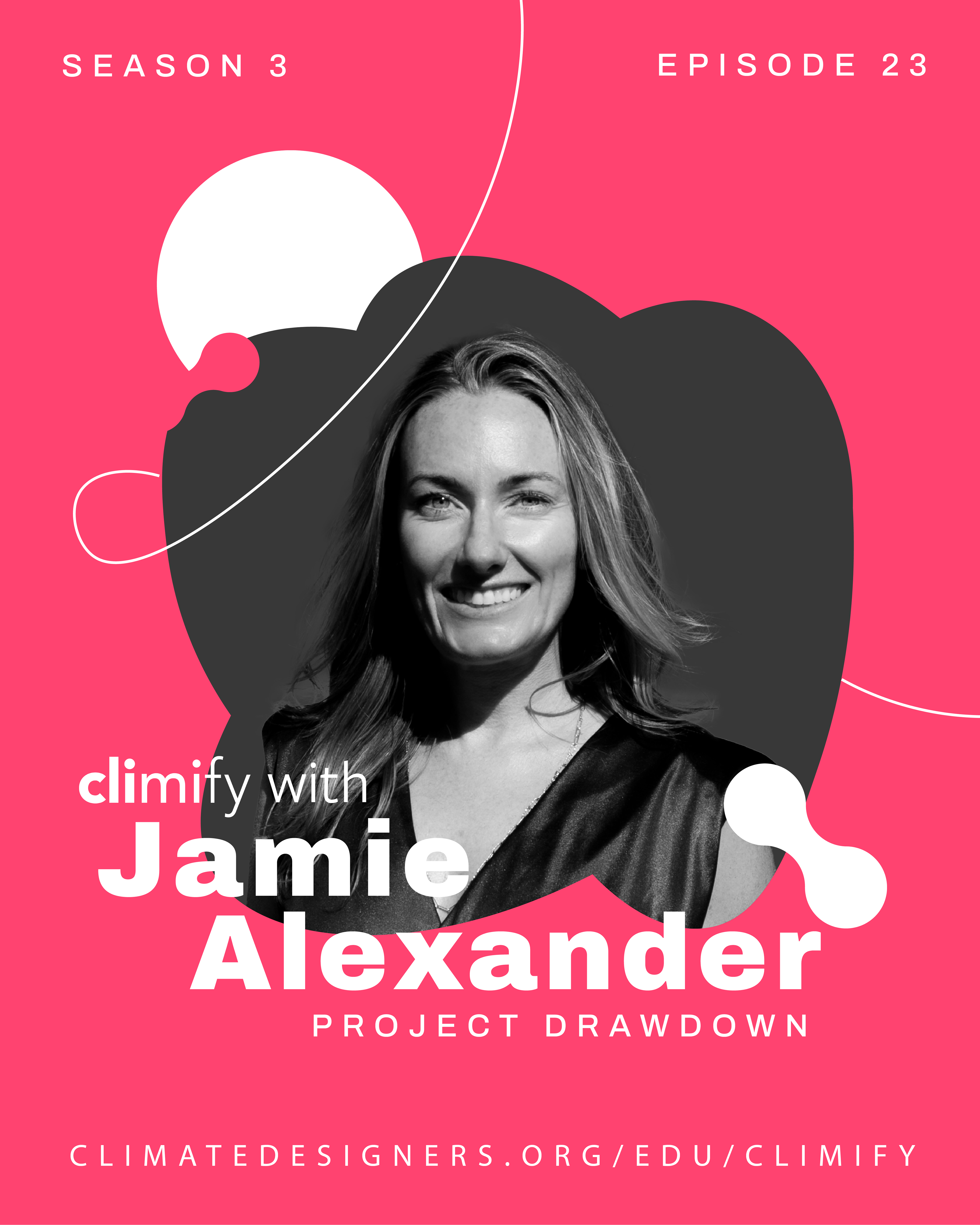
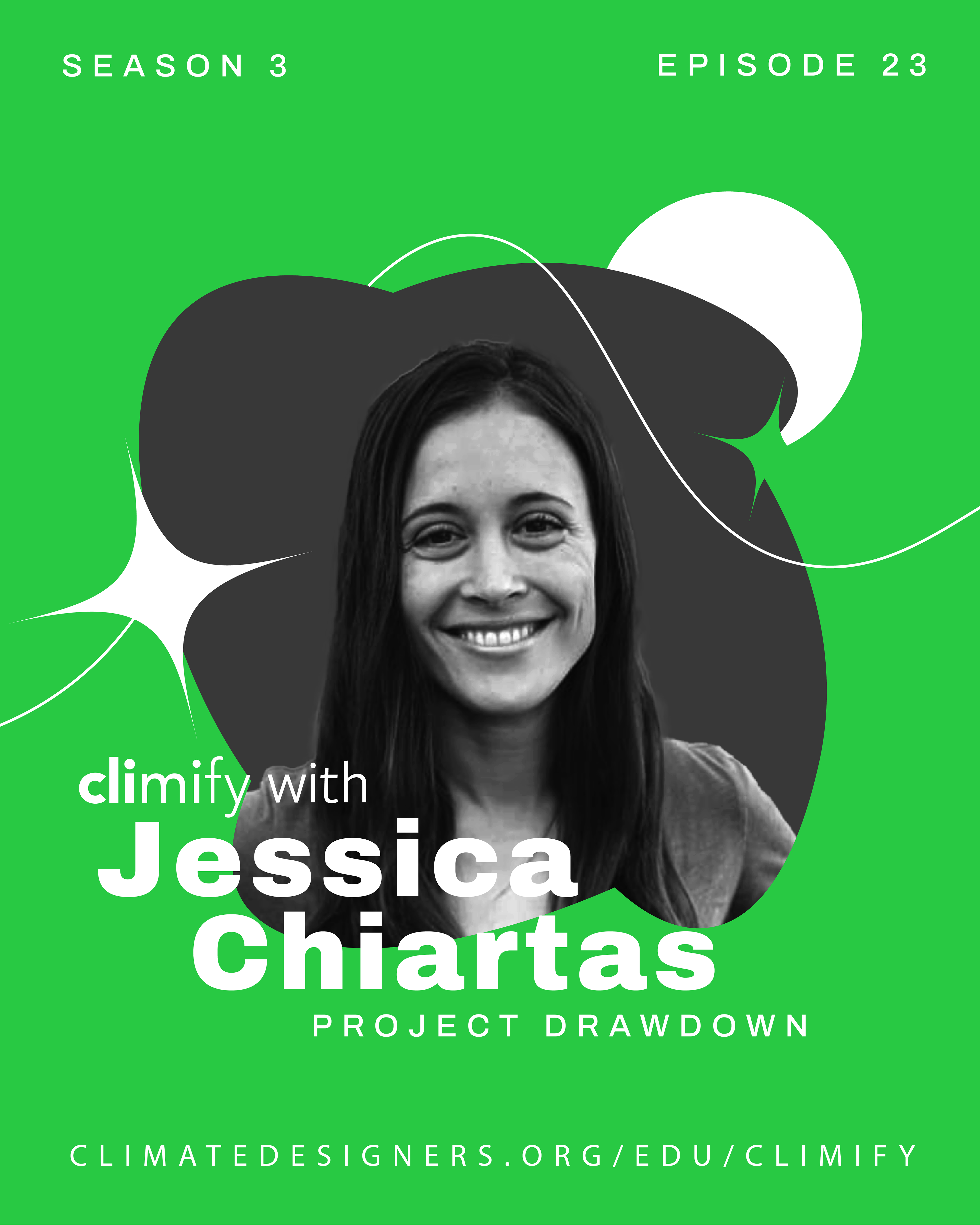
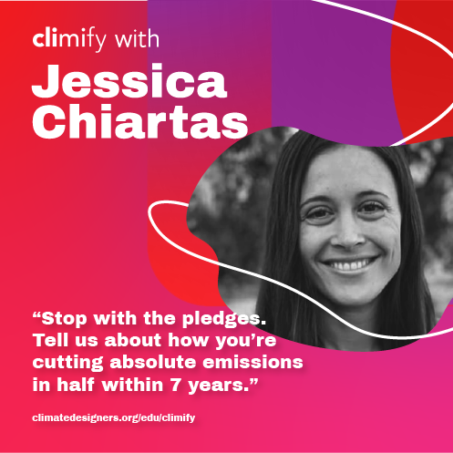
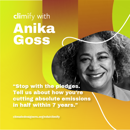
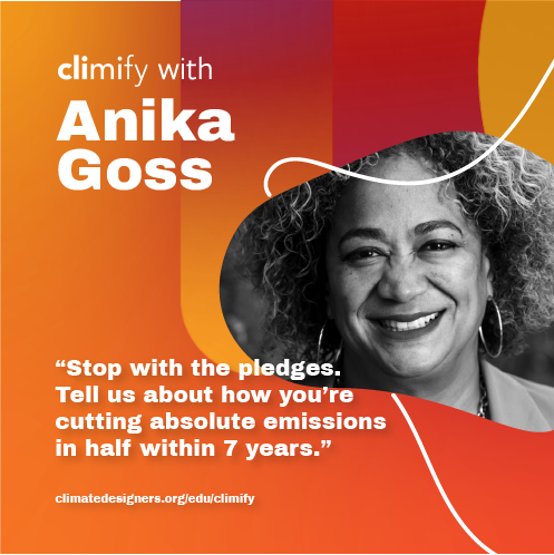
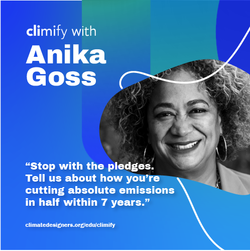
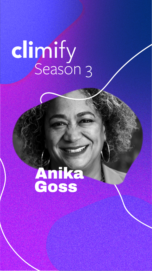
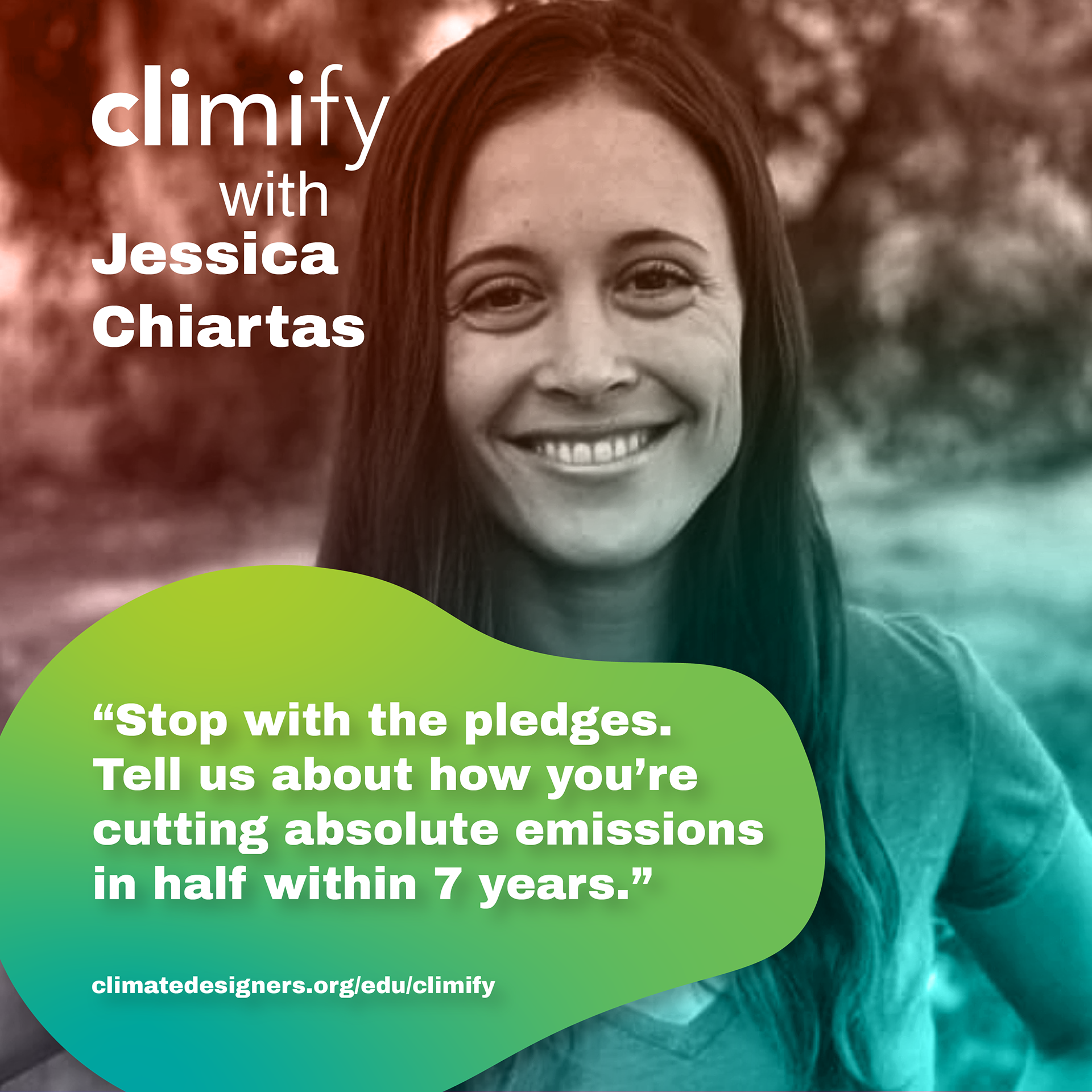
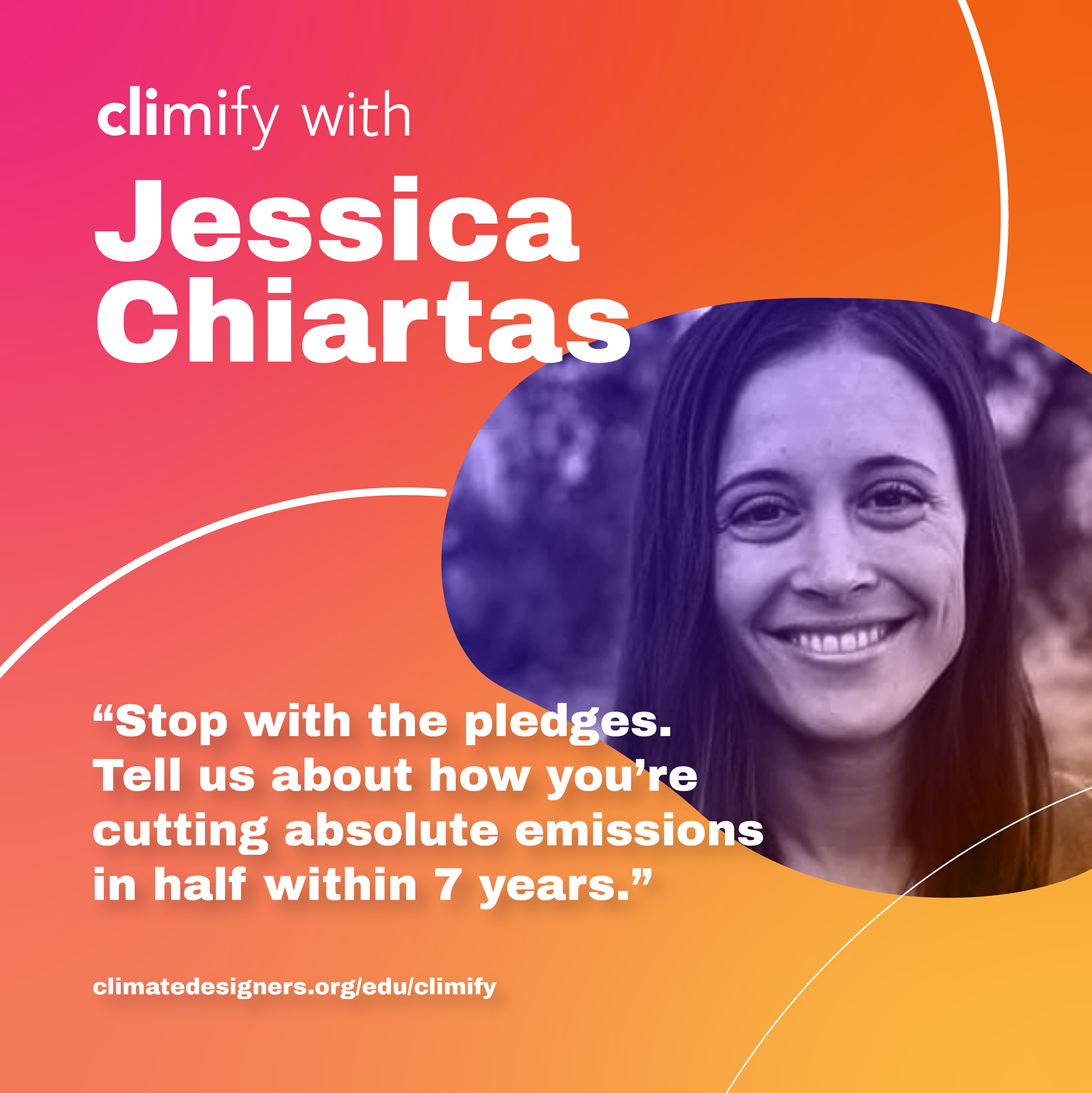
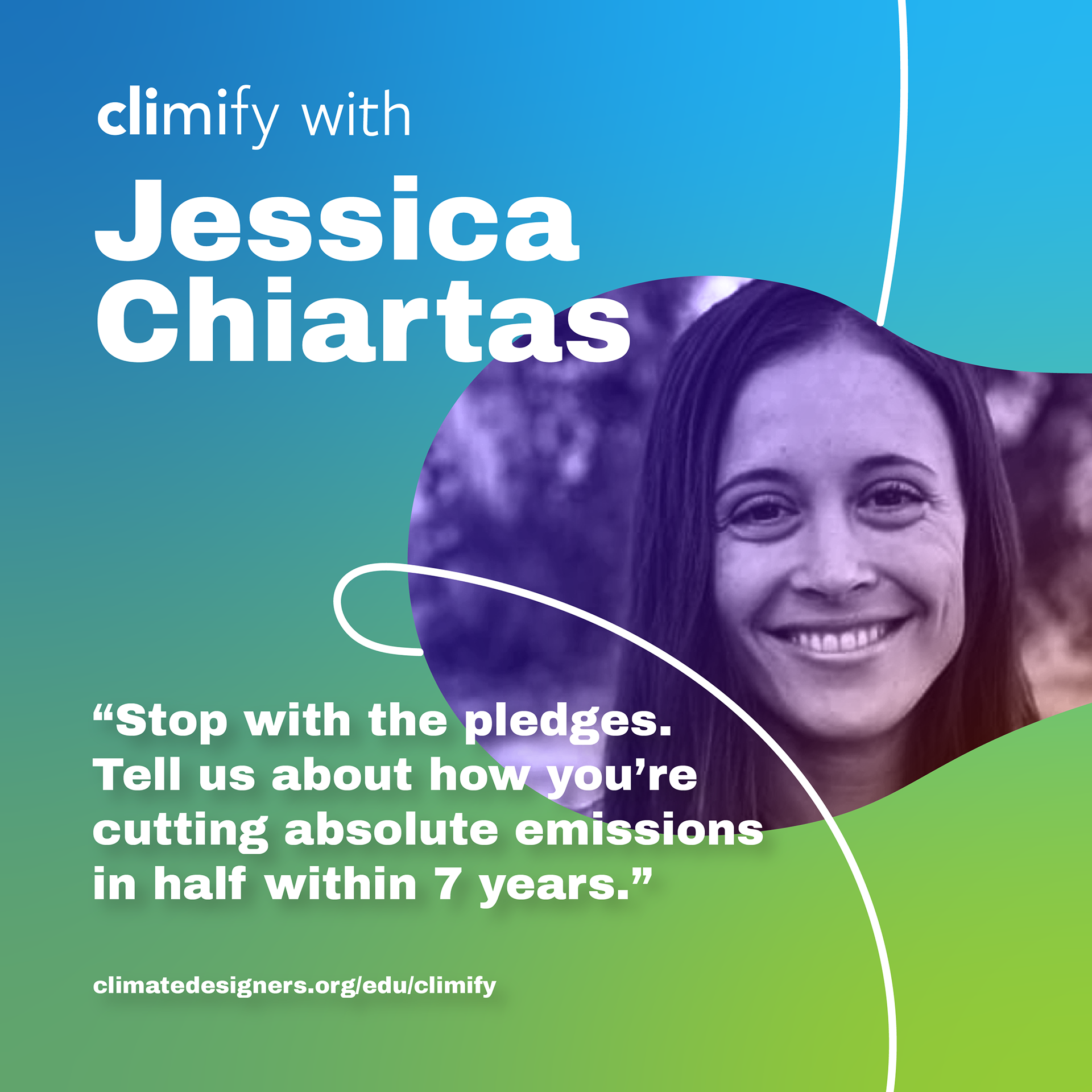
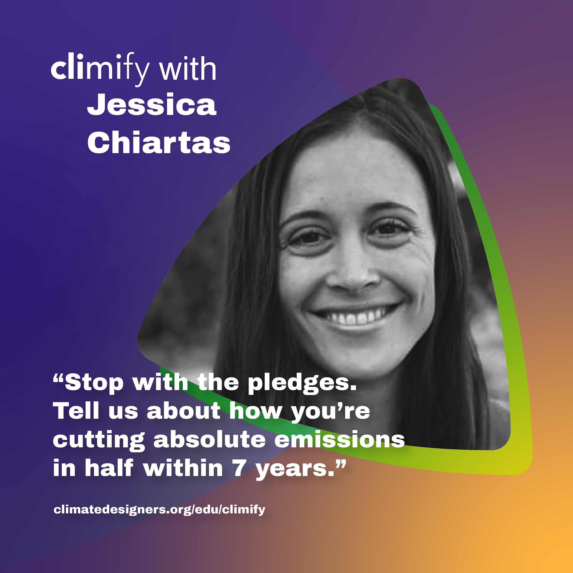
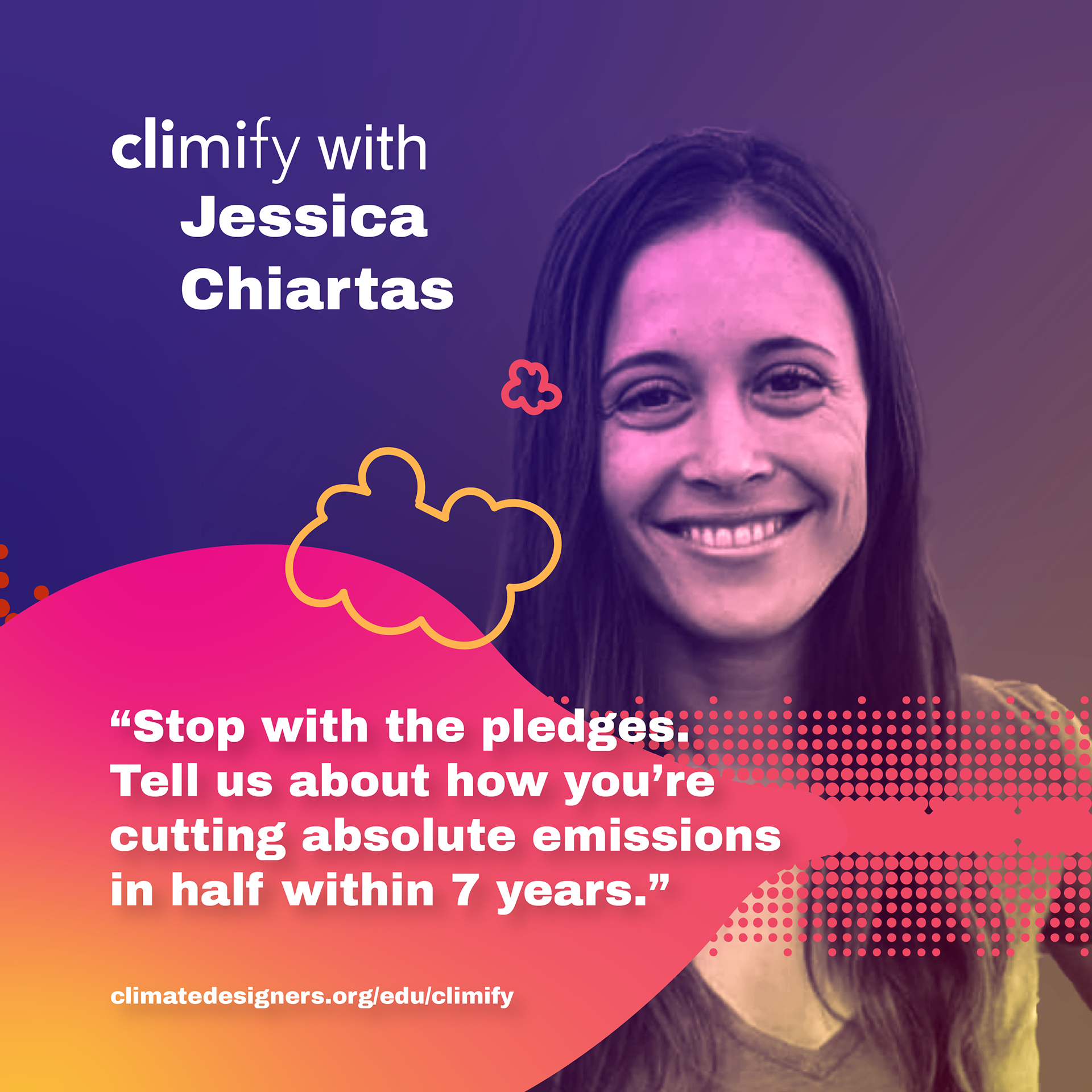
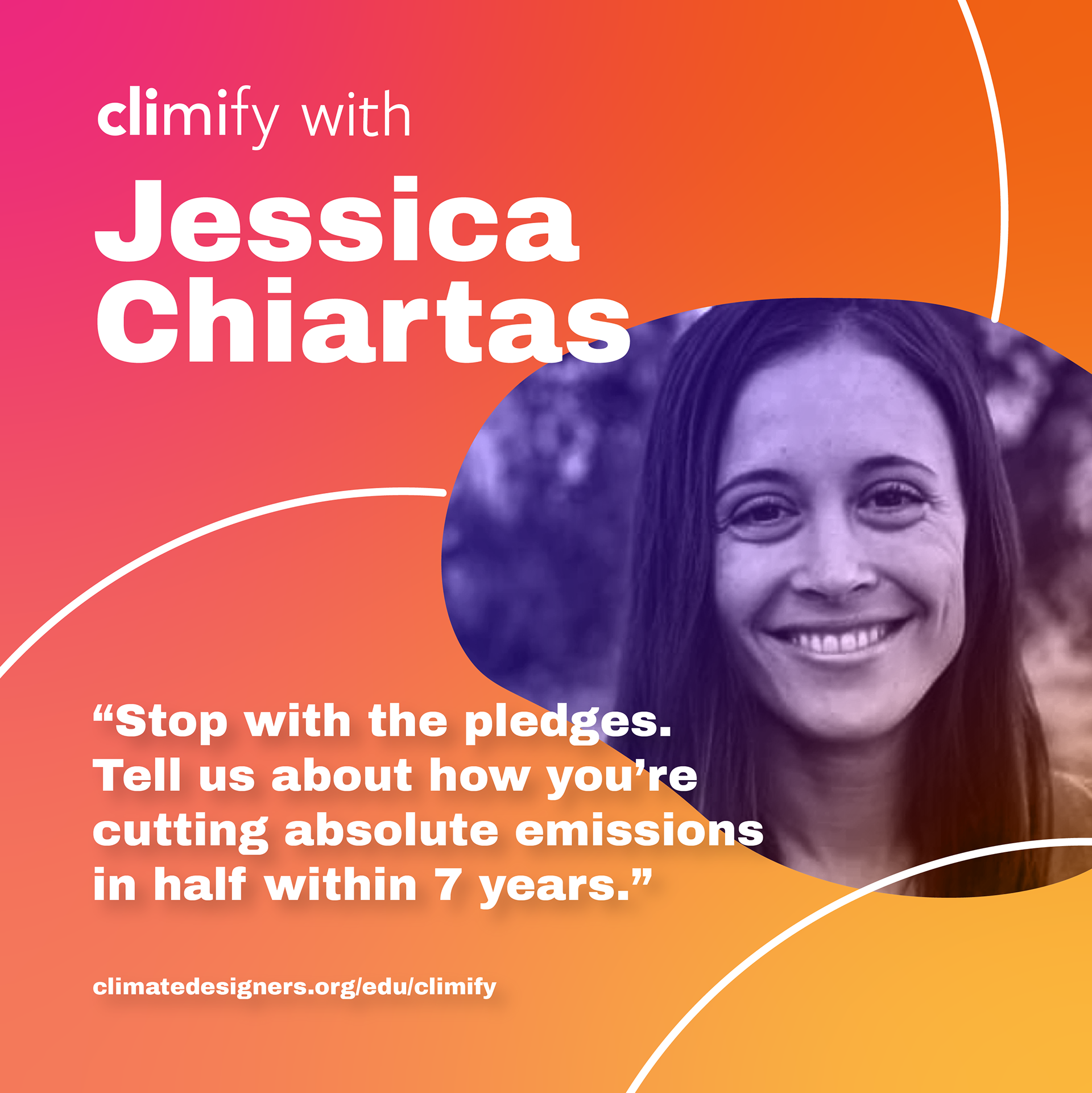
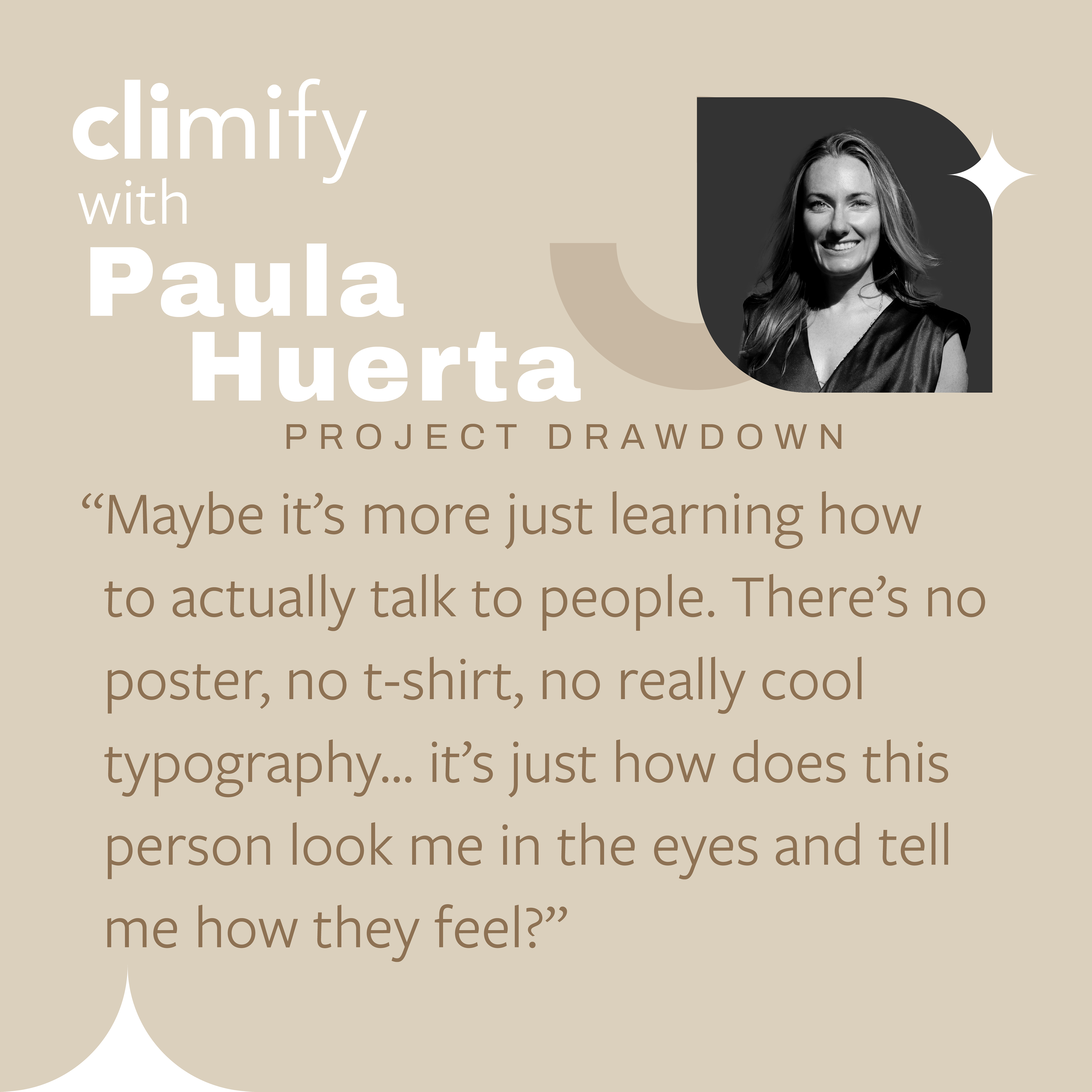
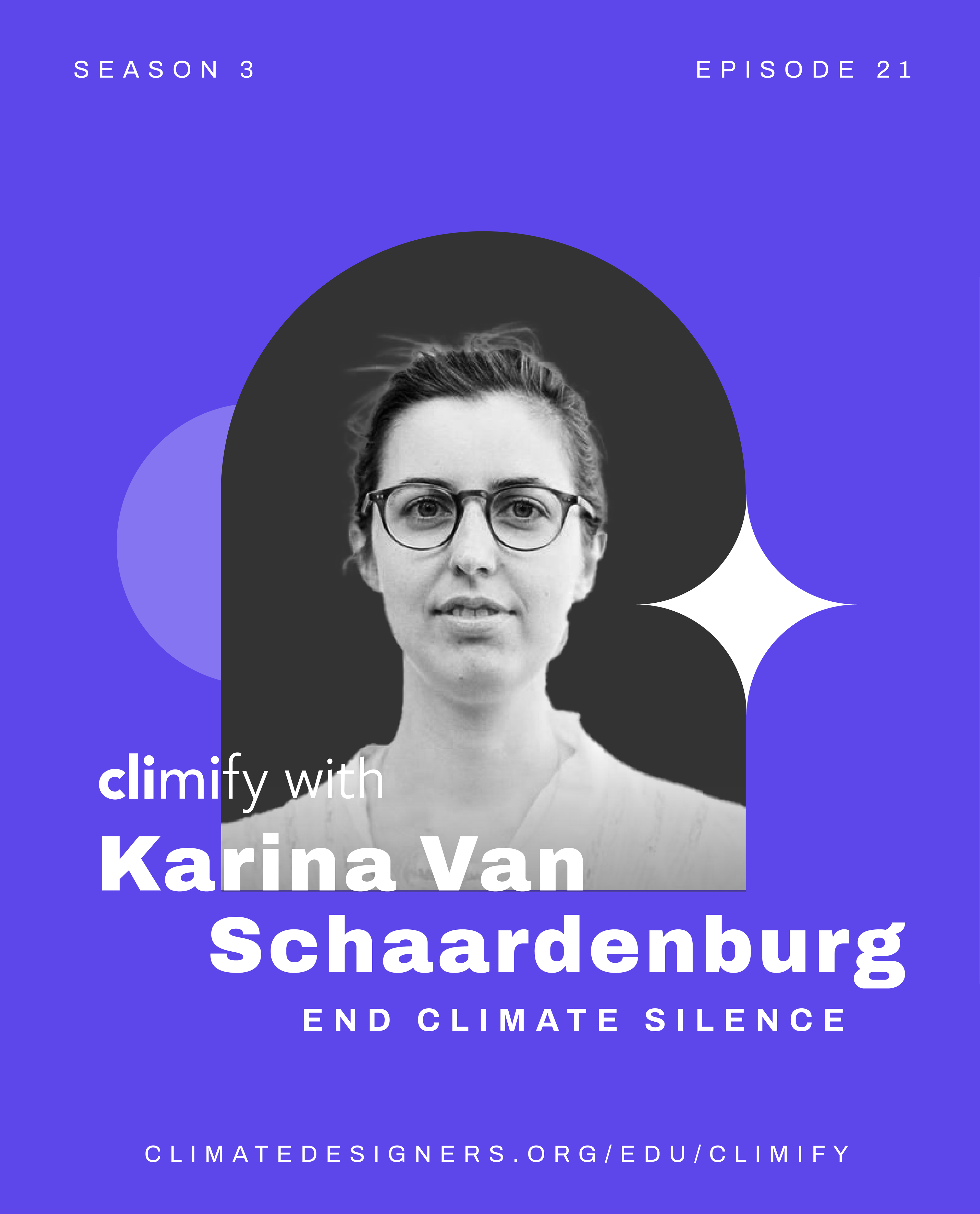
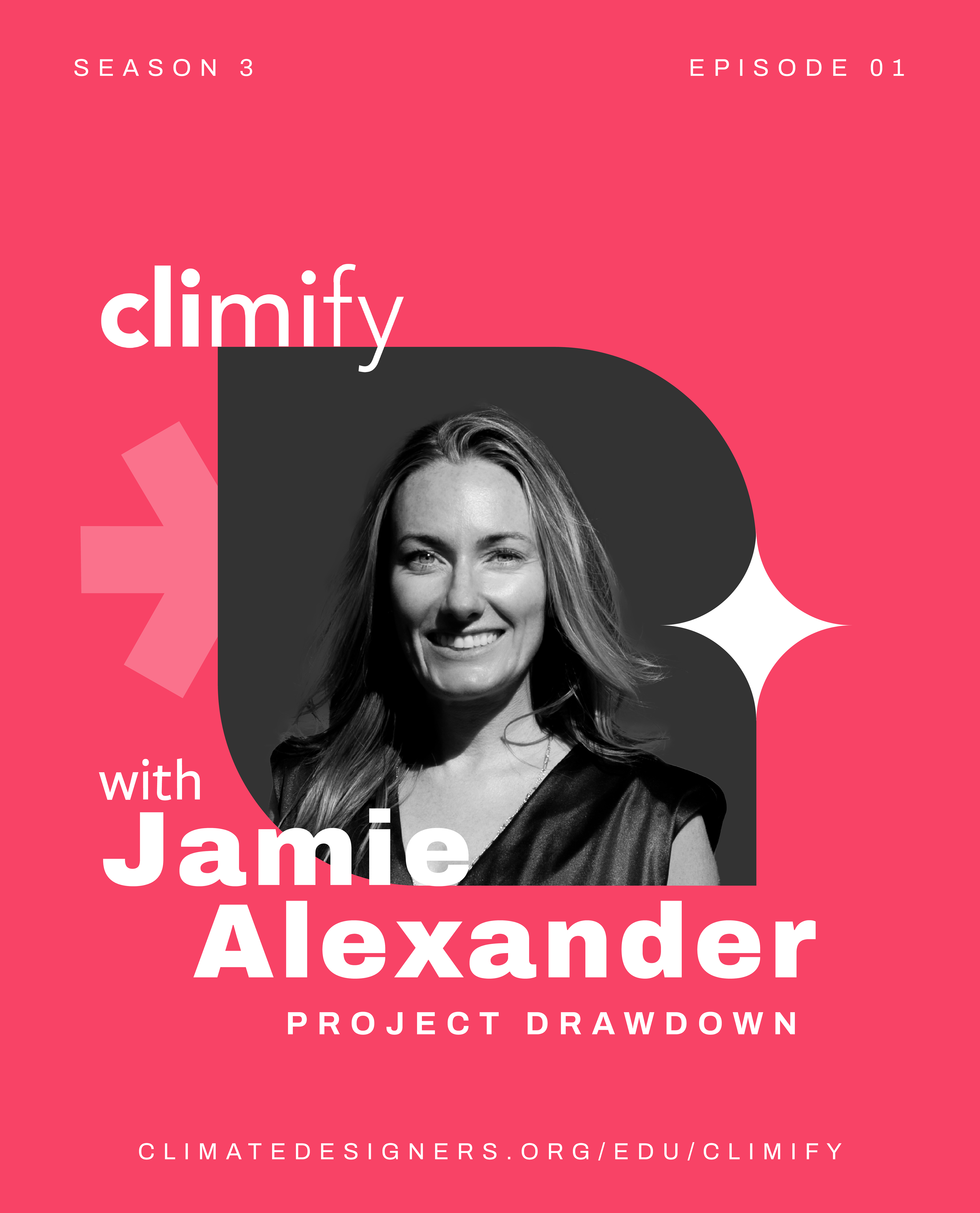
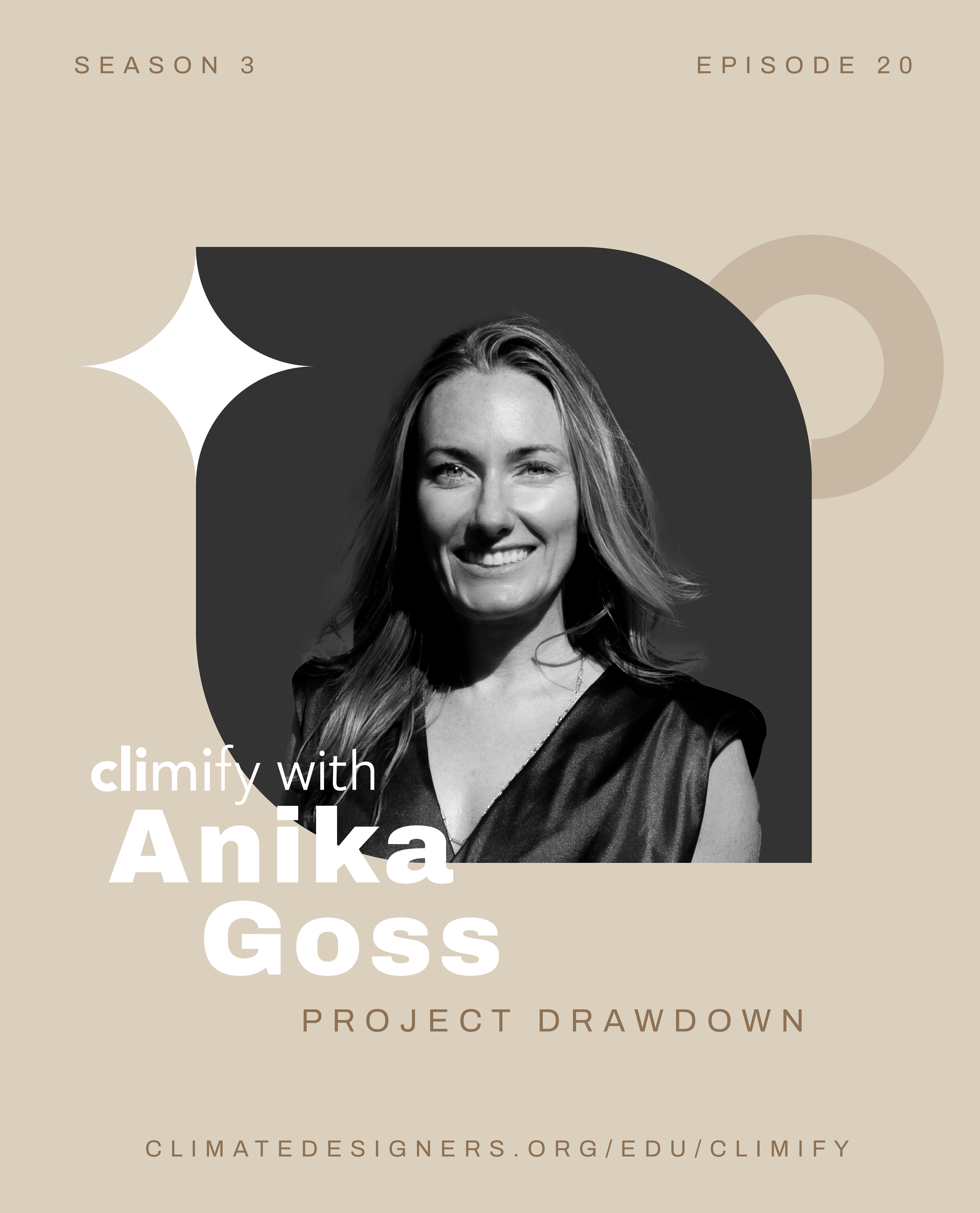
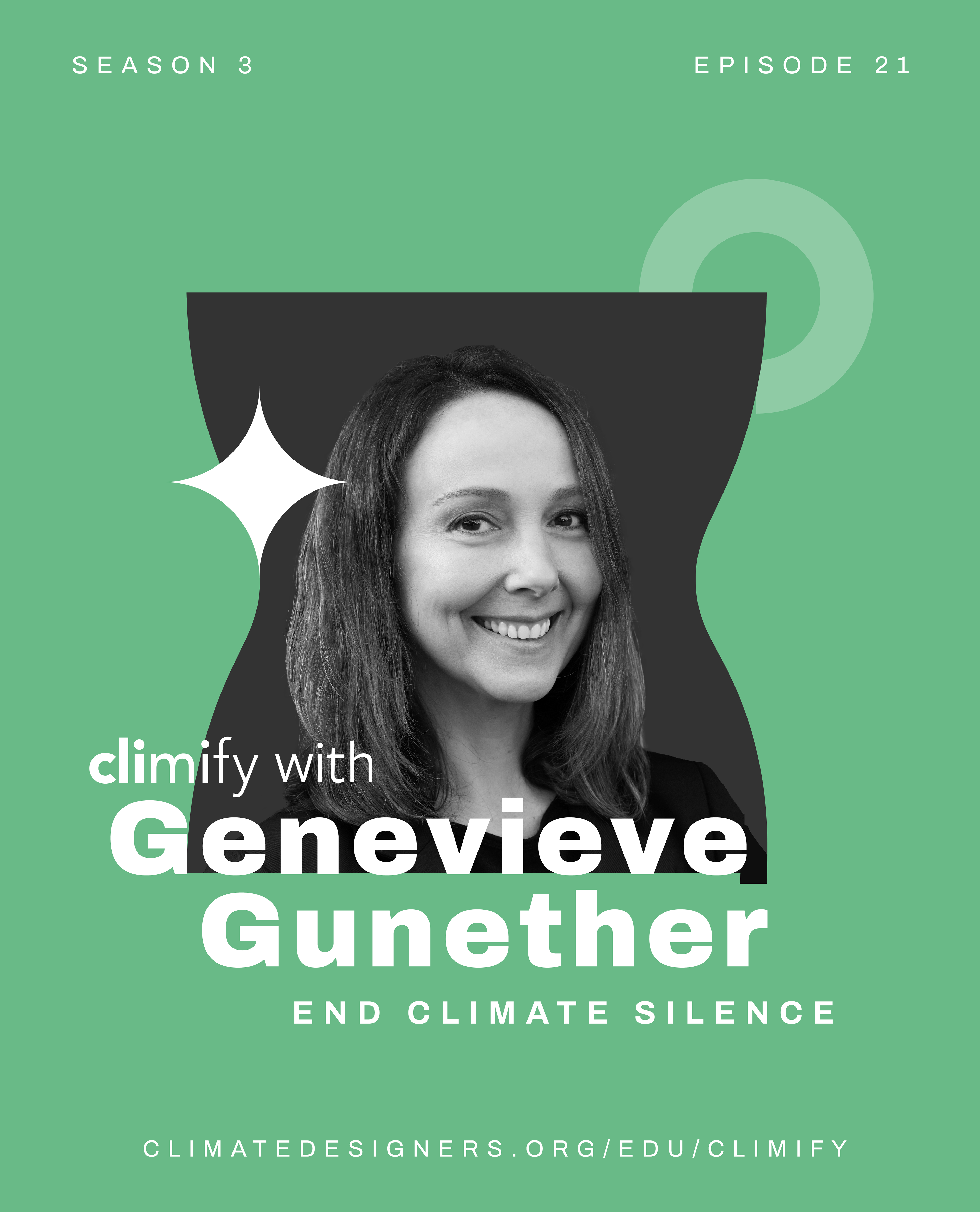
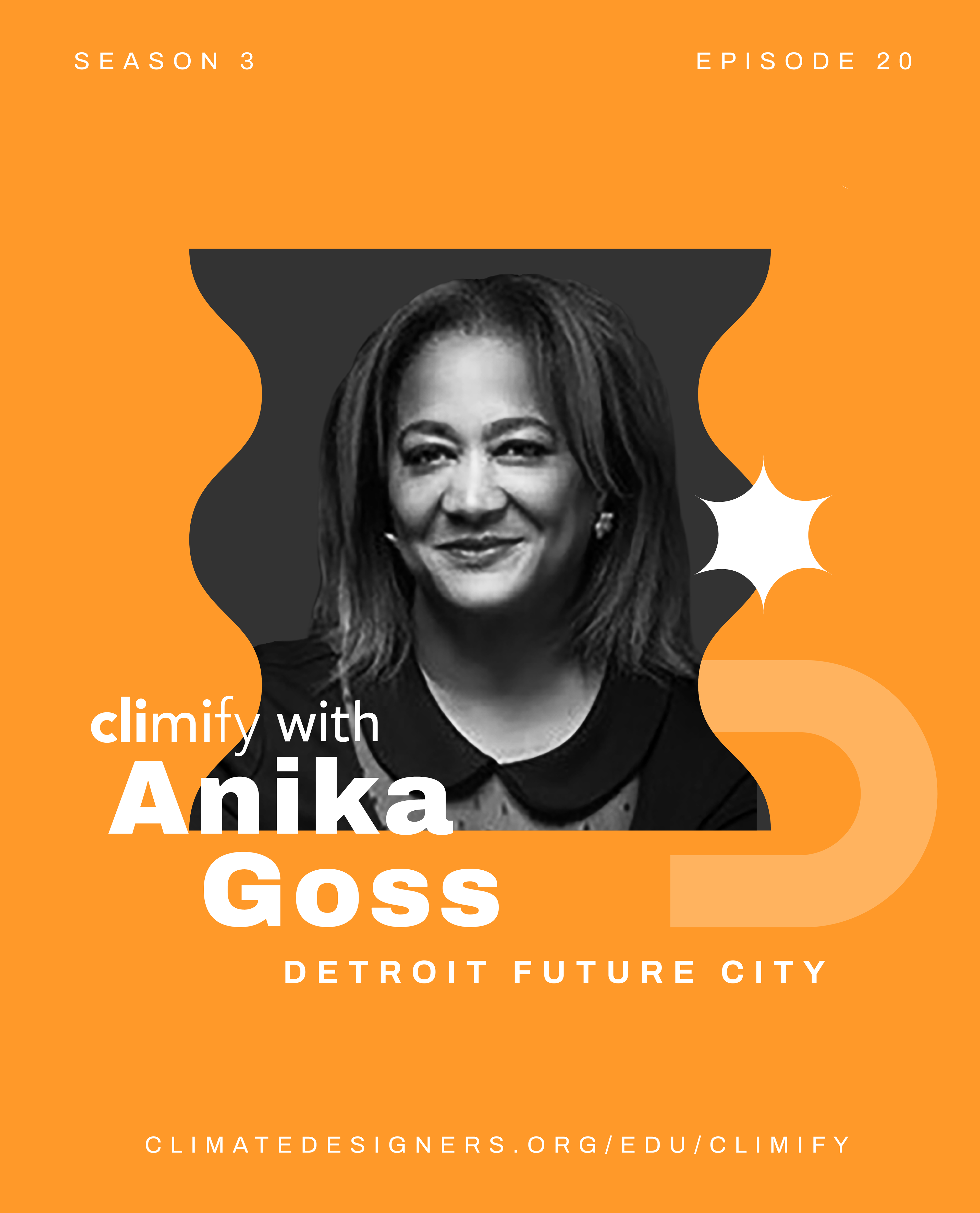
Episode Cover Templates
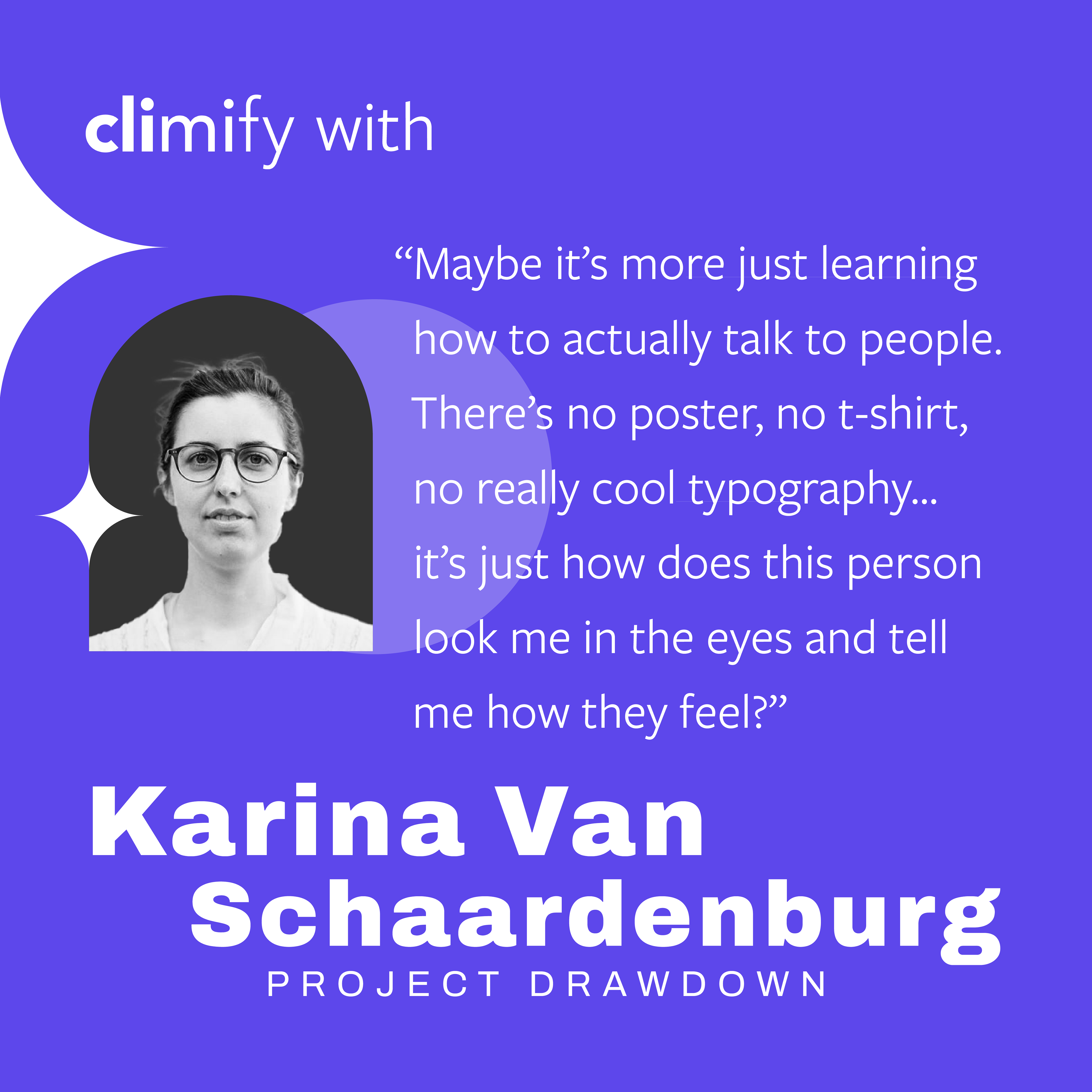
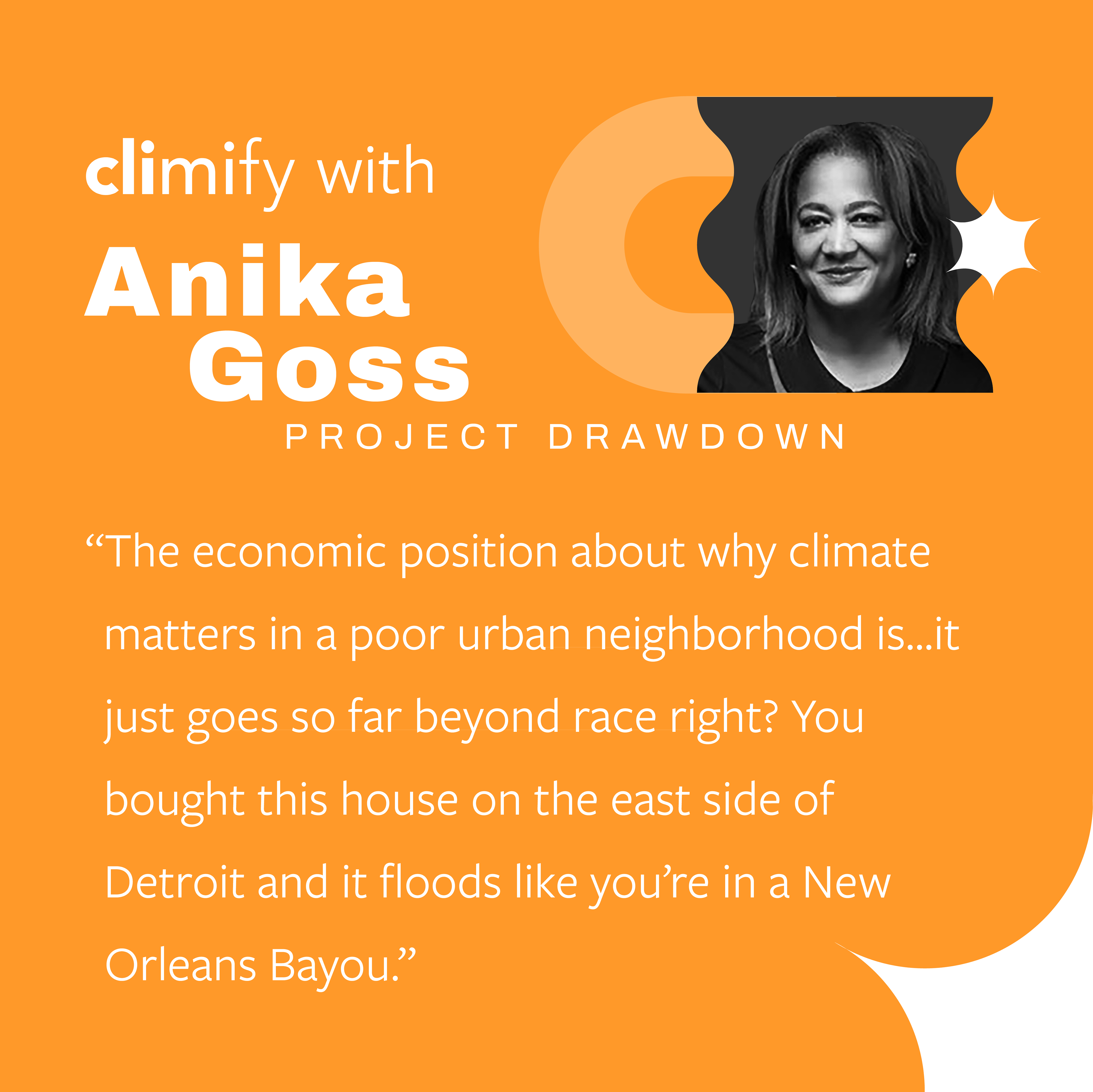
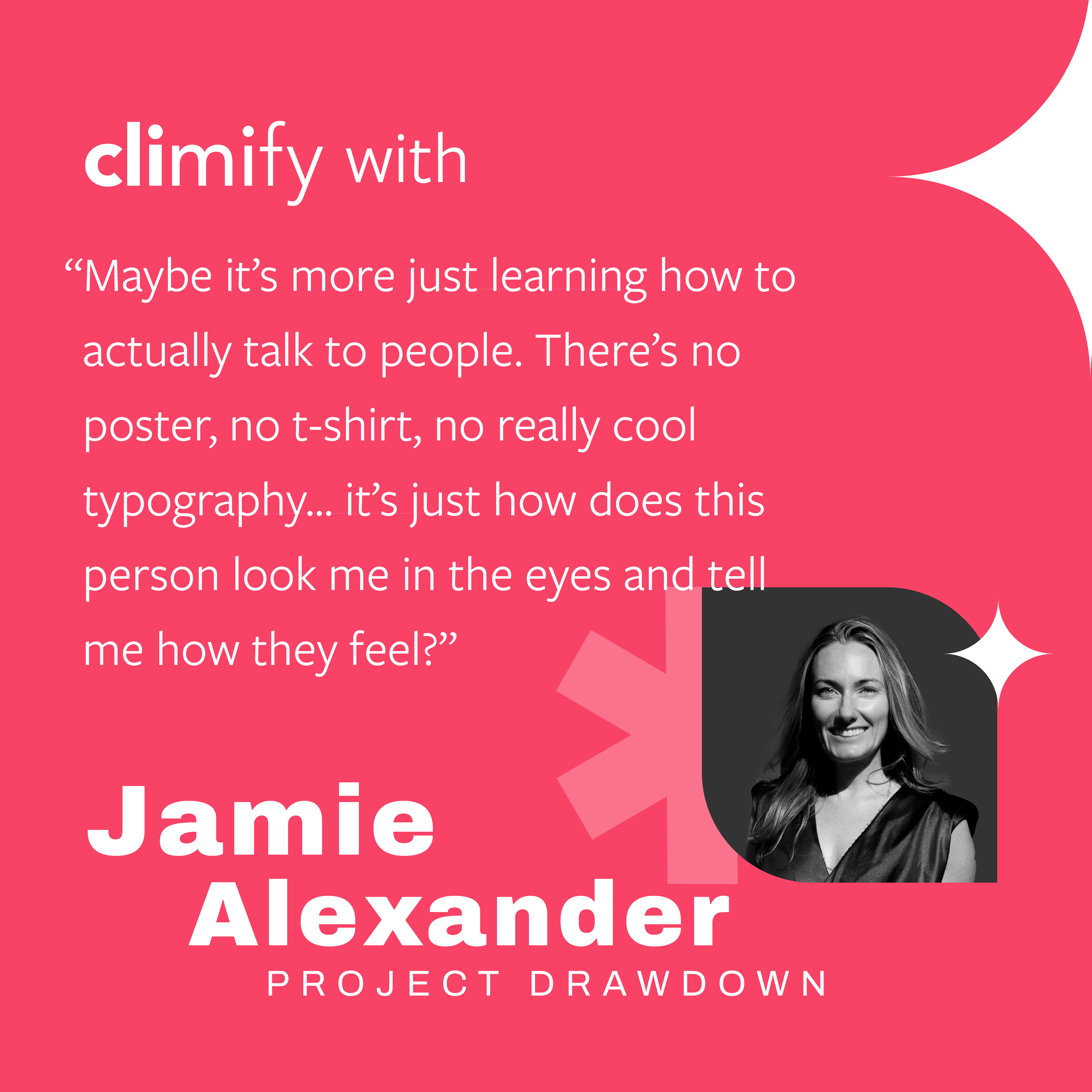
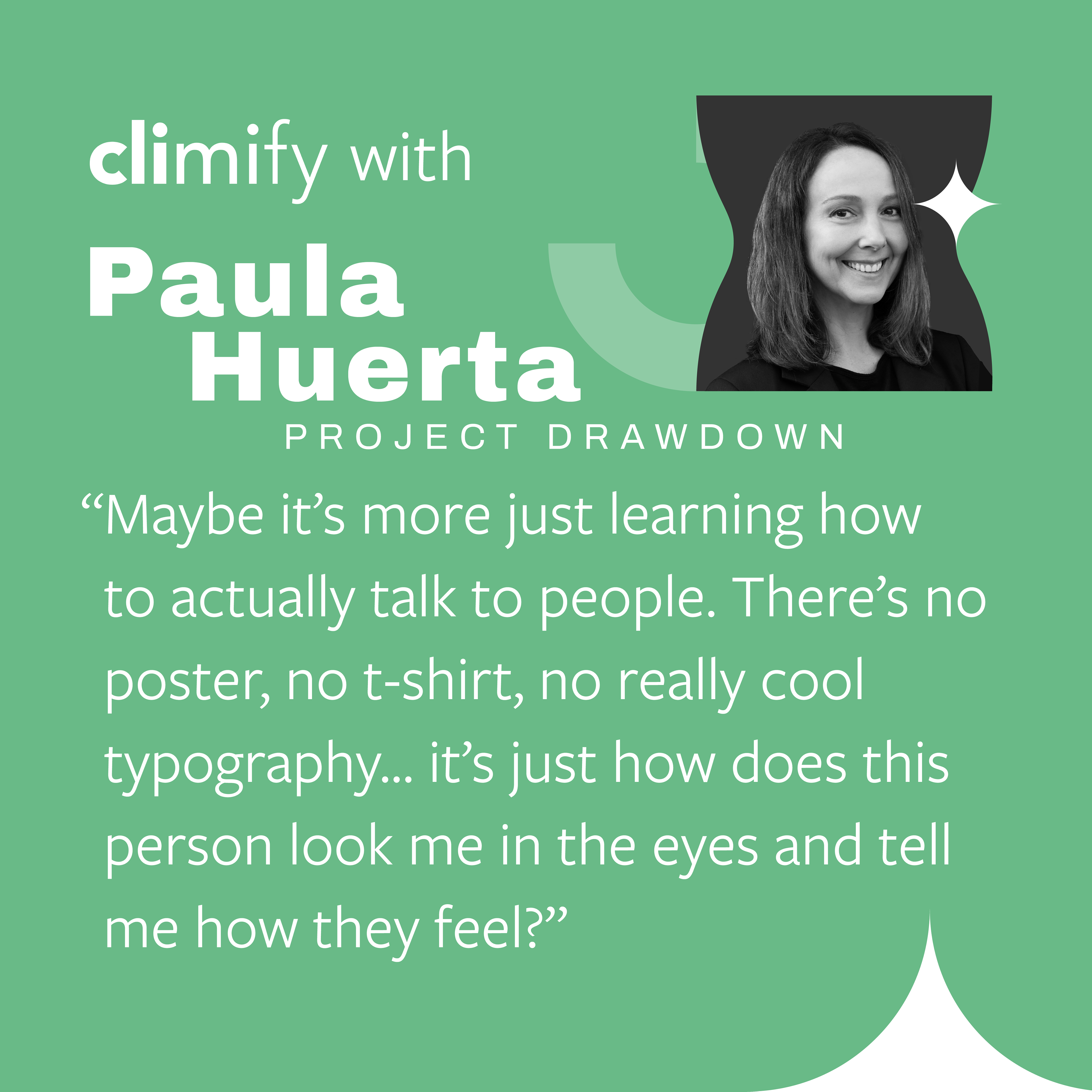
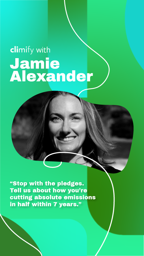
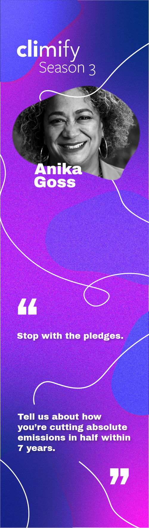
Instagram Episode Feature Cover Templates


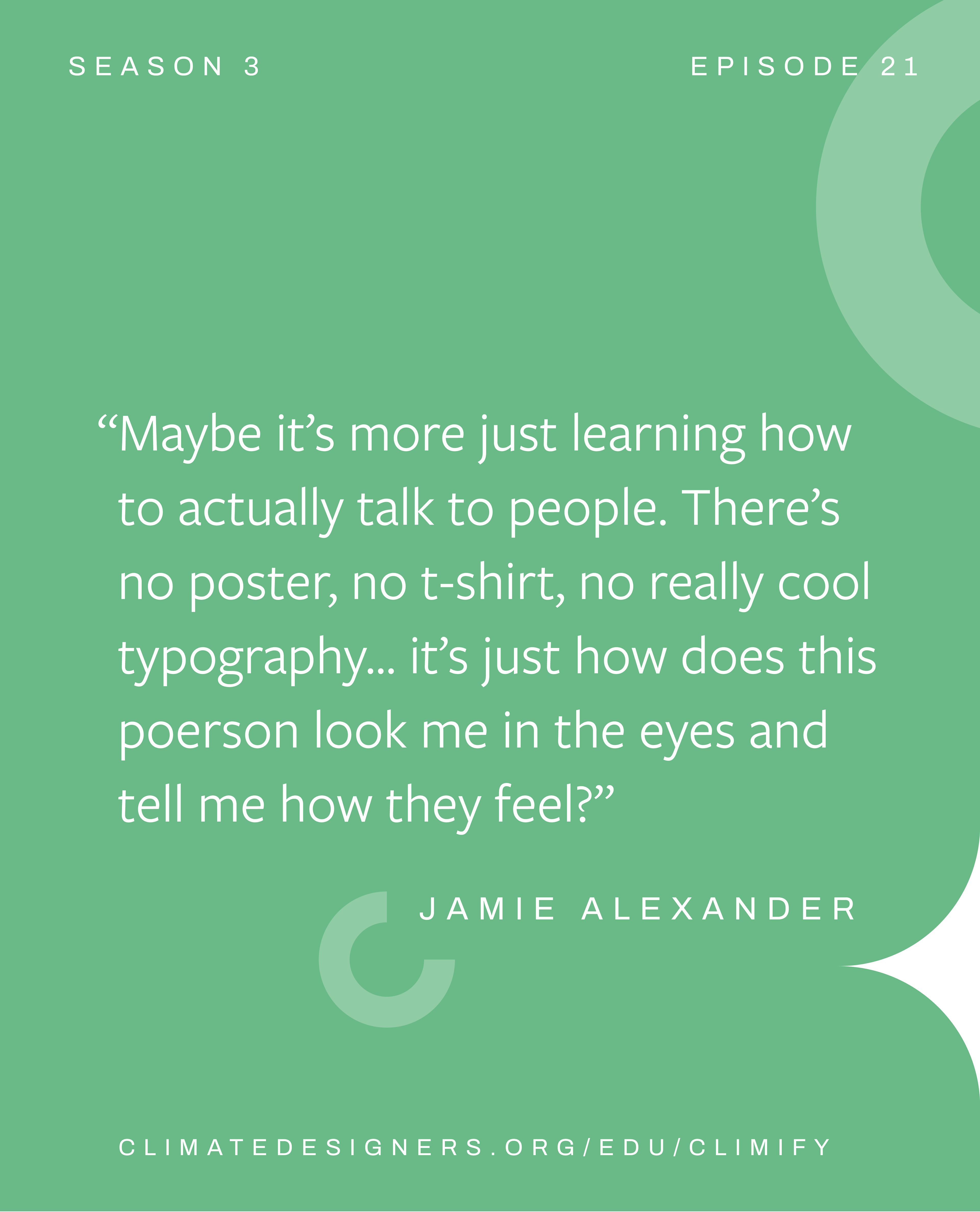
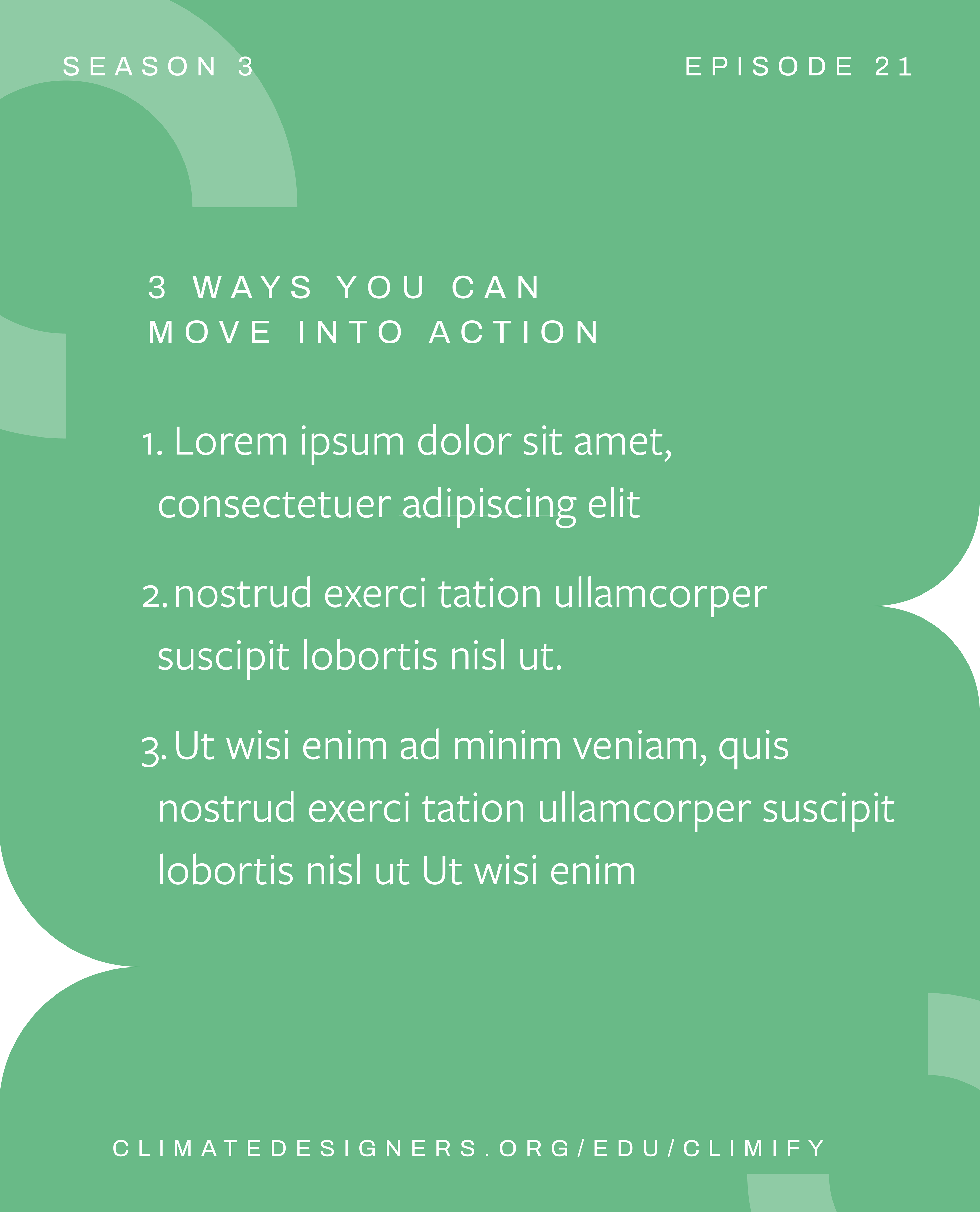
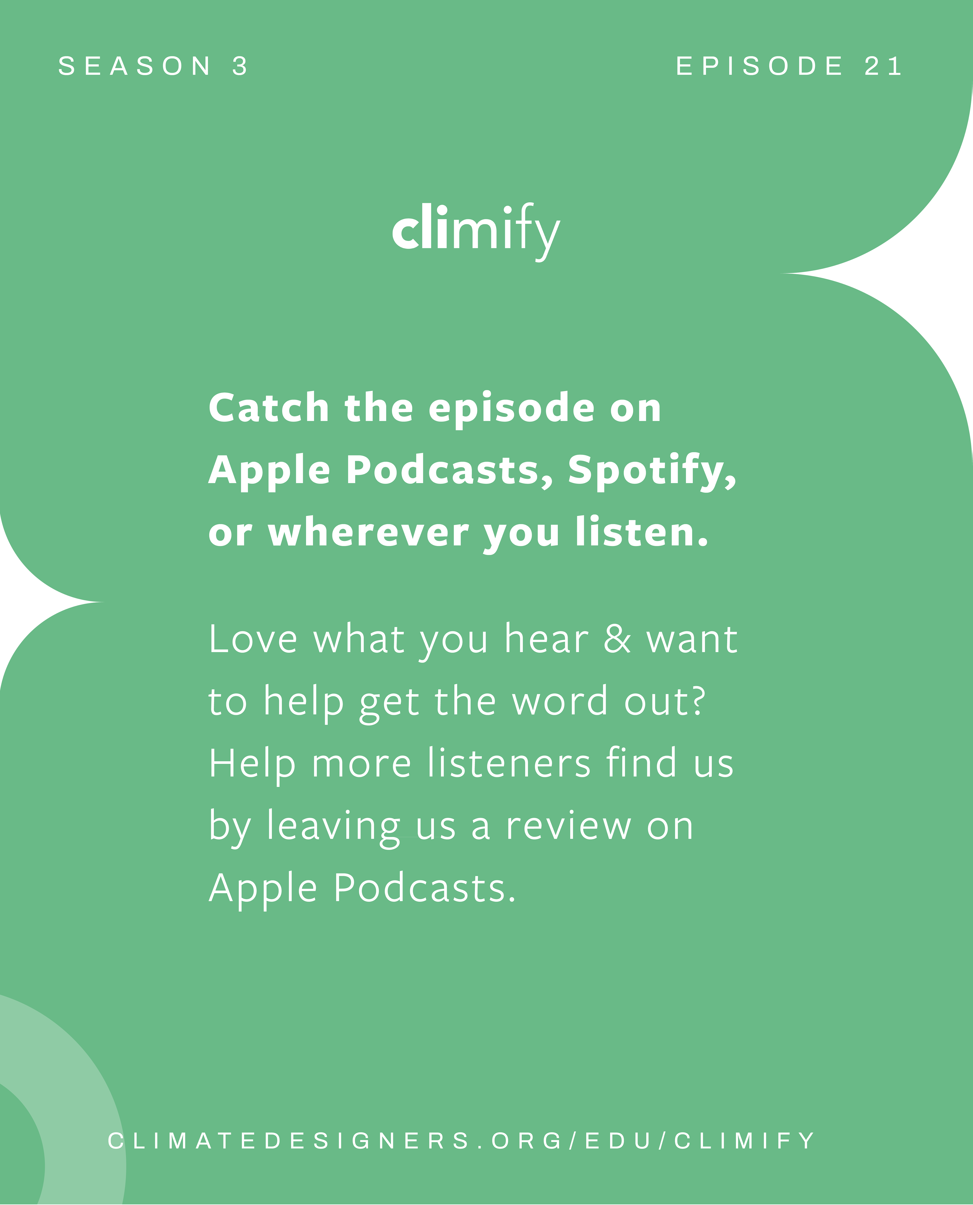
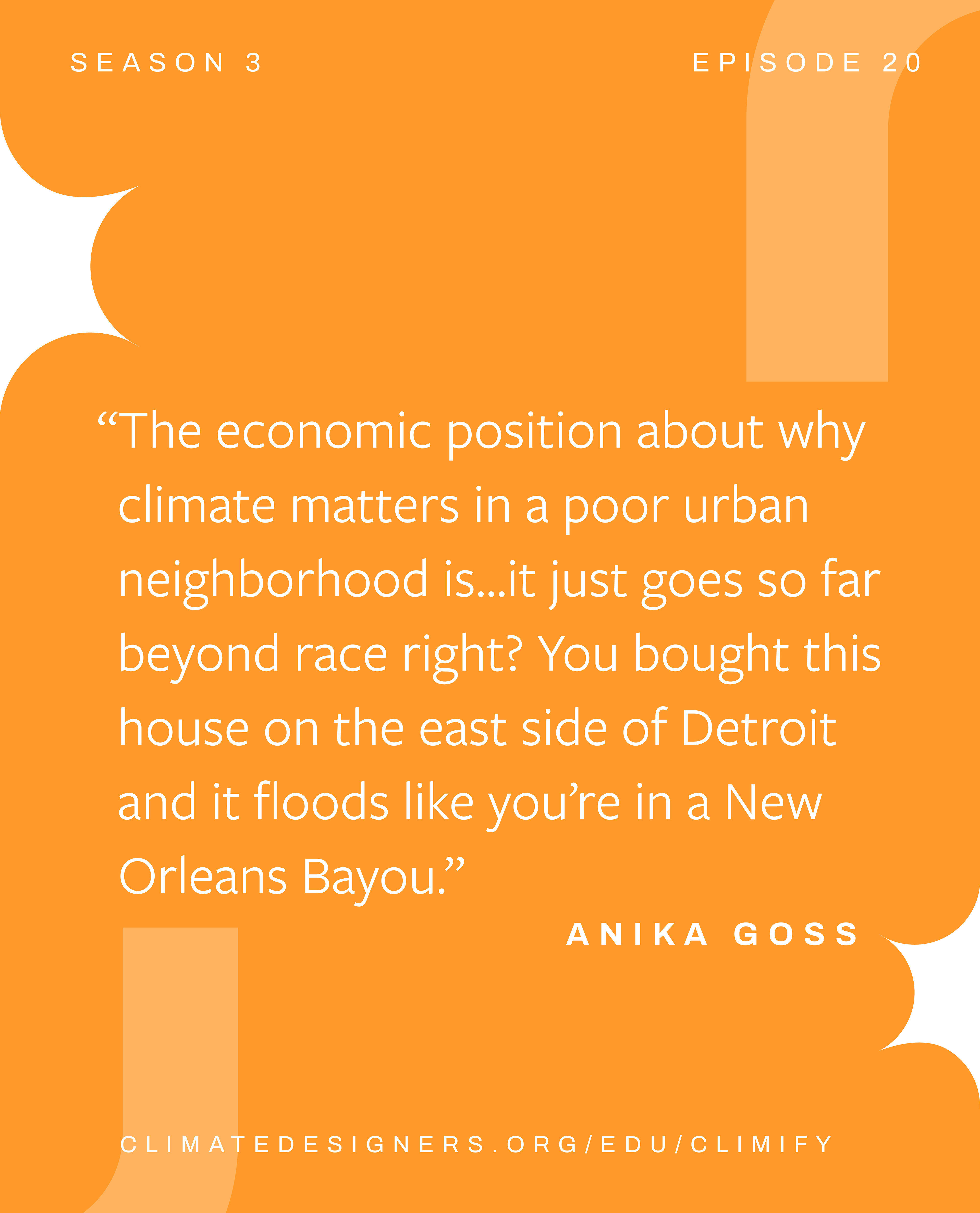
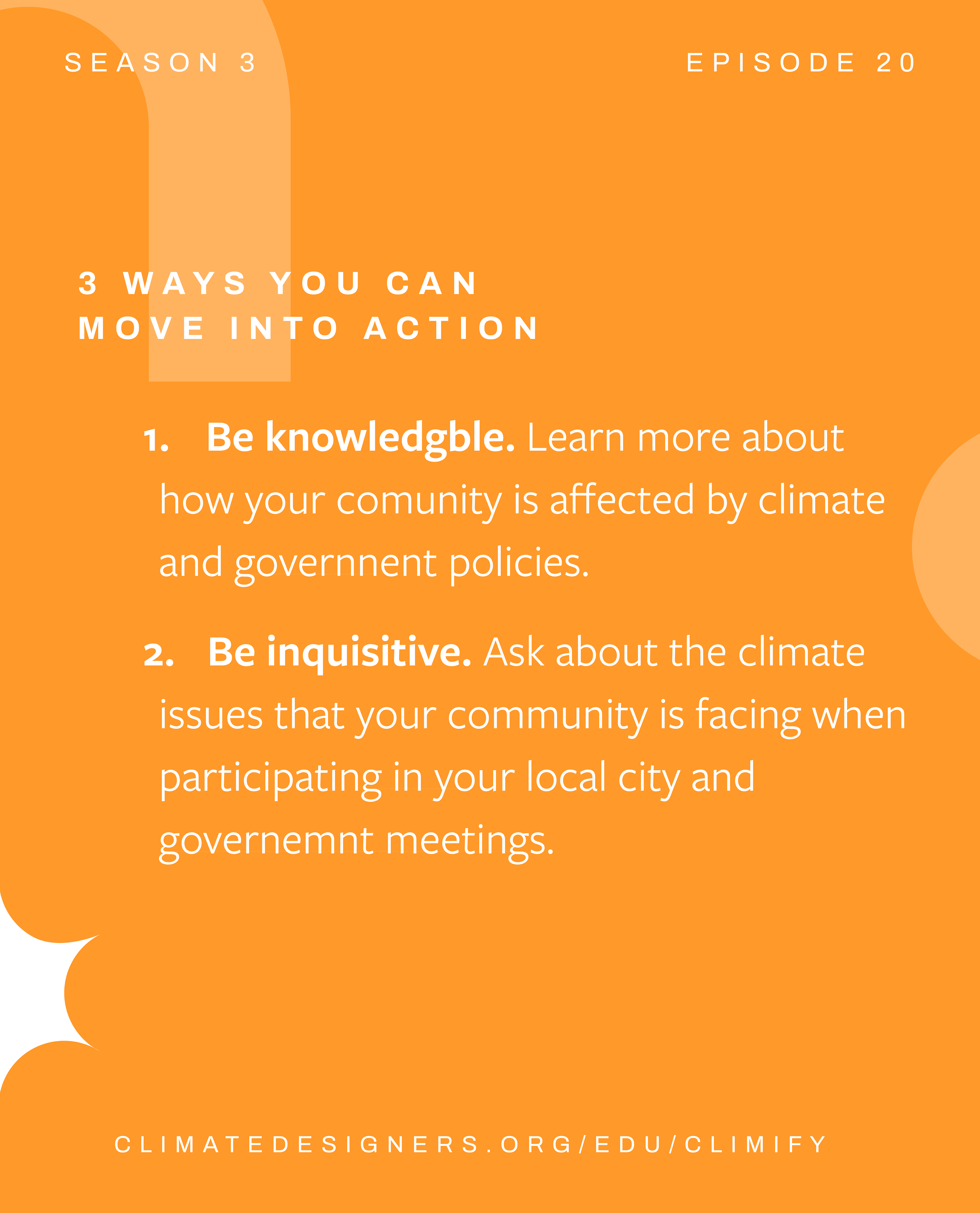
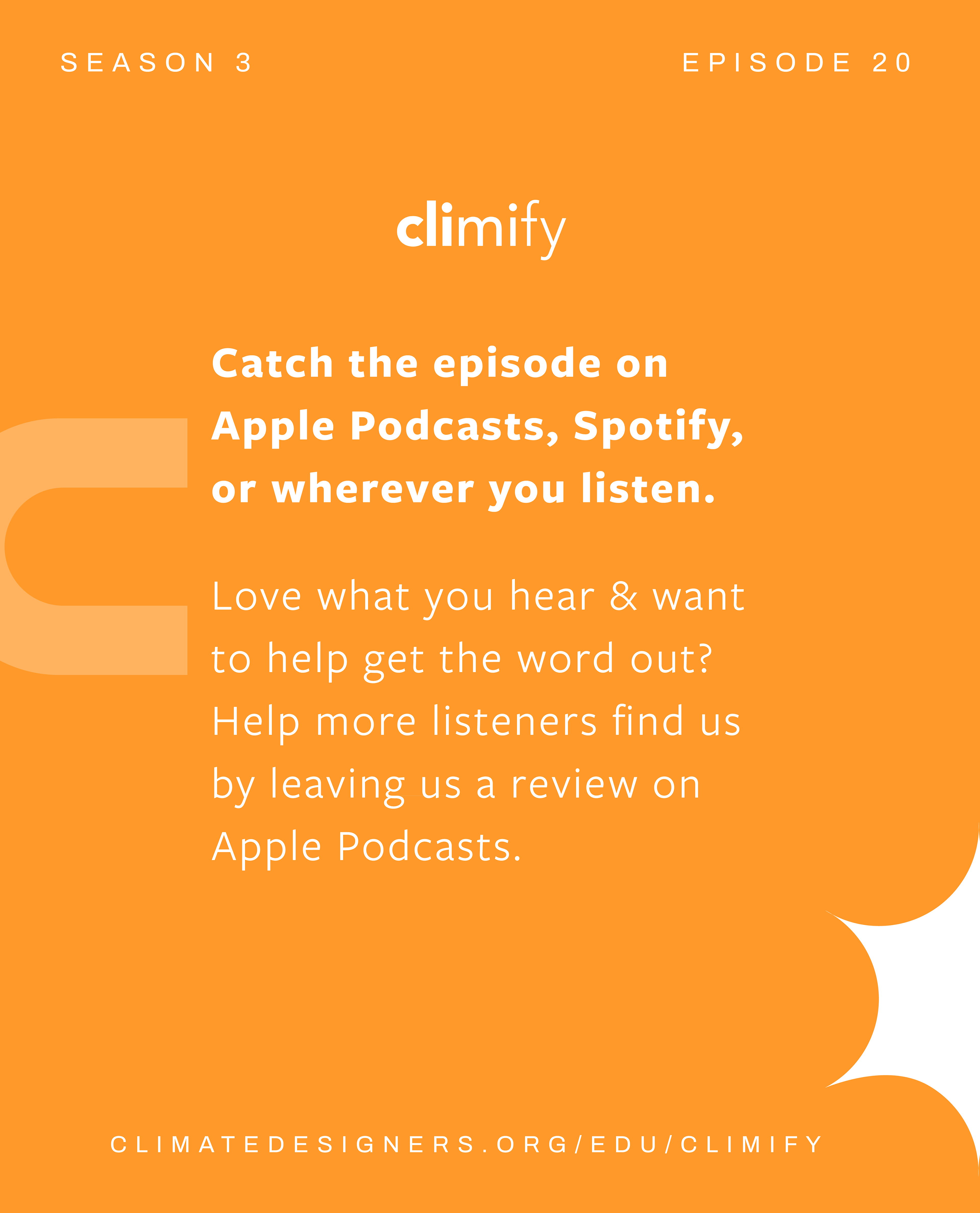
Instagram Carousel Post Examples
Base Assets
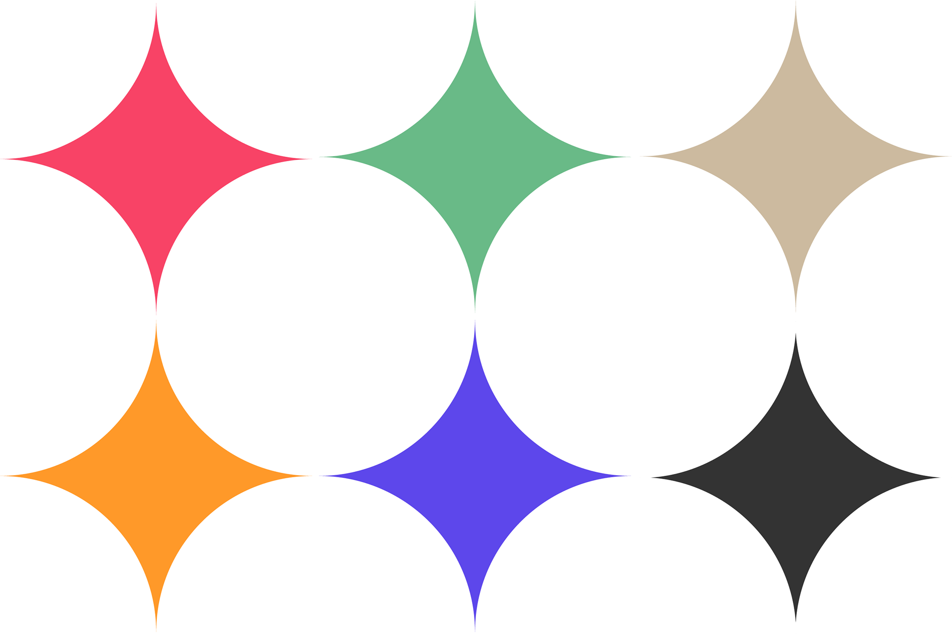
Season 3 Shape Combinations
The shapes chosen for season 3 are a combination of geometric shapes, specifically grouped to complement each others curves and straight edges.
The larger shapes are containers, meant to hold whatever imagery is used throughout the season in graphic content. The 4 point star is used as a divider and visual accent, to give some geometric flow to graphics. The less opaque shapes are more accent shapes, used in backgrounds and as dimensional pieces.

Season 3 Colors
Season 3's color palette is a lot simpler than the ones used in previous seasons. This was done to streamline the production process and to make a much cleaner look.
The 4 red, orange, blue, and green colors are the main ones this season. with season 3's release date being spring 2023, we wanted the color palette to be bright, bold and earthy feeling, but a bit muted, to accomodate the use of white text without reducing legibility.
The grey color is used as a common backdrop to enclose guest headshots. It was chosen to be a stark contrast to an otherwise really bright palette and reduce visual noise. The brownish grey was chosen as a stylistic neutral tone, so that people who wished to share the podcast materials had and the option that wasn't as bright, as many people in the Climify audience tend to have brands and platforms with more muted color palettes.
Logo/Asset Motion
The asset motion was done to bring extra flare to the current Climify brand. The logo mark and color choices were already strong, and the updated simple shape language was a perfect style to use in the pursuit of animation. I created a custom logo animation, as well as various assets animations, using After effects. Unfortunately though, due to time constraints, these elements were not fully finalized in order to add them into the published brand. Perhaps for a future season, we can come back to these concepts to expand on them.

Draft Work
A Collection of Design iterations throughout the Project.