There have been multiple occasions where I just wanted to make something without the pressure of having to make it for someone else, or a class, or anything of the sort. Here, I have placed a few mini projects I either conjured up for myself, did based off of an online prompt, or a combination of the two.
ReadFox
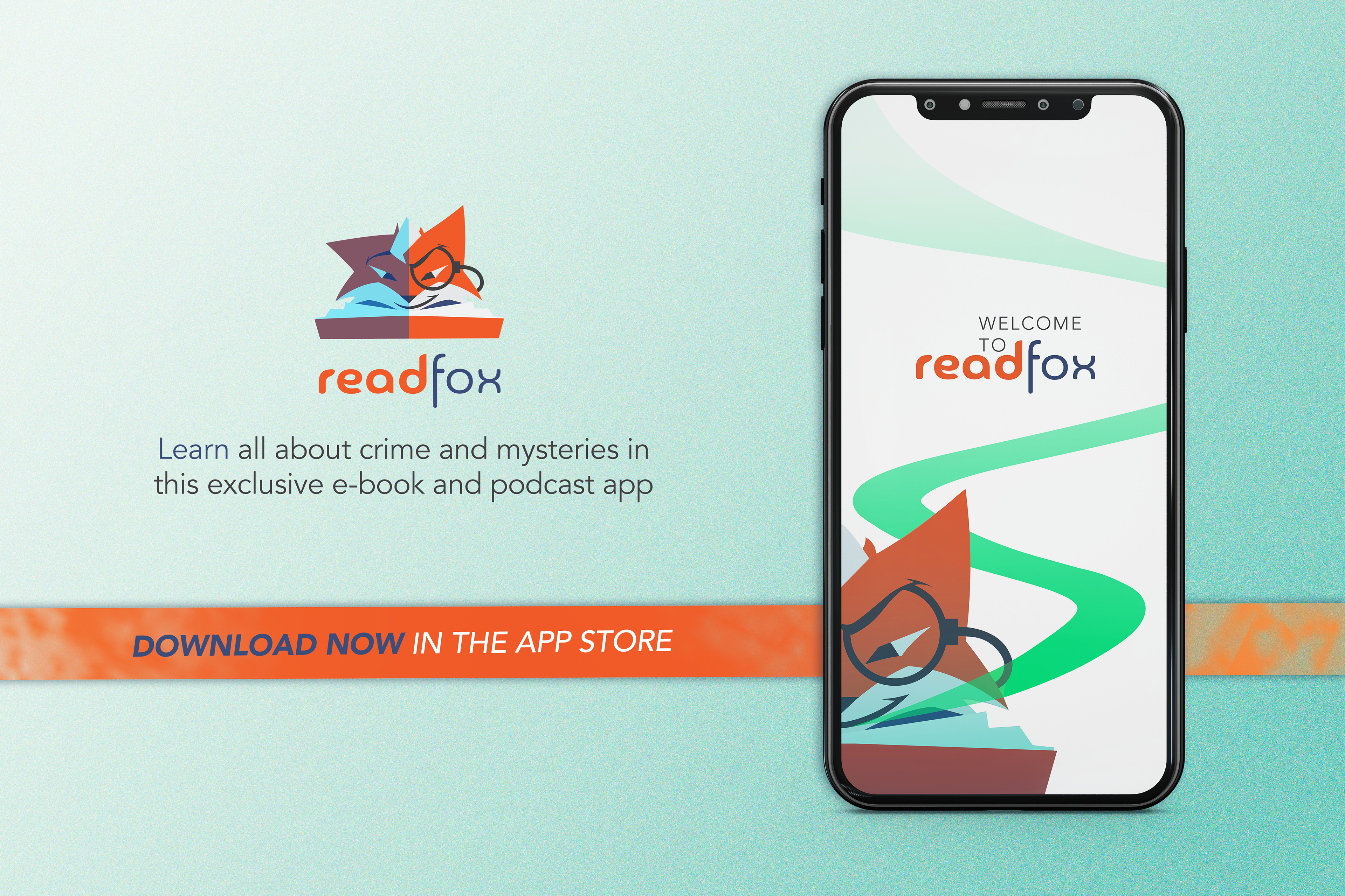
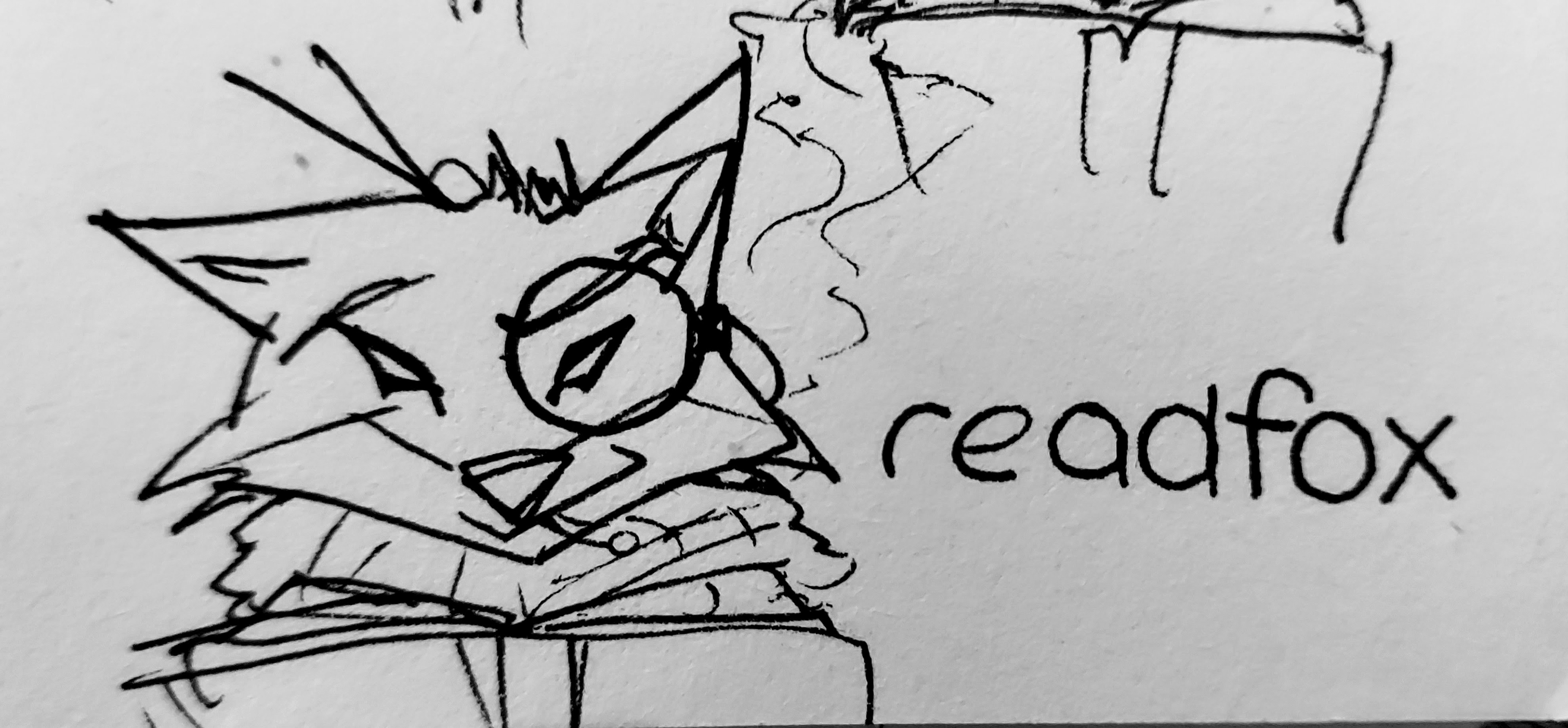
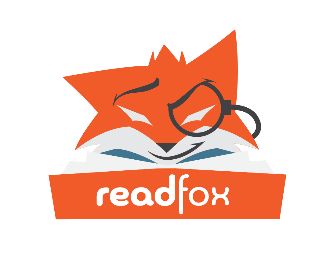
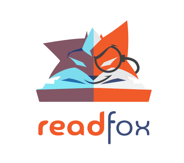
ReadFox is a crime and mystery podcast, e-book, and audio book app. This concept came from a design challenge to make a fox logo, with title text "Readfox". The idea for the logo to be of a mascot for a mystery app was entirely my idea. Below are some other iterations of the design and some of the sketches.
The concept on the phone was an idea for an opening (landing) screen for said app.
The current goal is to fully flesh out this fox mascot. The idea is that he is a cunning, sneaky, snarky detective, who throws himself at mysteries and crimes, and is always doing some sort of research. He frequently looks over materials while wearing his favorite investigative outfit, smoking a cigar as time passes. His name you ask? It's Froid the Fox.
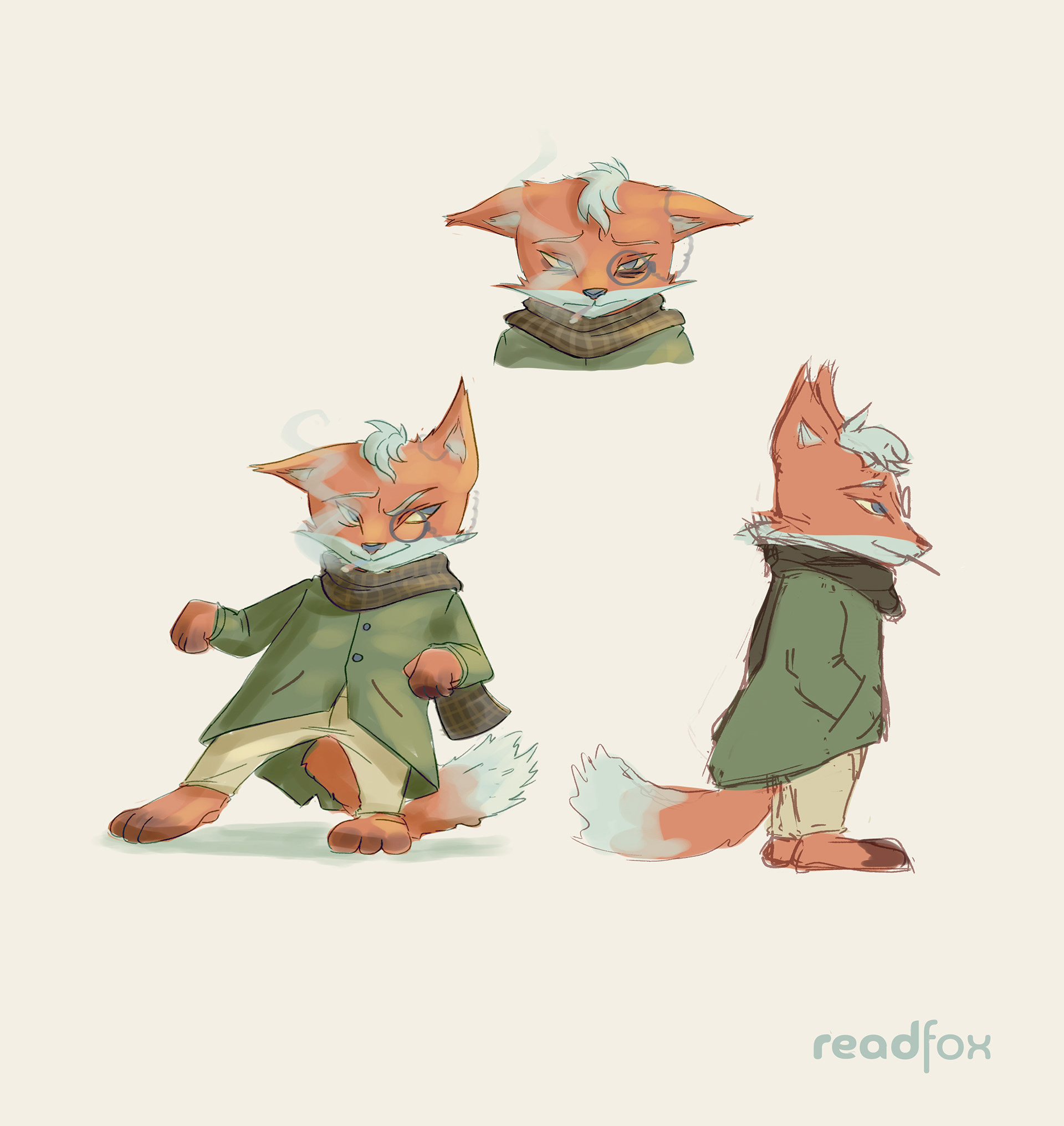
Current Mascot Character Concept
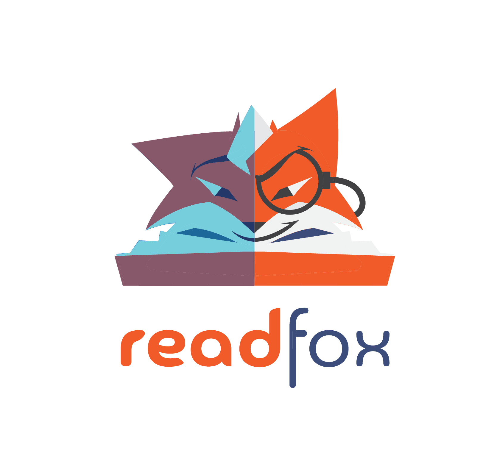
Current logo mark. Only to be used digitally. (Wordmark can be used separately)

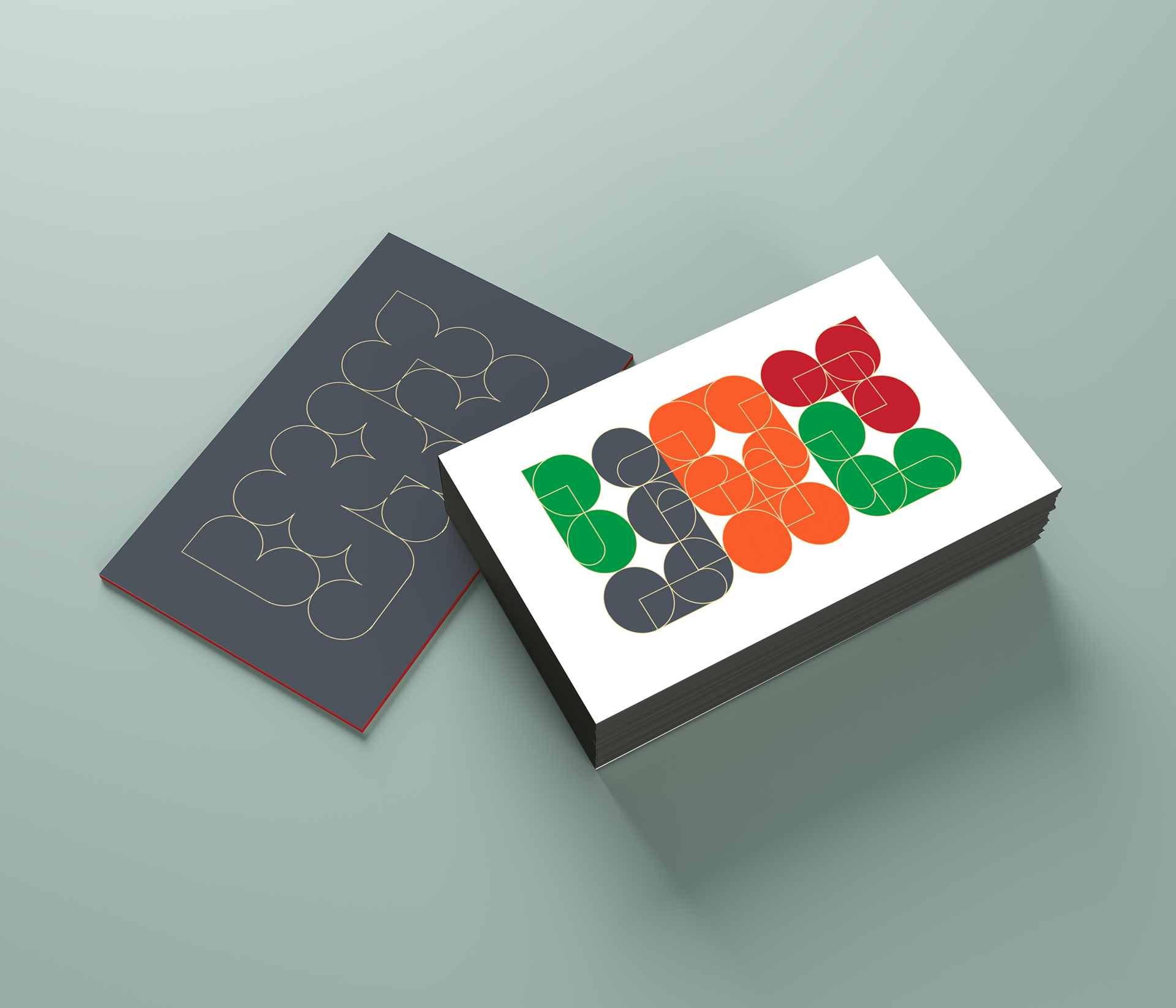
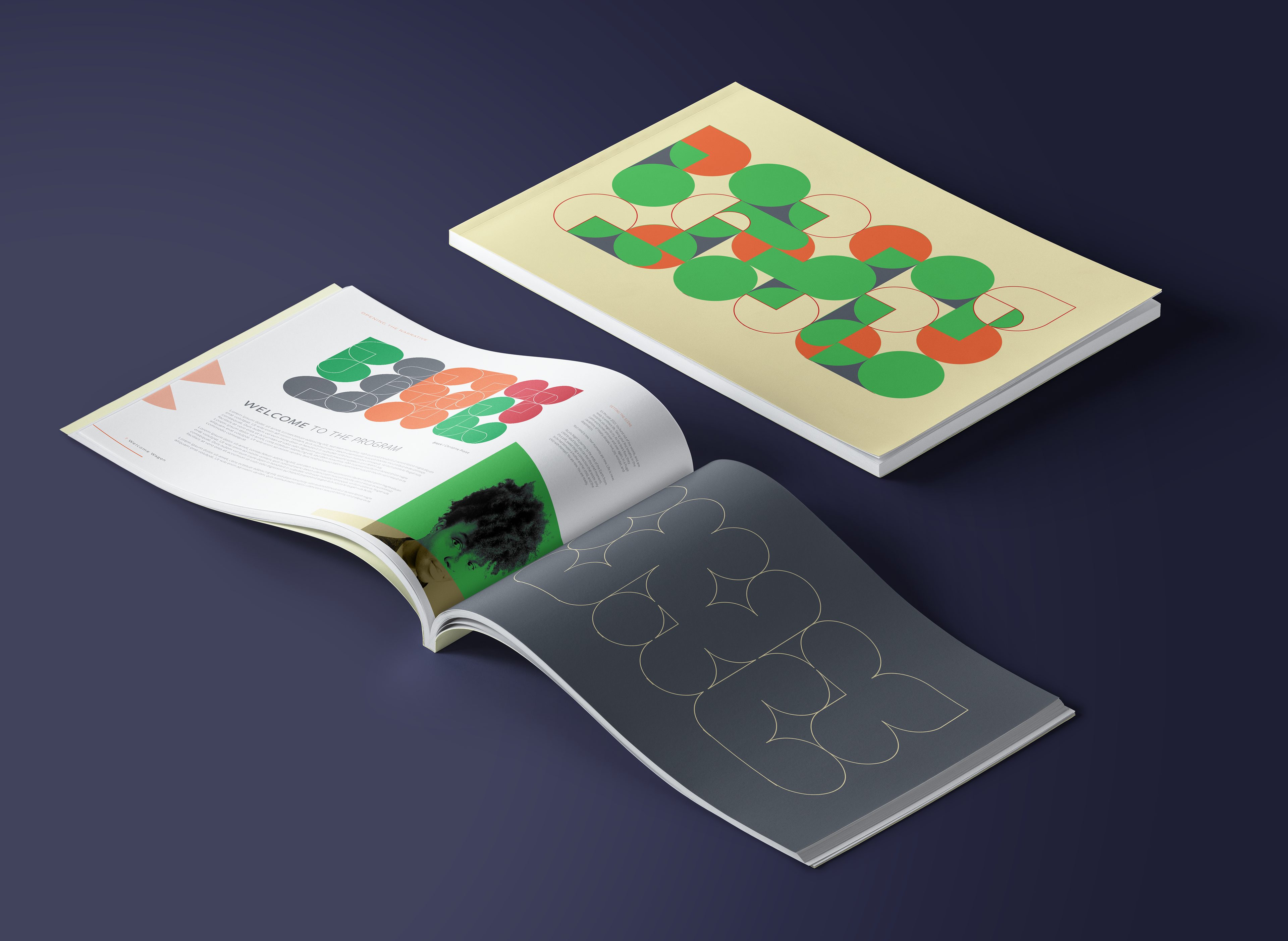
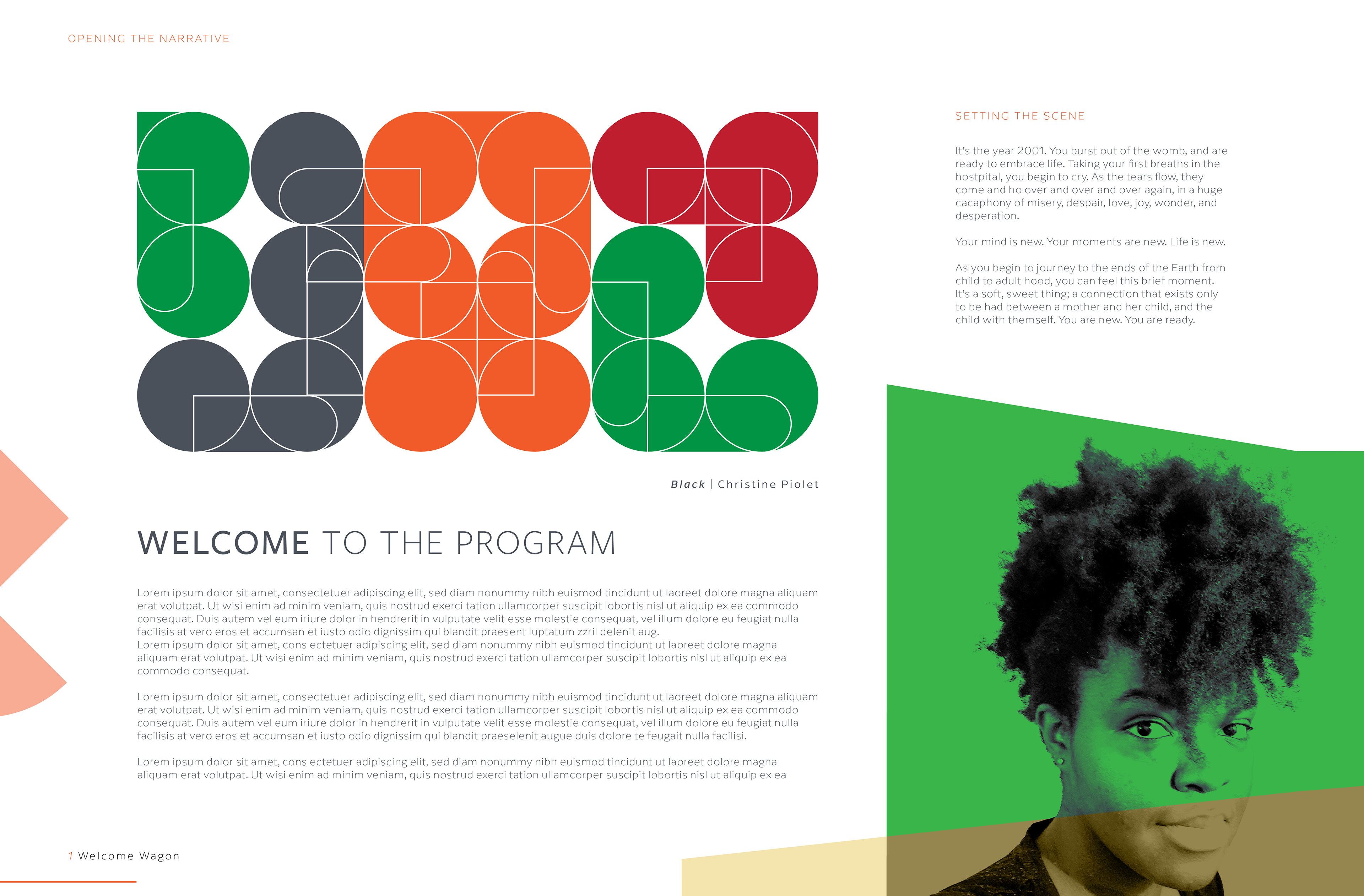
Shape Exploration
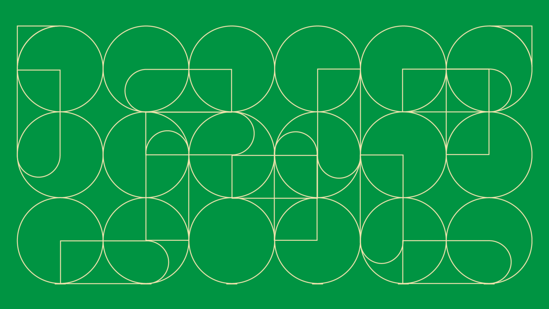
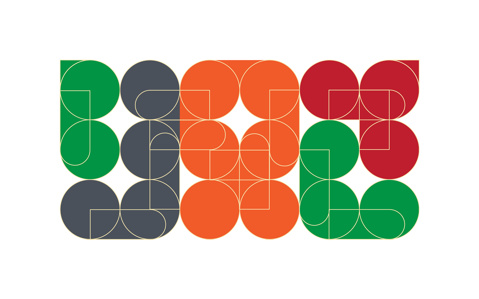
This little project was done to practice making things on a grid layout...specifically, words and complex shapes. For this exercise, I combined rectangles and circles to make the word "Black". I really enjoyed this, and was even able to take the design and use it as a part of some sort of book layout format. I'll be continuing to explore this style of designing, as there's bound to be some very interesting shapes I can make with this method.
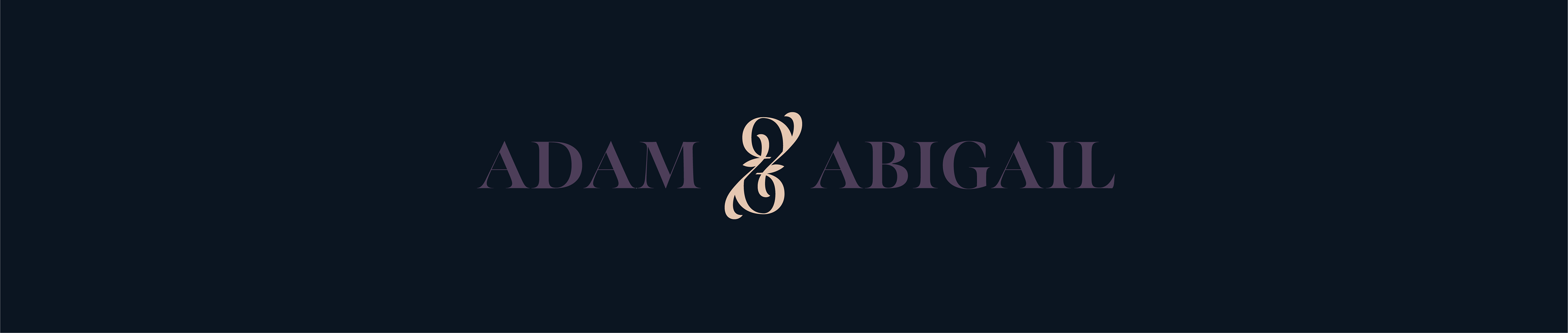
Adam & Abigail

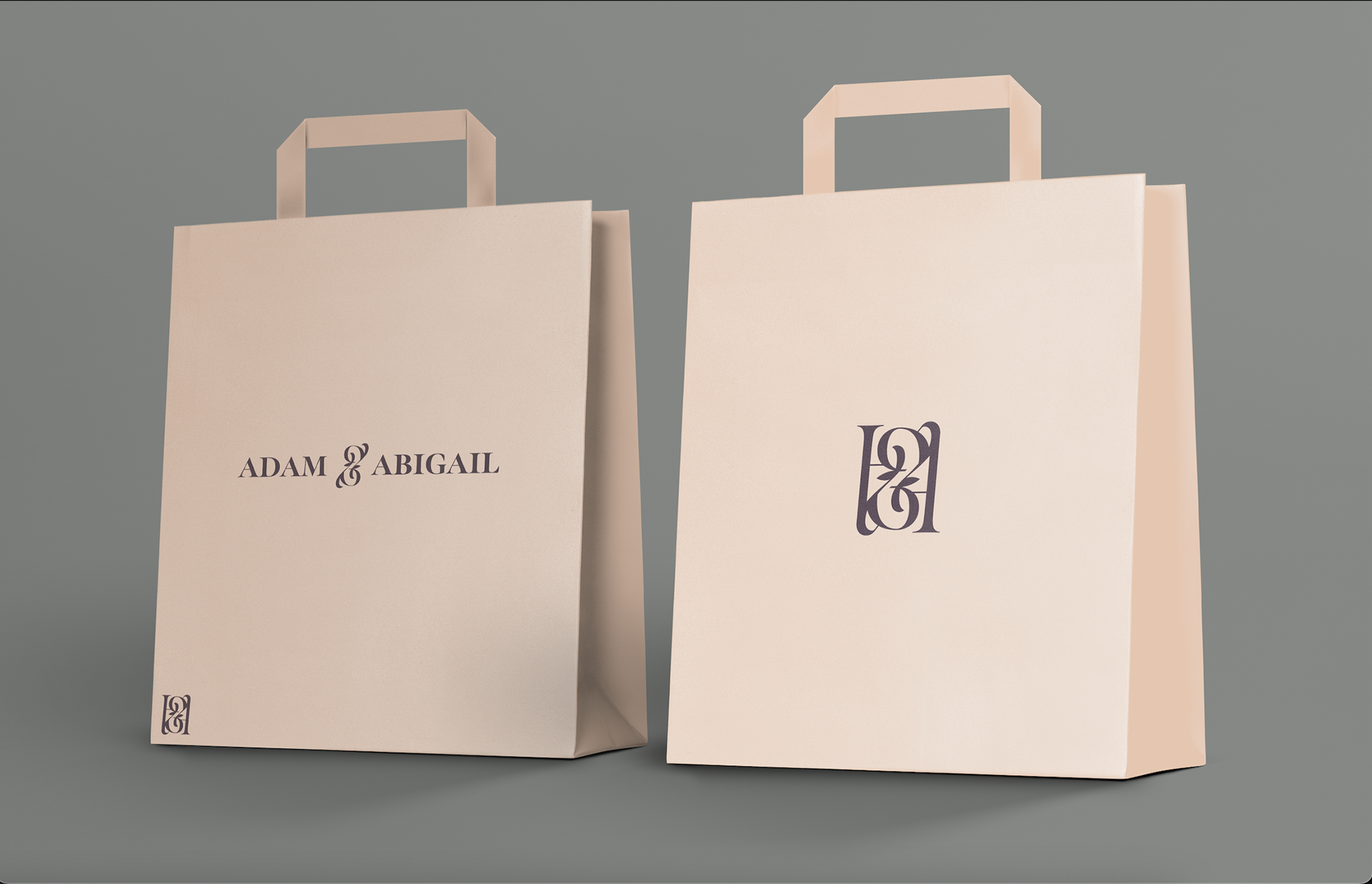
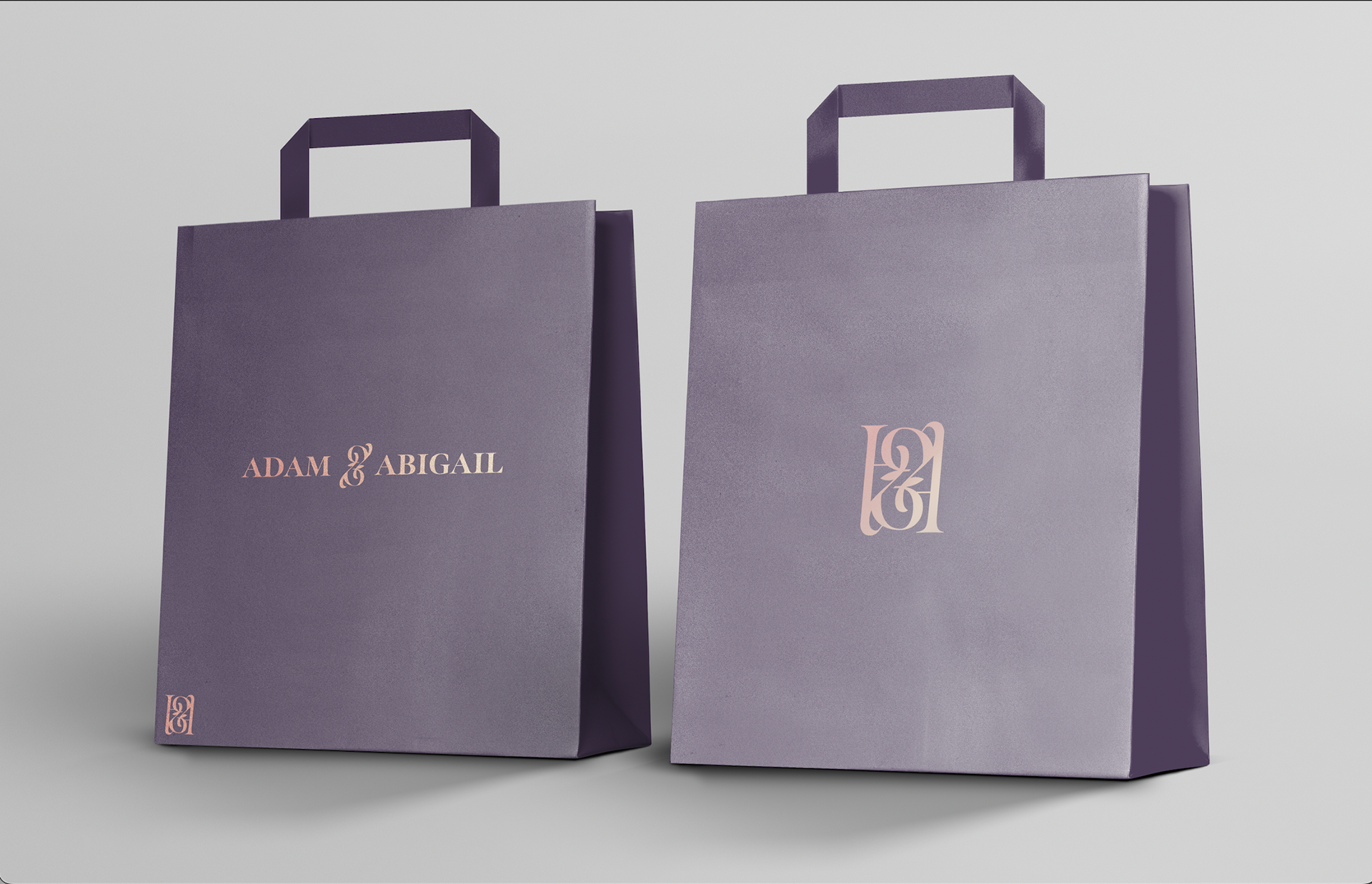
This logo was made after receiving a prompt asking for one for a high end clothing brand called Adam & Abigail. I wanted the design and the branding to reflect elegance.
This design for the logo focused on trends seen when I was researching. Many high end brands tend to use serif fonts, with high contrast and all caps letters. So, that was the route I took. I found a font with a nice shape, and then proceeded to exaggerate the contrast, making parts hairline thin and increasing the stroke in other places.
However, I felt that simply having the word wasn't enough. So, I decided to try giving it more flare, by redesigning the ampersand into its own logo/symbol. I took the existing one from the typeface, and layered it on top of itself in multiple ways until I found an outline I liked. I then edited it until It came to look like the symbol in between "Adam" and "Abigail" in the final logo design.
The "A&A" logo was born from that further exploration and need for a more condensed design; since I felt the original design was very wide and wouldn't be able to translate to all mediums.

Away
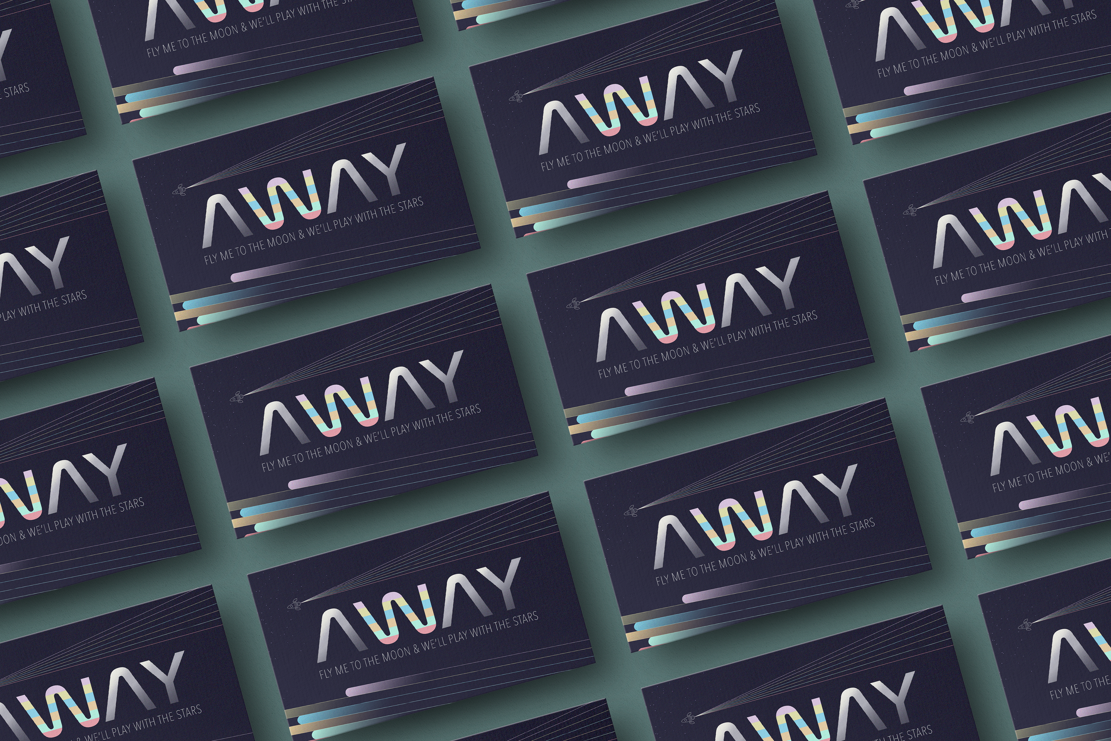
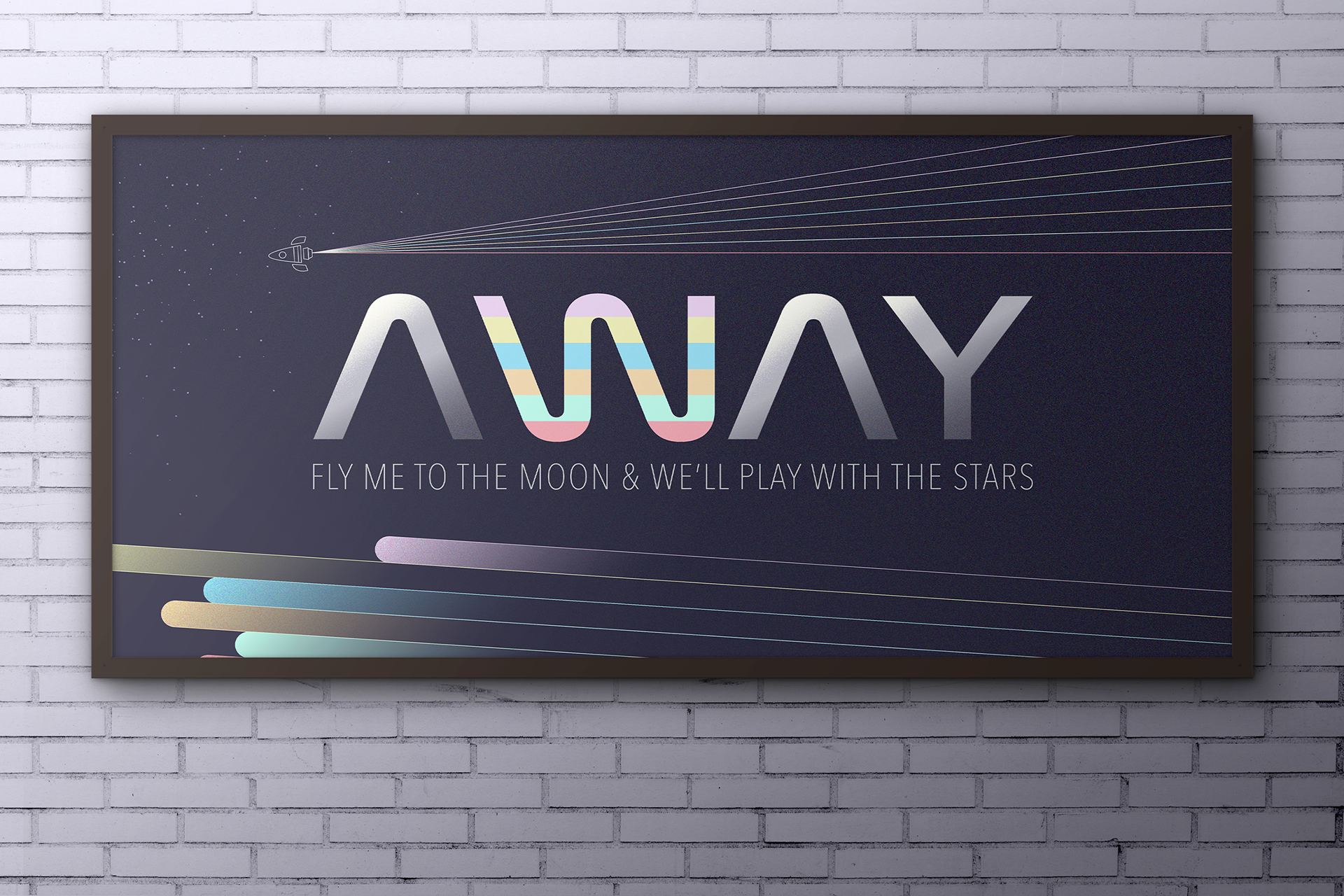
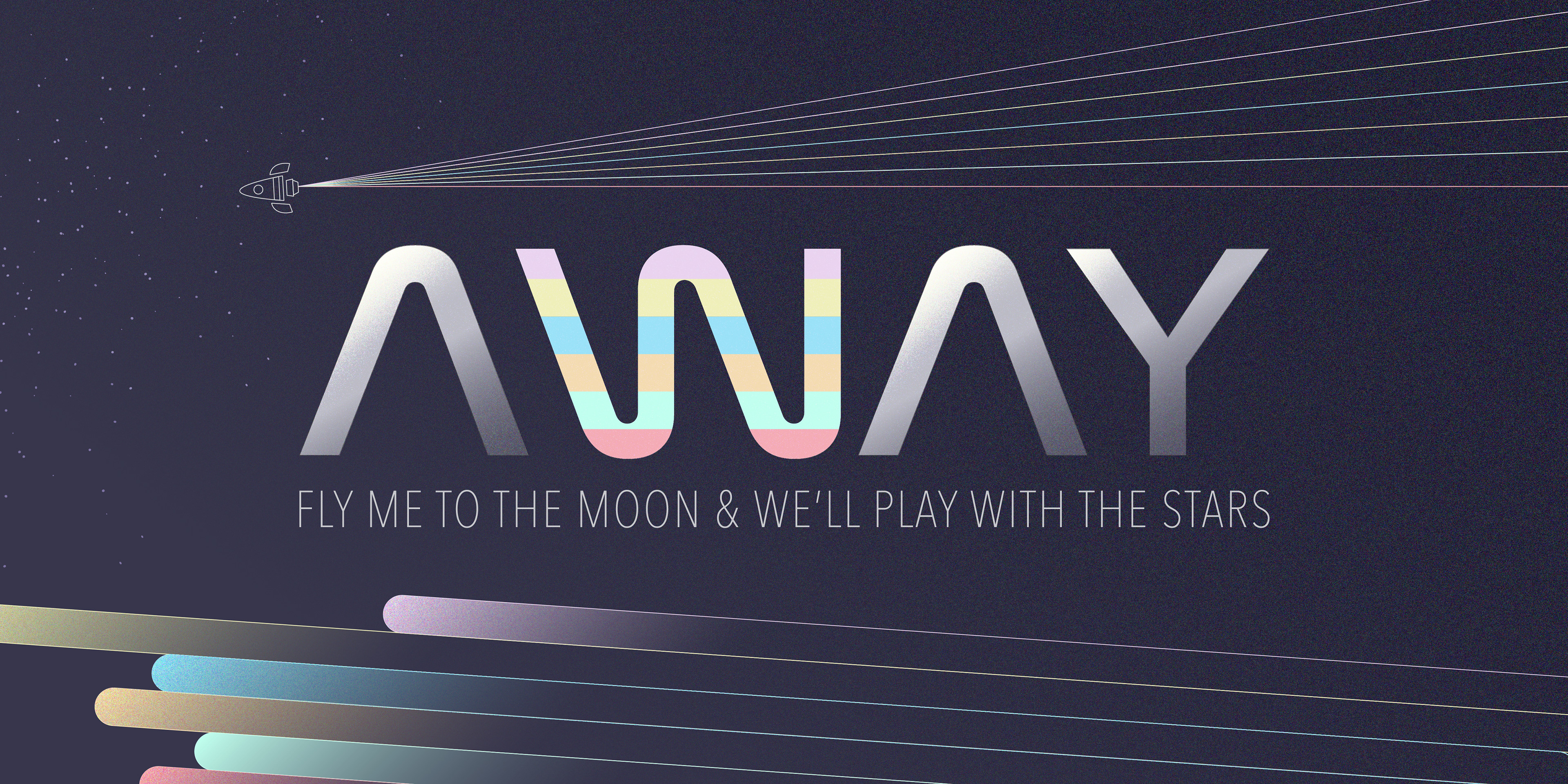
AWAY was a design I created after opening up Illustrator and finding a typeface that I downloaded a long time ago, but never actually used. Upon viewing the shape and form of it, my initial thought was that it reminded me of the typeface and feel of NASA branding. So, I decided to play off of that motif.
Taking NASA to mind, and the first word that popped in my head after coming to this realization (AWAY), I created this poster that serves as an introduction to space related content. The mood I went for was to be muted, retro and nostalgic. This was achieved with the desaturated color palette, and the grainy static overlay texture I applied.
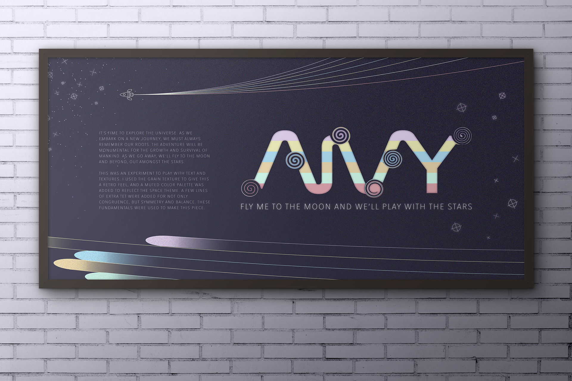
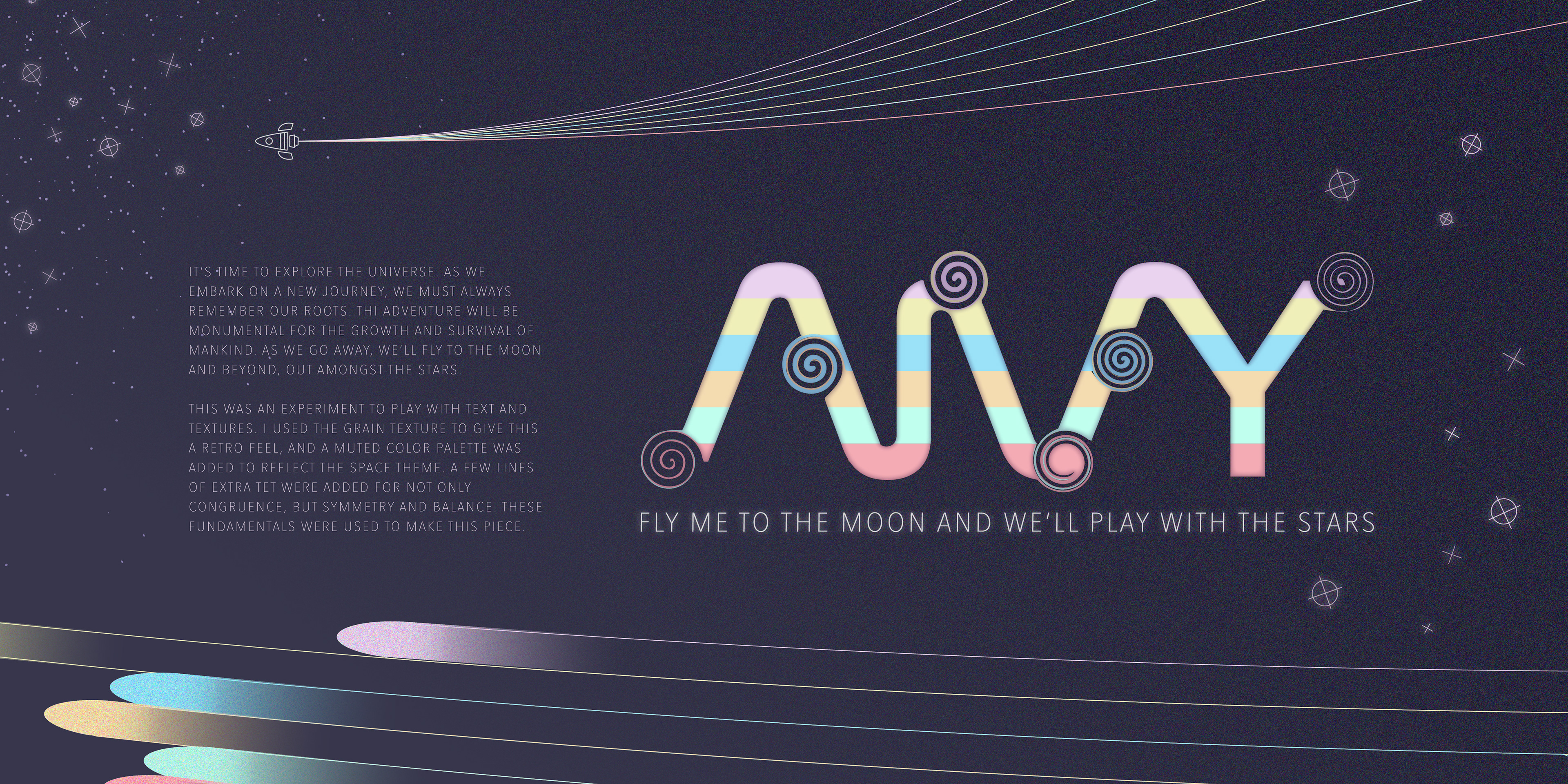
After making the initial poster with the word AWAY and the phrase below it, I decided to make the second design, further increasing the motion of the composition by adding curves to the lines that made the rocket streaks. I also began playing with how the letters could intersect and converge into one unified form. Once I was satisfied with this, I added some star designs, and a mini blurb about the 'content' of the image.
After making all of this, I feel that the design can be expanded into a branding project for a sort of space exploration website or book. Something that serves as a fun, interactive, animated intro into space content, space travel, and the science behind it all.
"I am genuinely excited to make more projects like these, and to eventually be able to expand a few of these ideas into larger things. Work like this truly makes me fall in love with designing over and over again."
-C.P.