Timeline:
About 3 weeks
Tools Used:
Photoshop, Illustrator
Skills & Practices:
Illustration, Email Layout, Motion Design
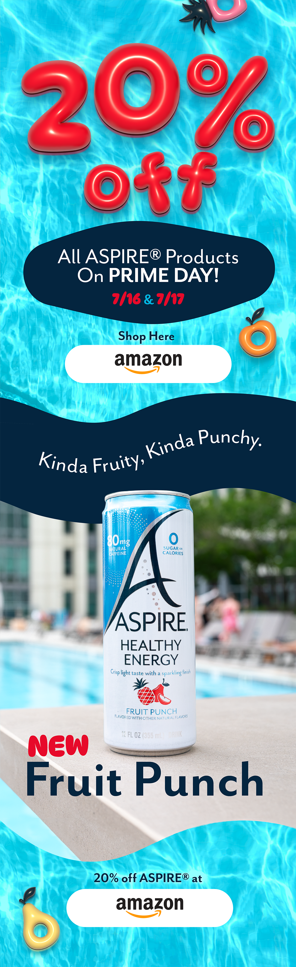
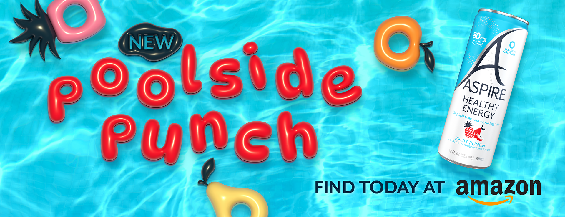
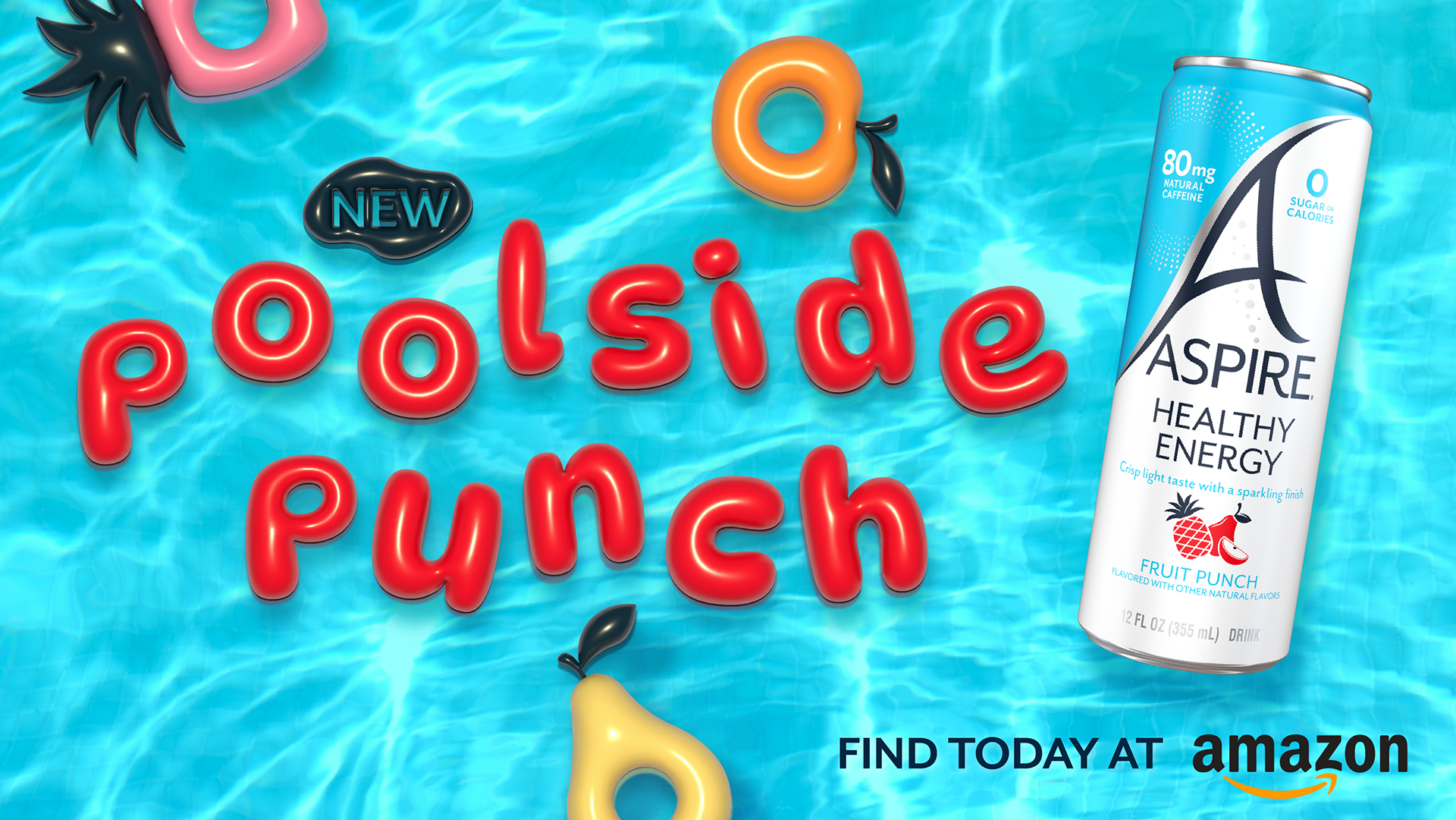
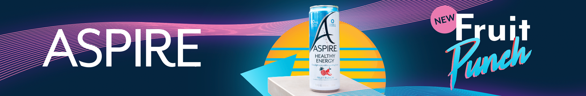
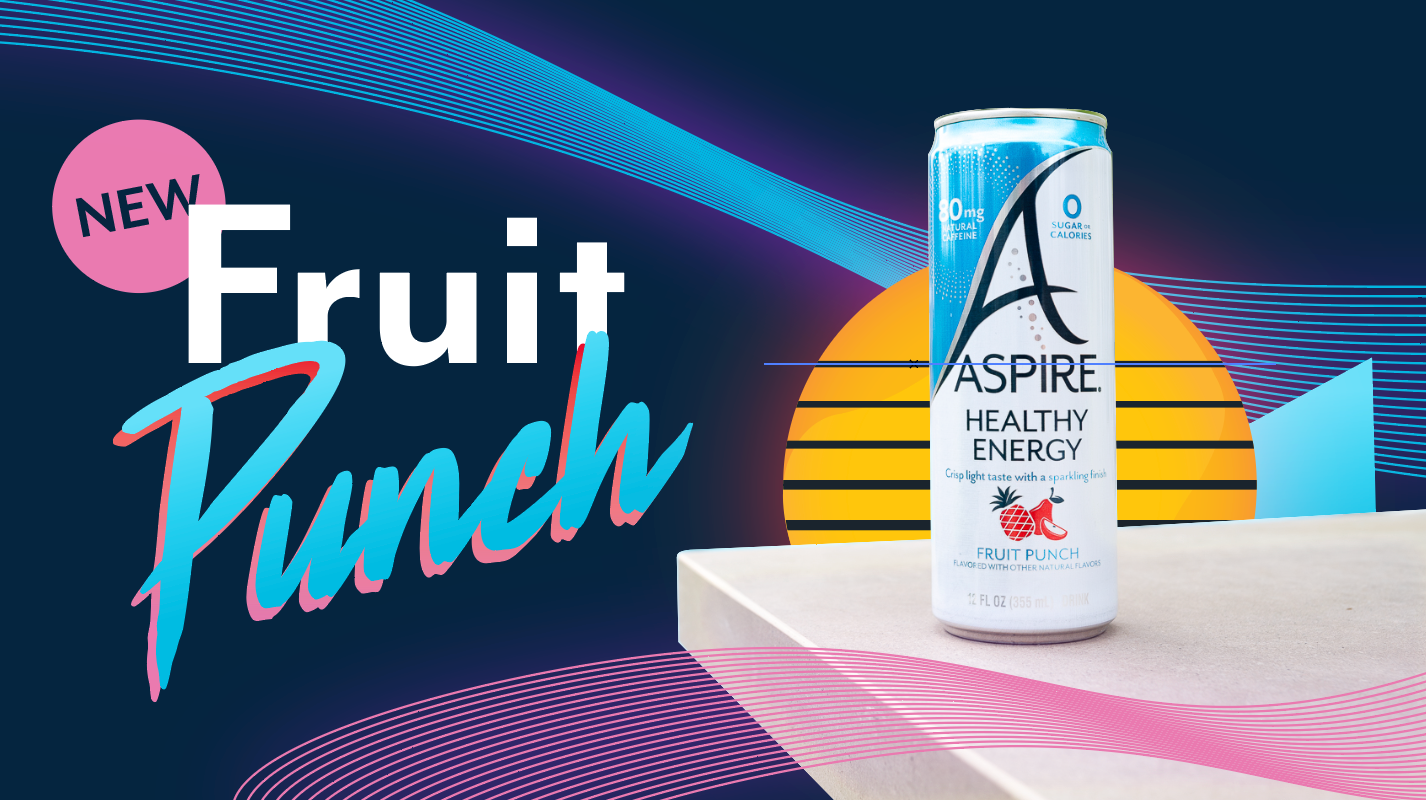
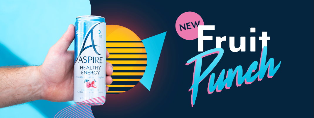
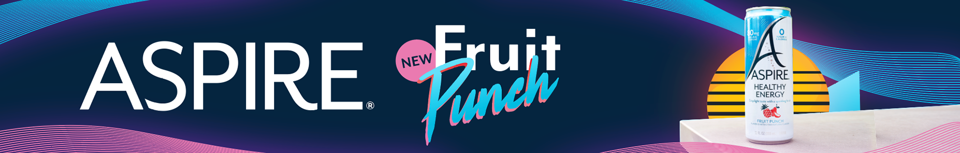
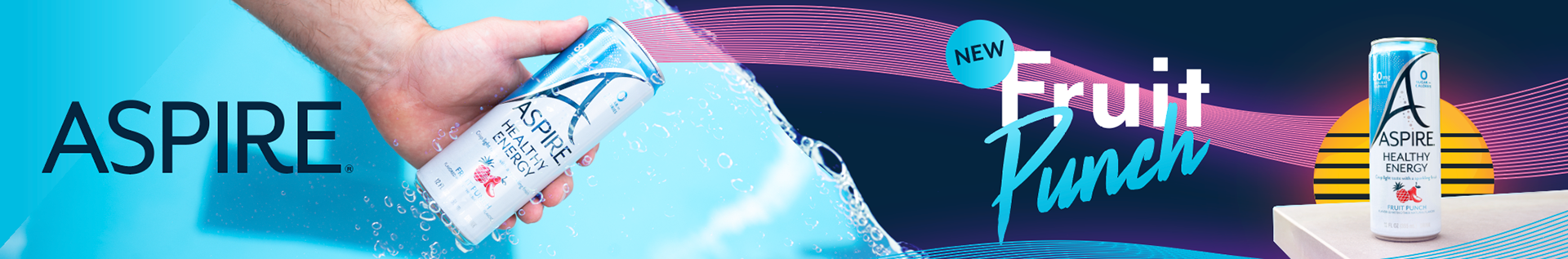
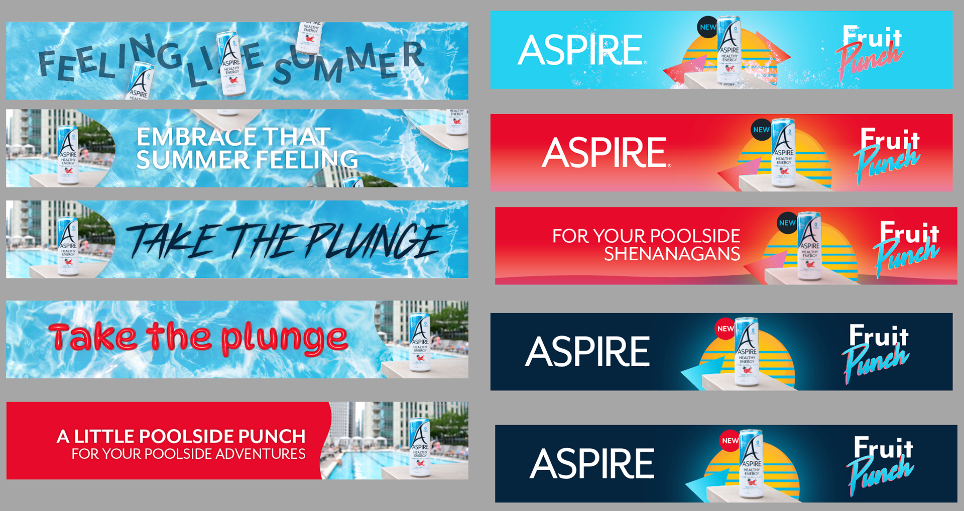
In early March, ASPIRE decided to relaunch their fruit punch flavor, and with that, we decided to make a promotional box and digital banners to let customers know. With the flavor of the product being one of the sweetest in the brands line-up and it being a summertime launch, the team decided to focus on the sweeter parts of life for the visuals. In this case, we went for a playful take on retro 80's Miami Vice stylization, merged with some modern summery elements.
This ultimately launched on Amazon Prime day, as a fully digital promotion.
Style 3
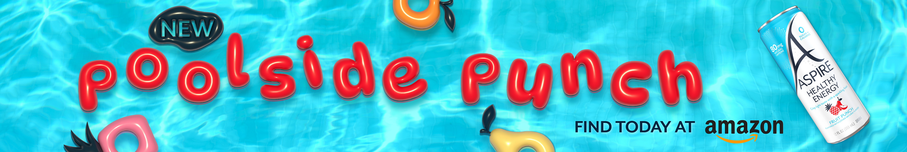
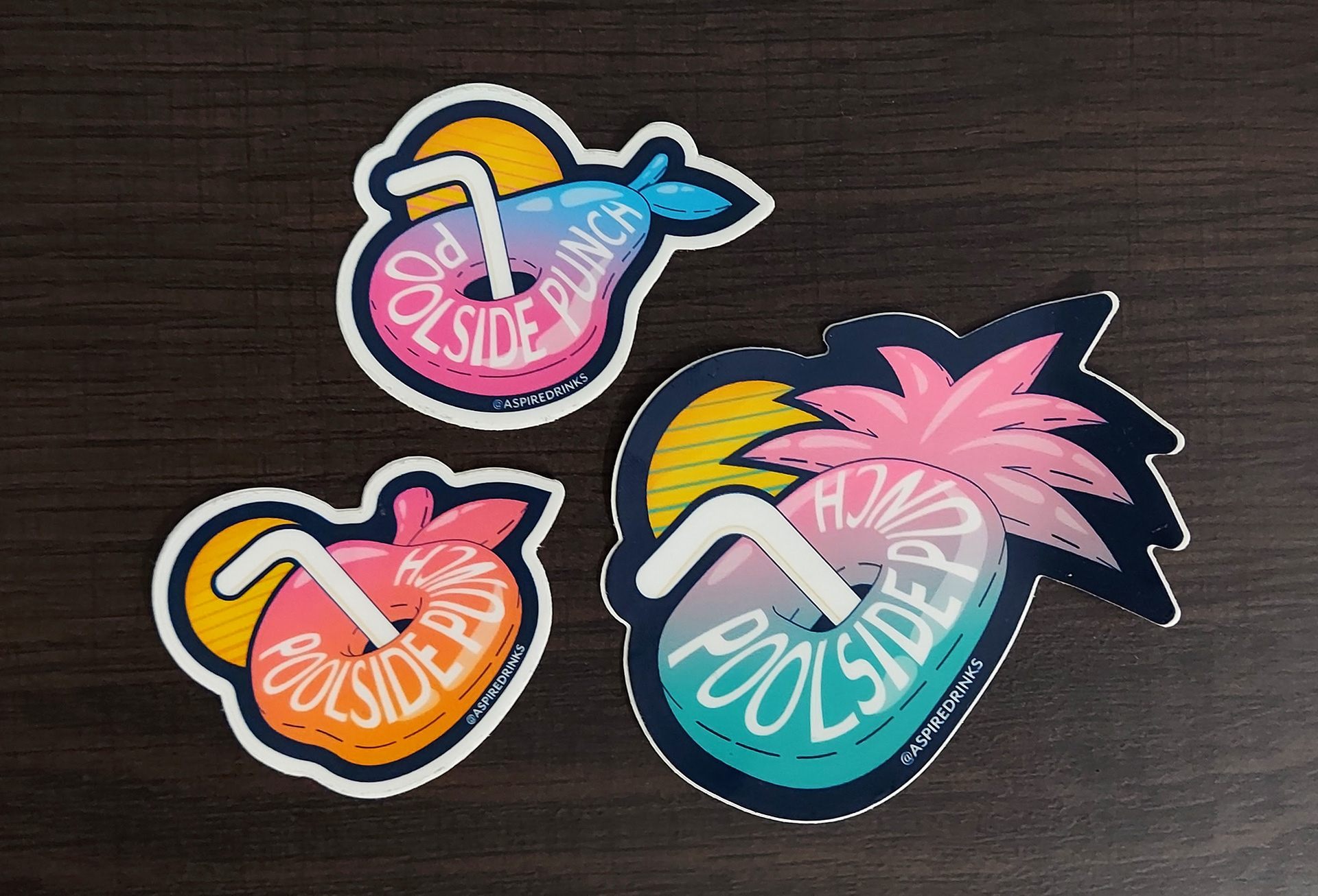
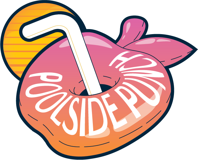
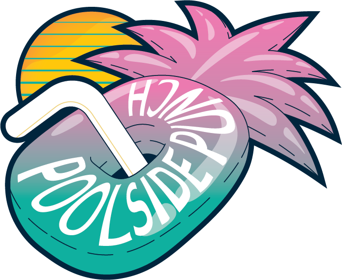
Final Visual Elements
This was the finalized direction for this project. We combined a vaporware aesthetic with some summery, fun graphics to bring out the vibe of the potential situations the drink is consumed in.
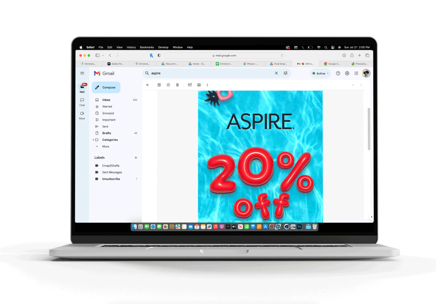
Email
Banners
Stickers

Draft Work
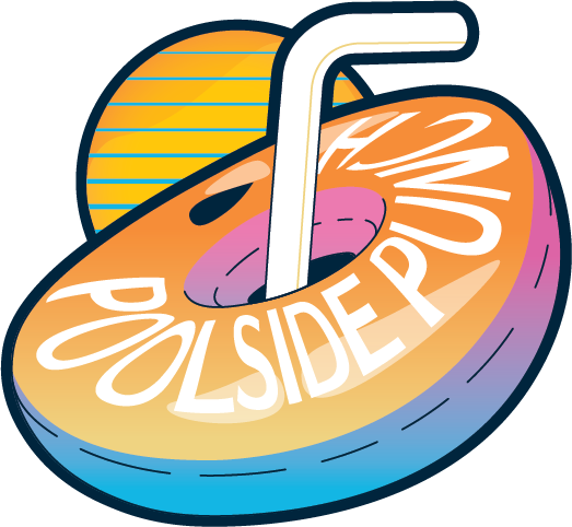
Direction 2
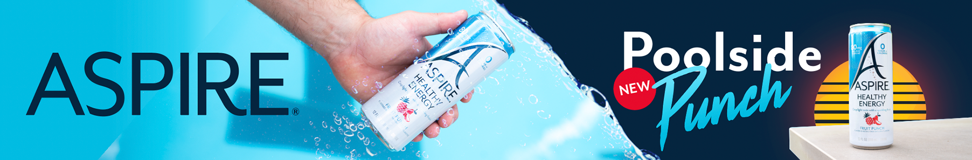
This was the semi-final banner direction, which was scraped in favor of a more dynamic, unique direction with pool floats and more water. This exploration, while capturing an 80's vibe, was ultimately dark, and too toned down.
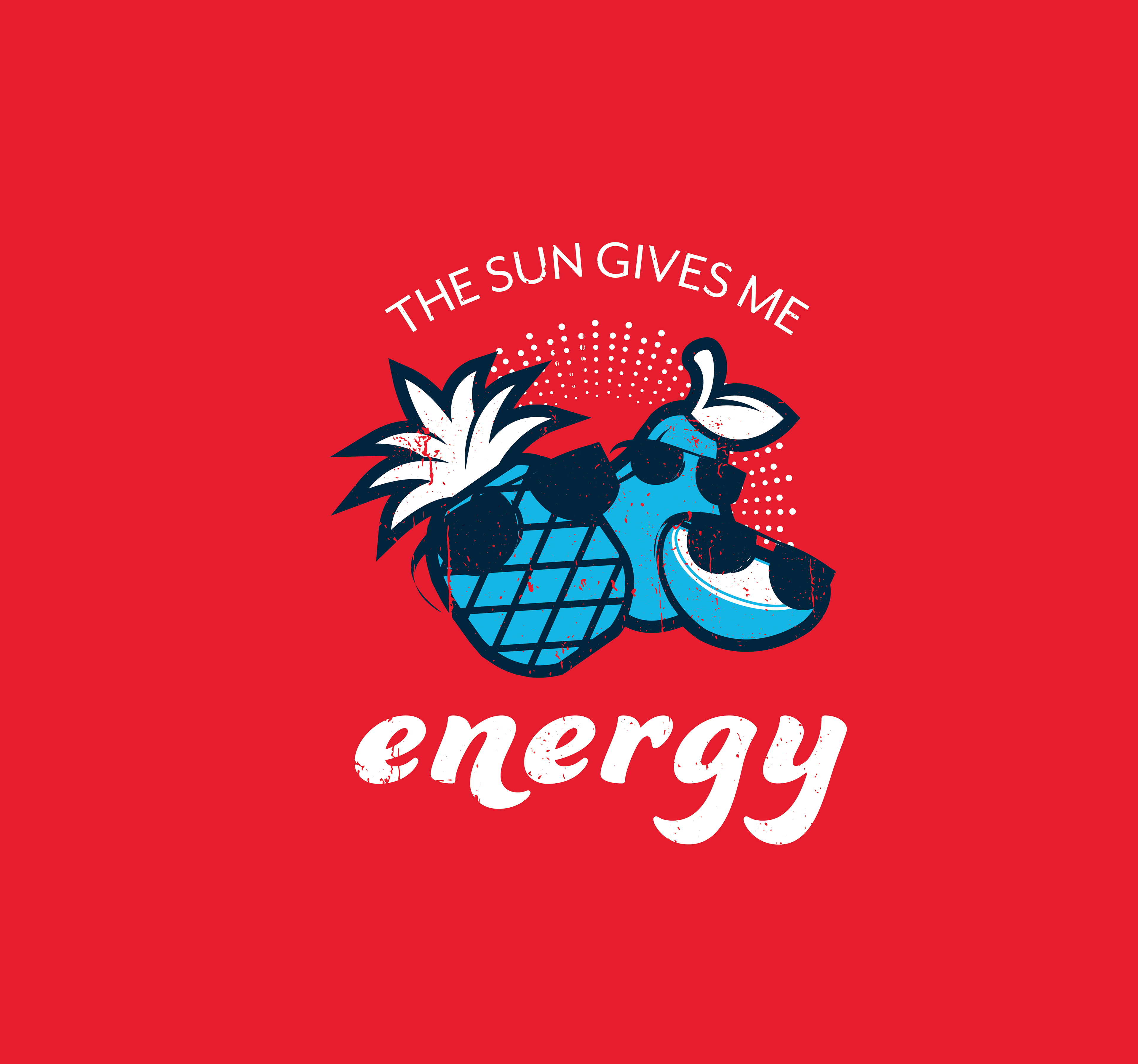
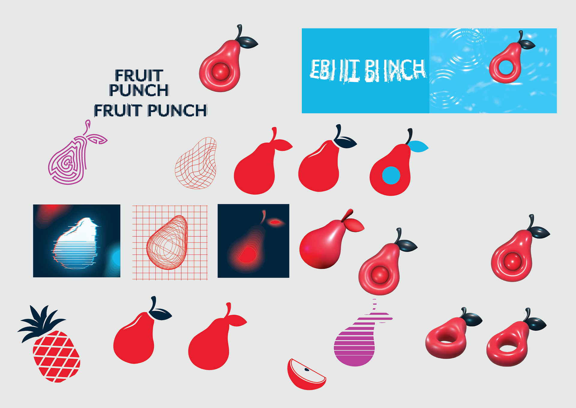
Direction 1.5
These are some sticker and icon manipulation sketches I did slightly before and mostly after I defined the look of Direction 1, transitioning into the final look shown above. These explorations took a lot of the 80's motifs and more modern aesthetics and mashed them together.
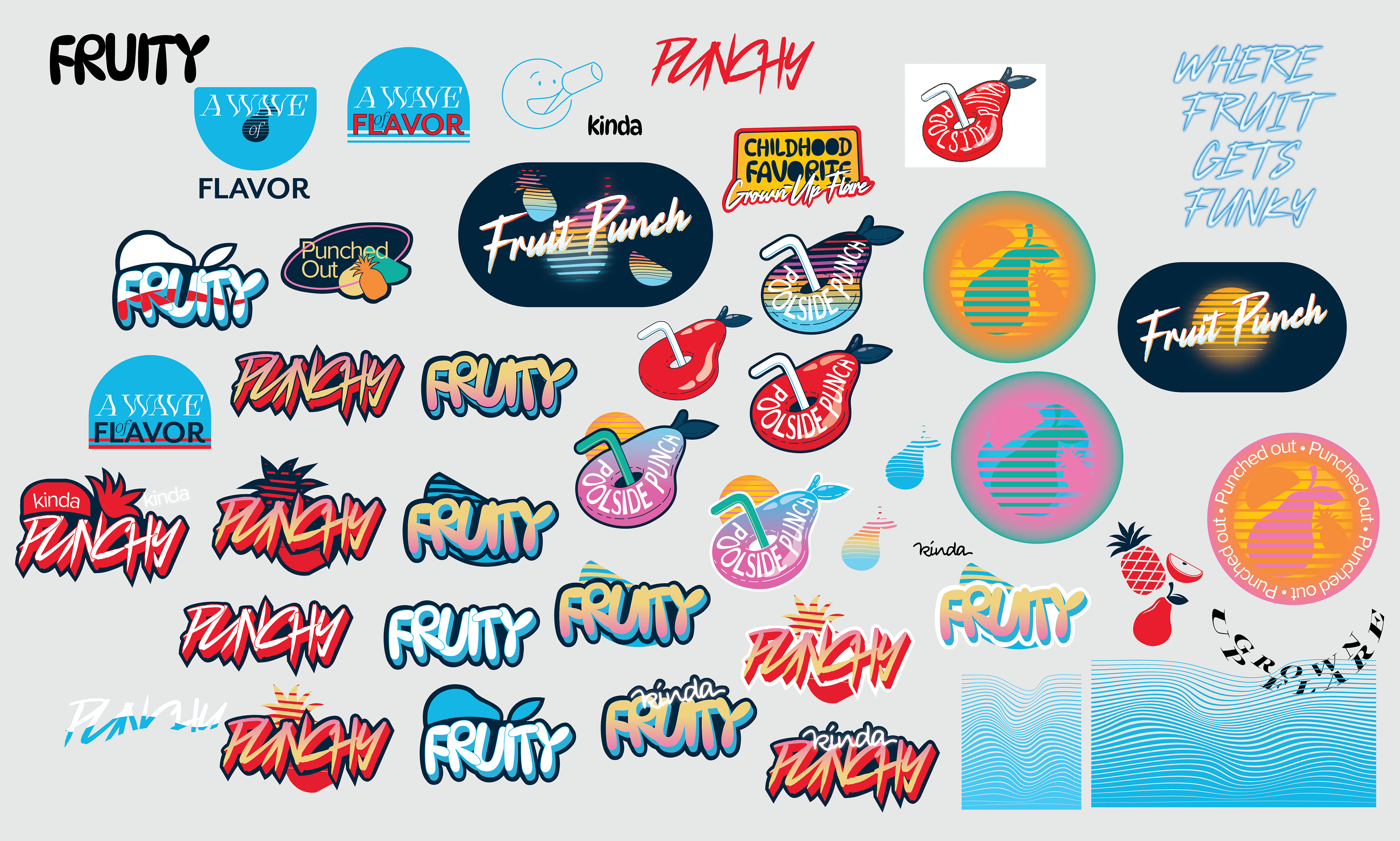
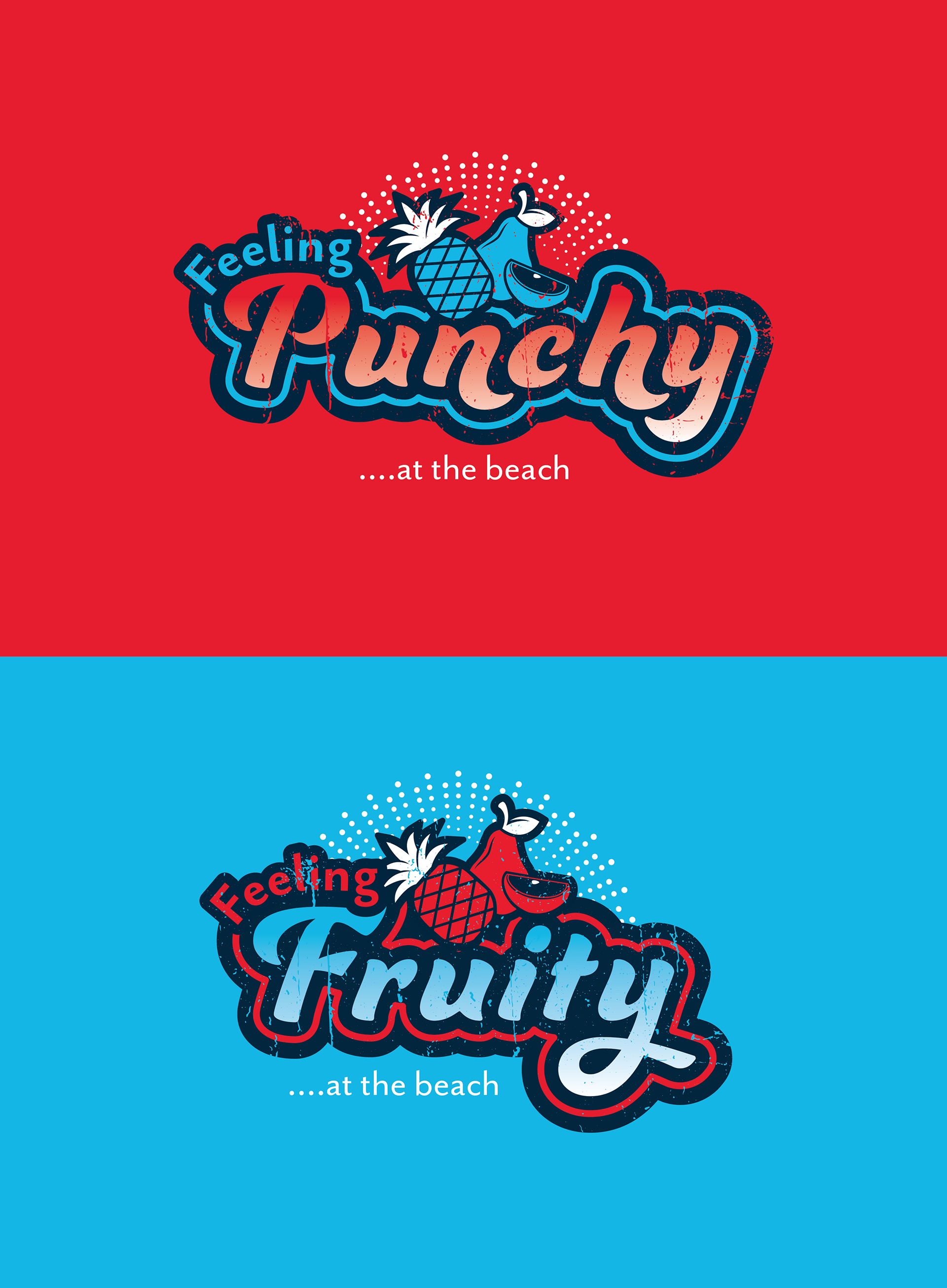
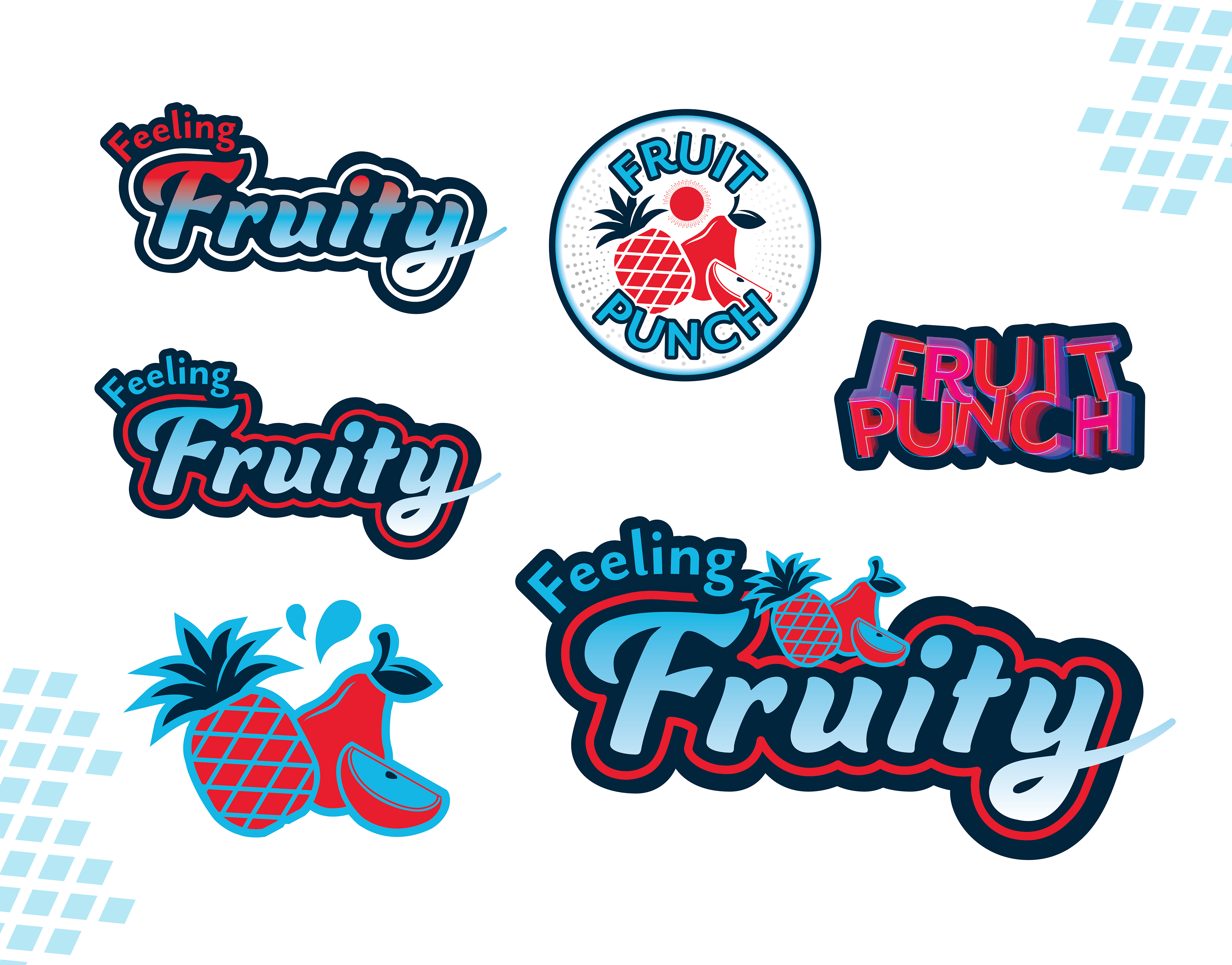
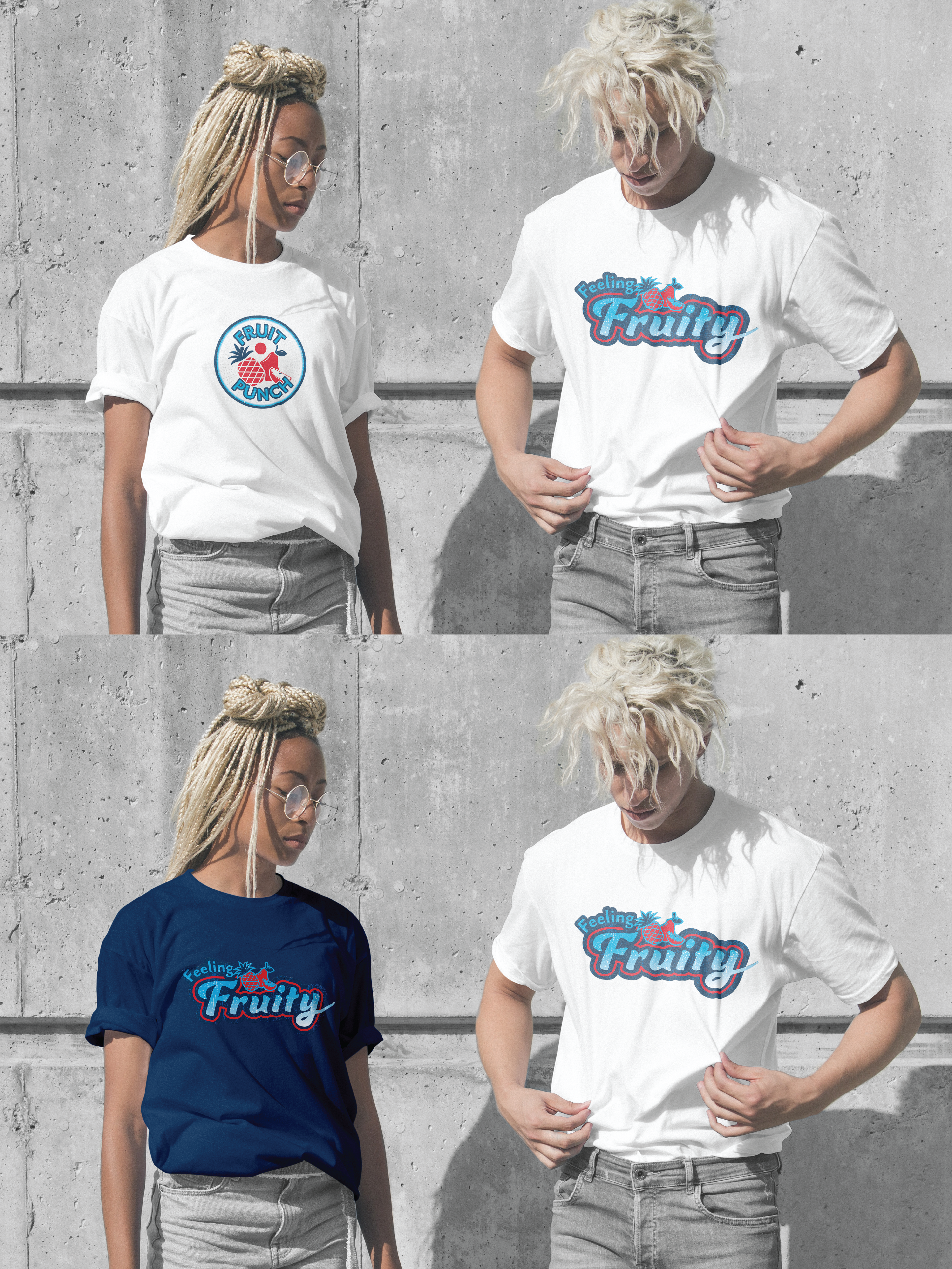
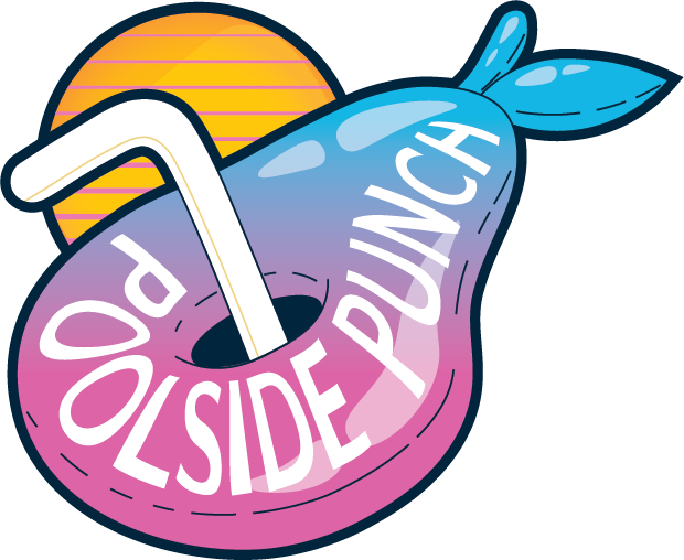
Direction 1
This was the original visual style, before the campaign was set in stone. Using mostly existing iconography from the ASPIRE library, this was going to be a more grunge, beach-y set of stickers, t-shirts, and quips, many centered around Fruit Punch puns. The puns made it into the final direction, but ultimately, we decided to use the icons and visuals in a more stylized way.