Timeline
Intern from June 2023 to October 2023
Tools Used
Photoshop, Illustrator, Figma, Powerpoint
Skills & Practices
Presentation Design, Branding, Illustration
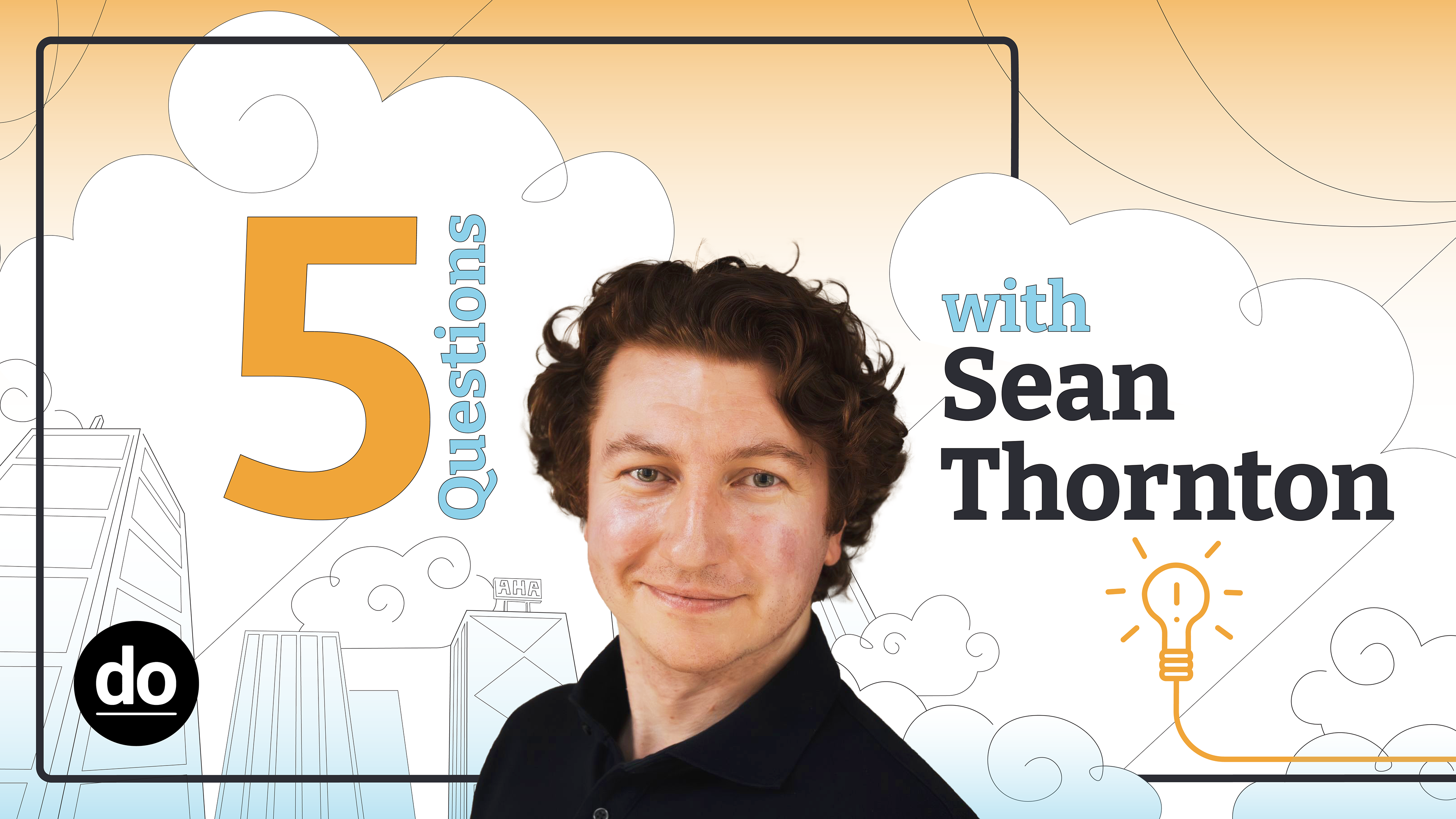
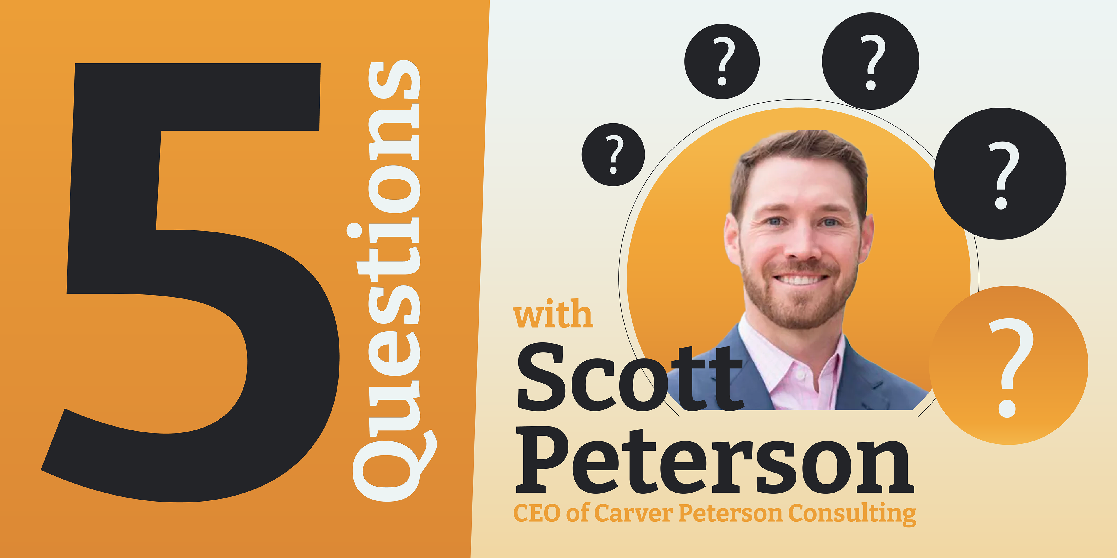
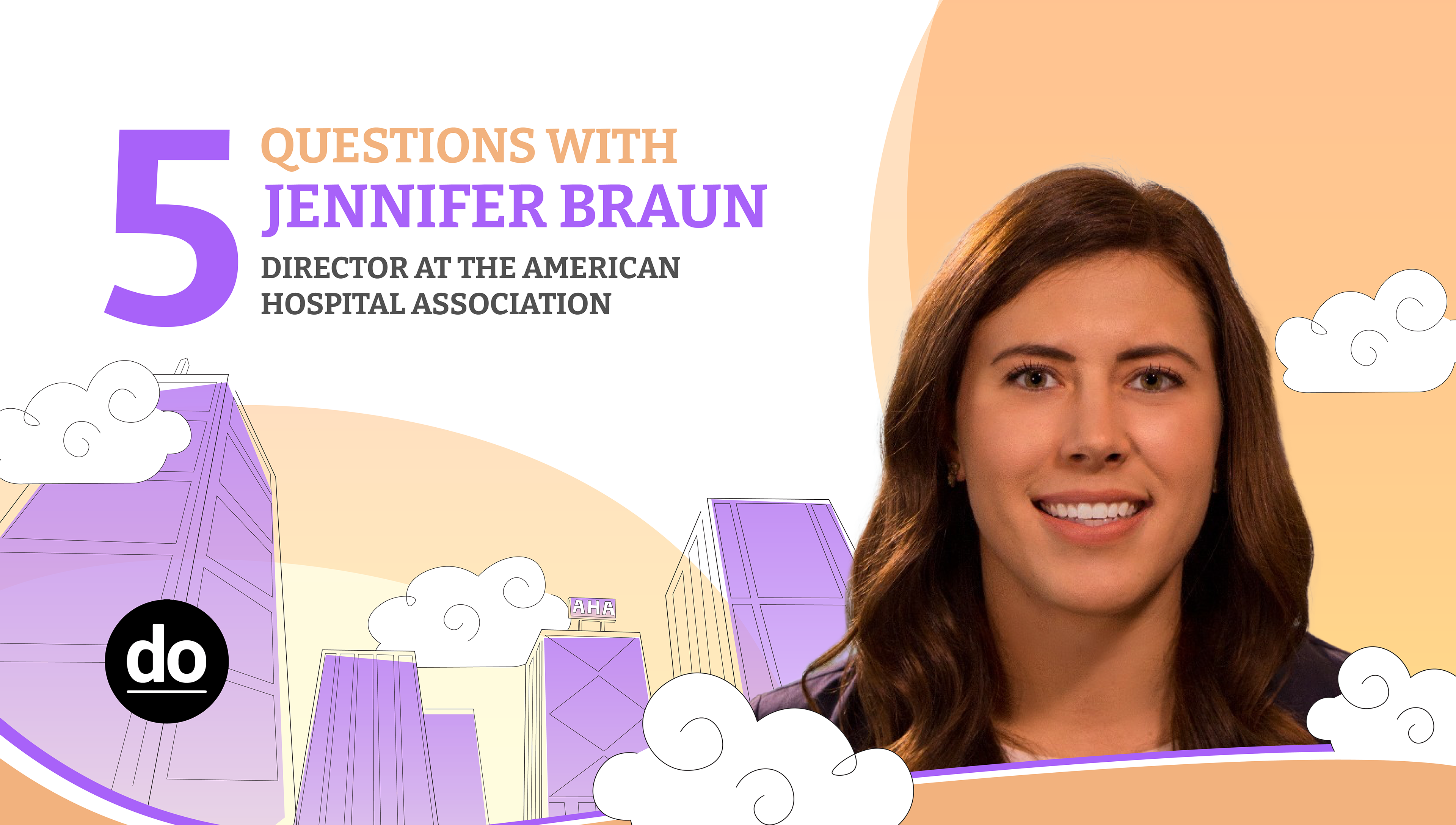
At DoTank, I worked as a visual design intern creating branding, illustration, and presentations for various clients. In this page I have a sampling of 3 different projects I did while there.
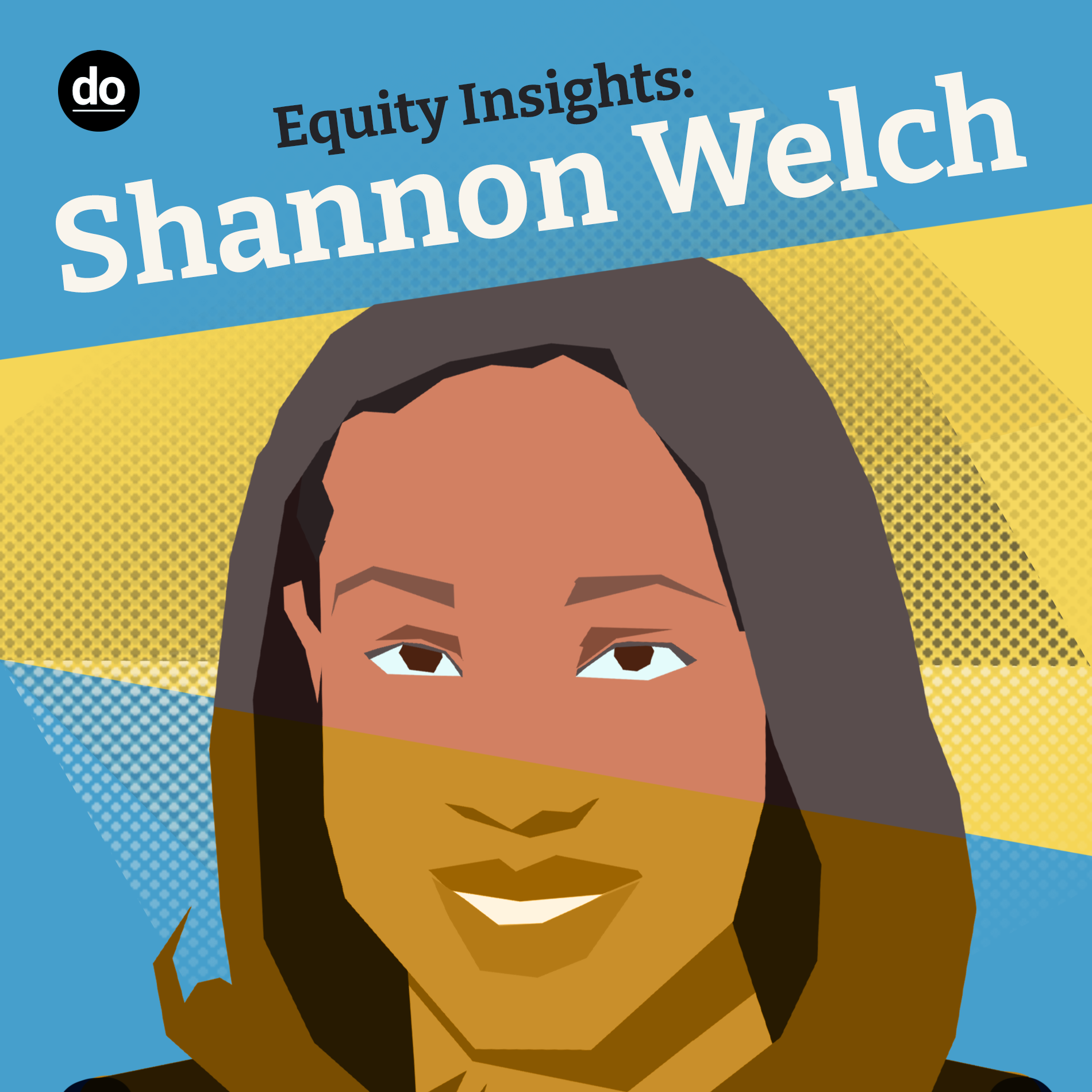
Equity Insights
Podcast Refresh
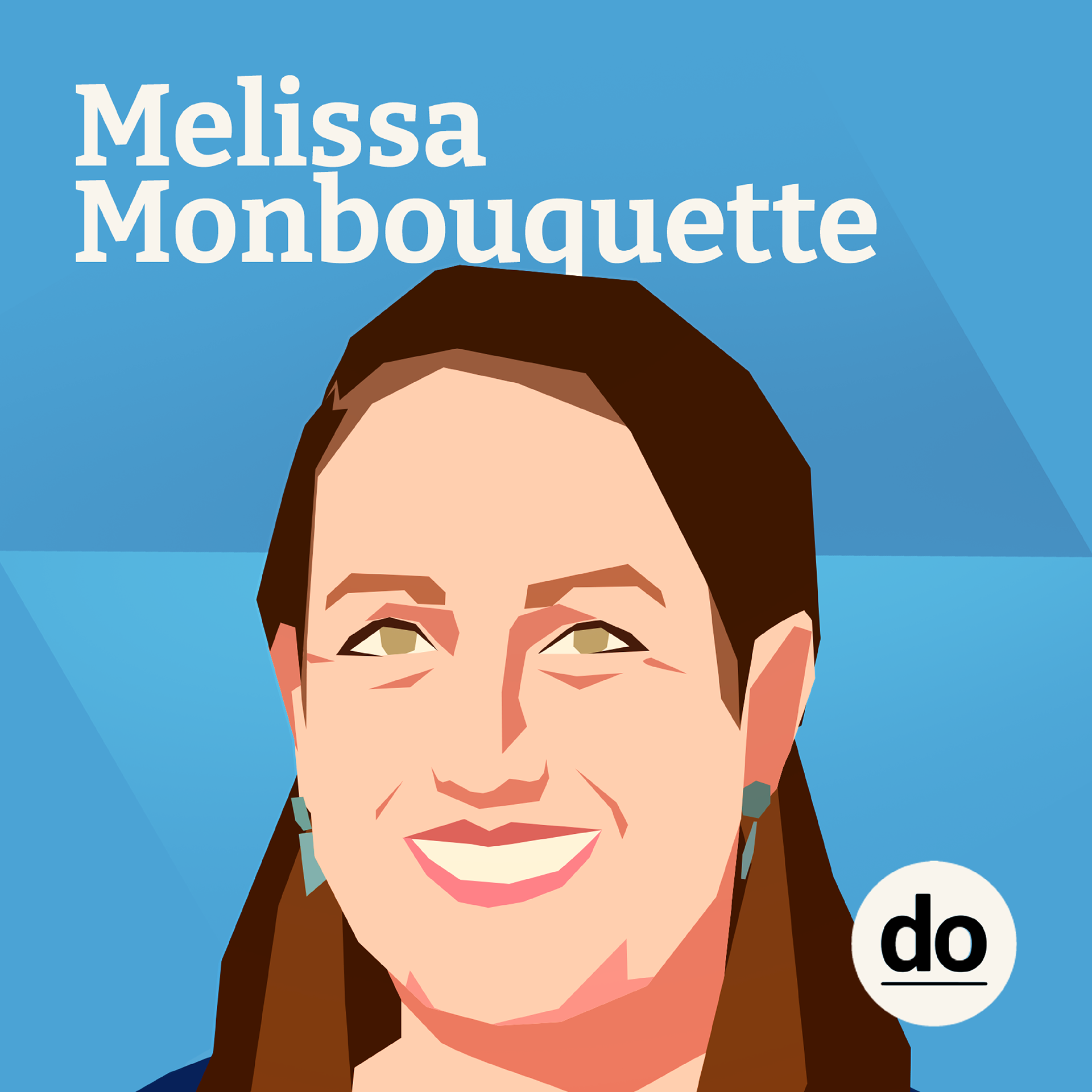
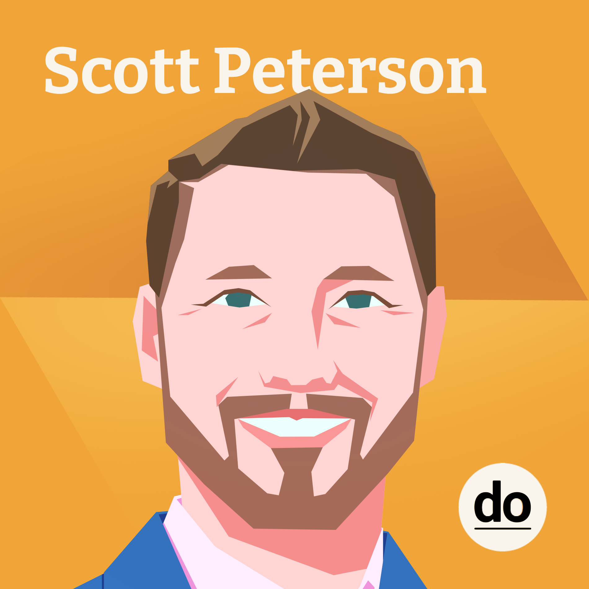
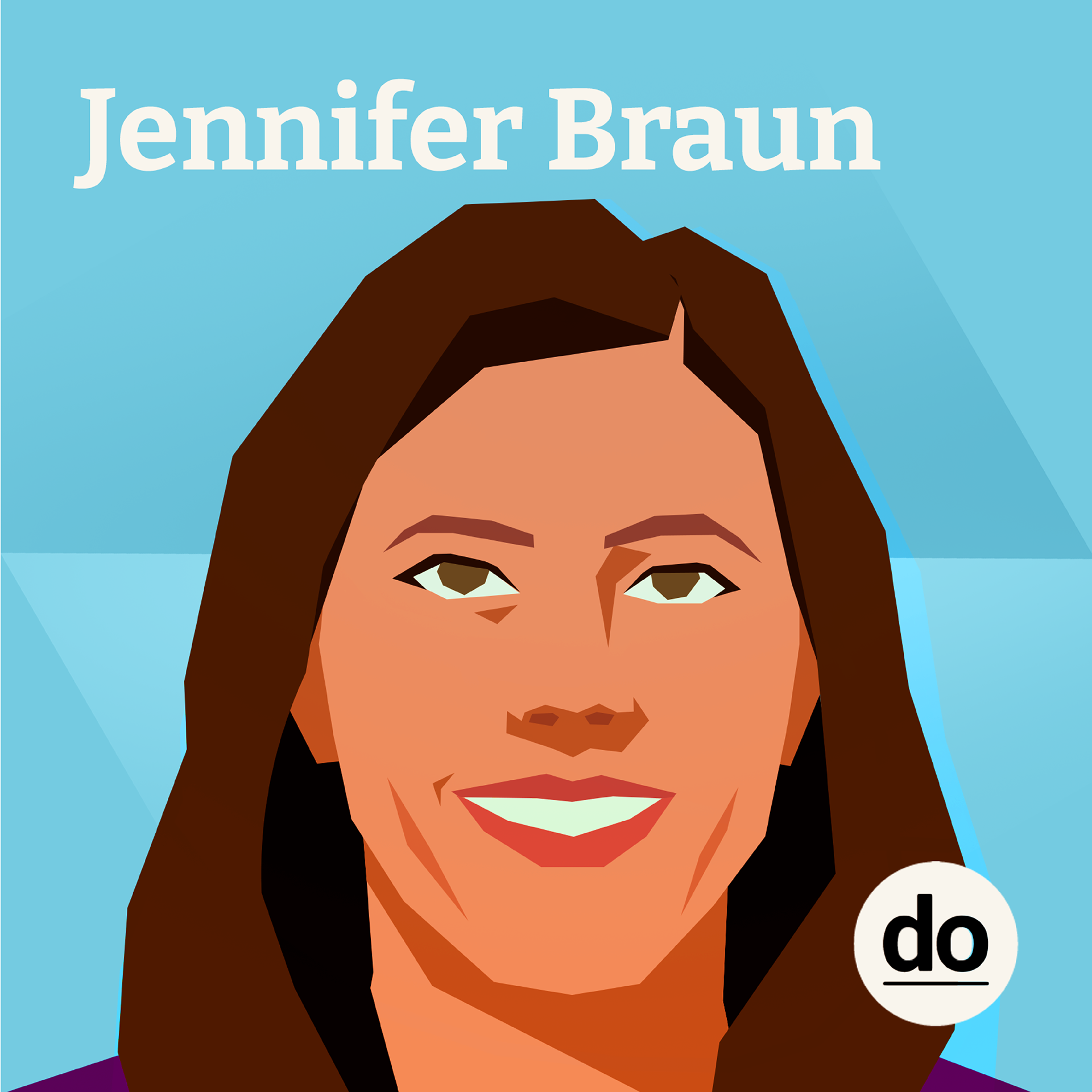
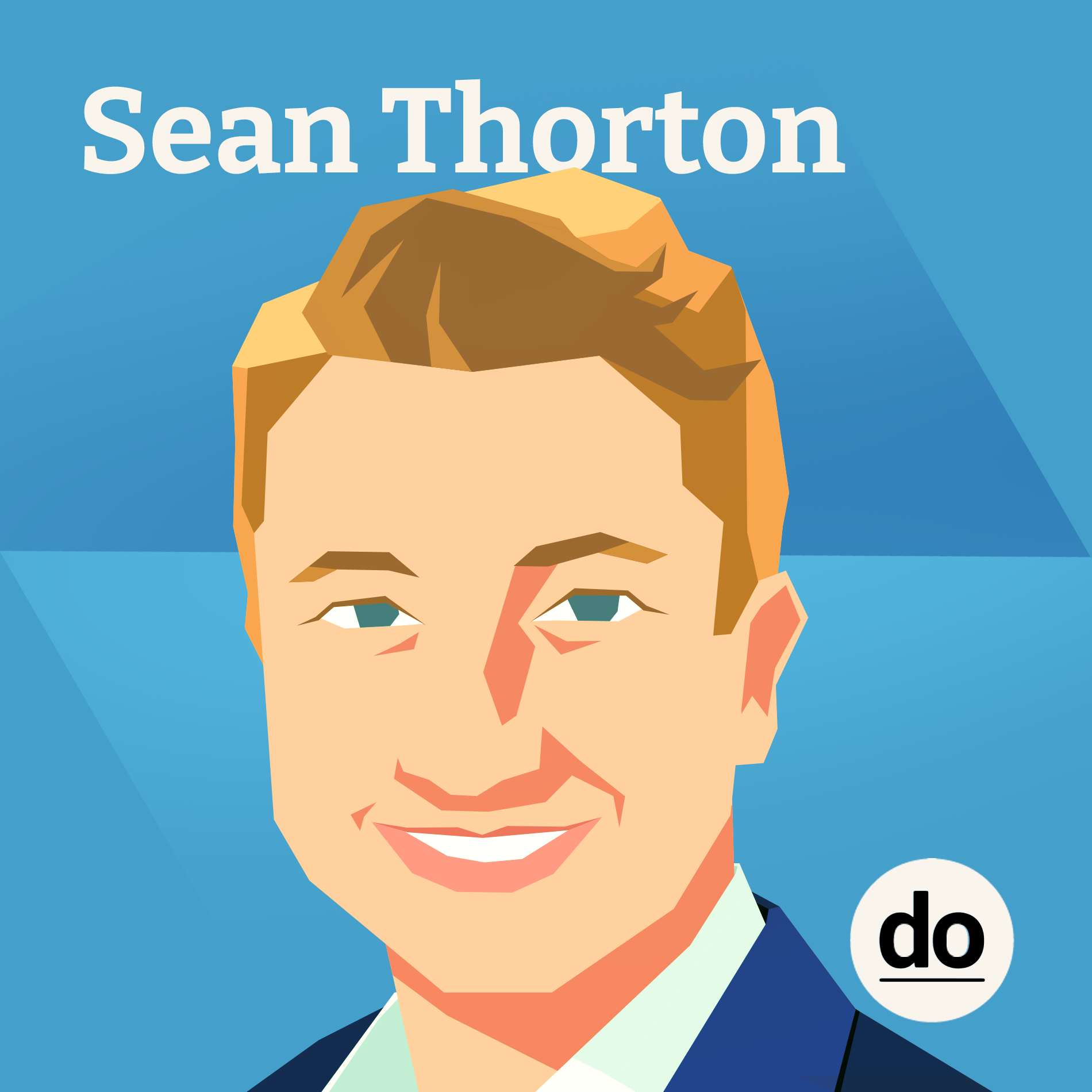
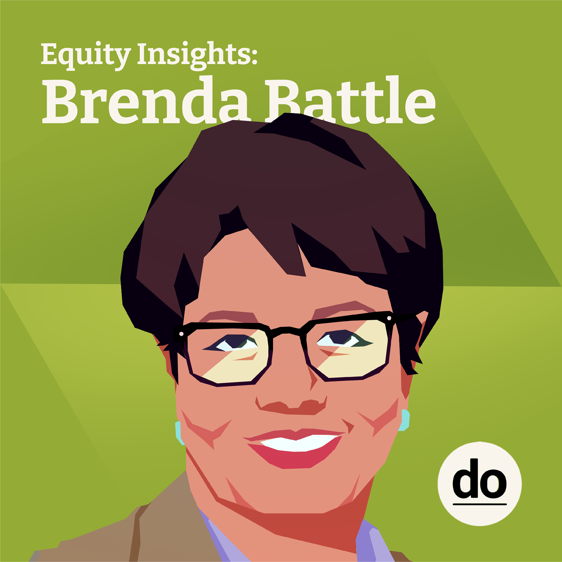
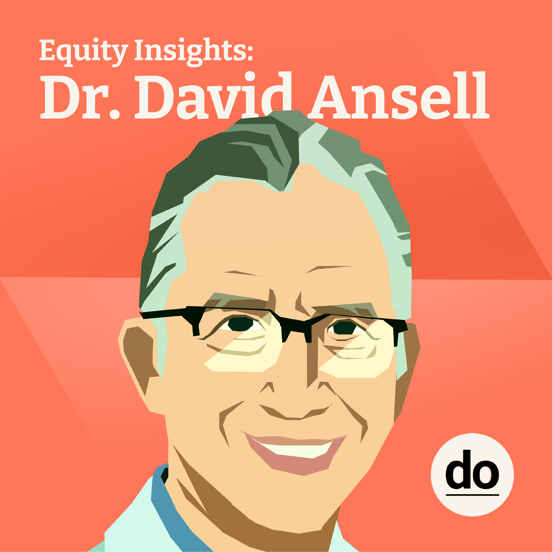
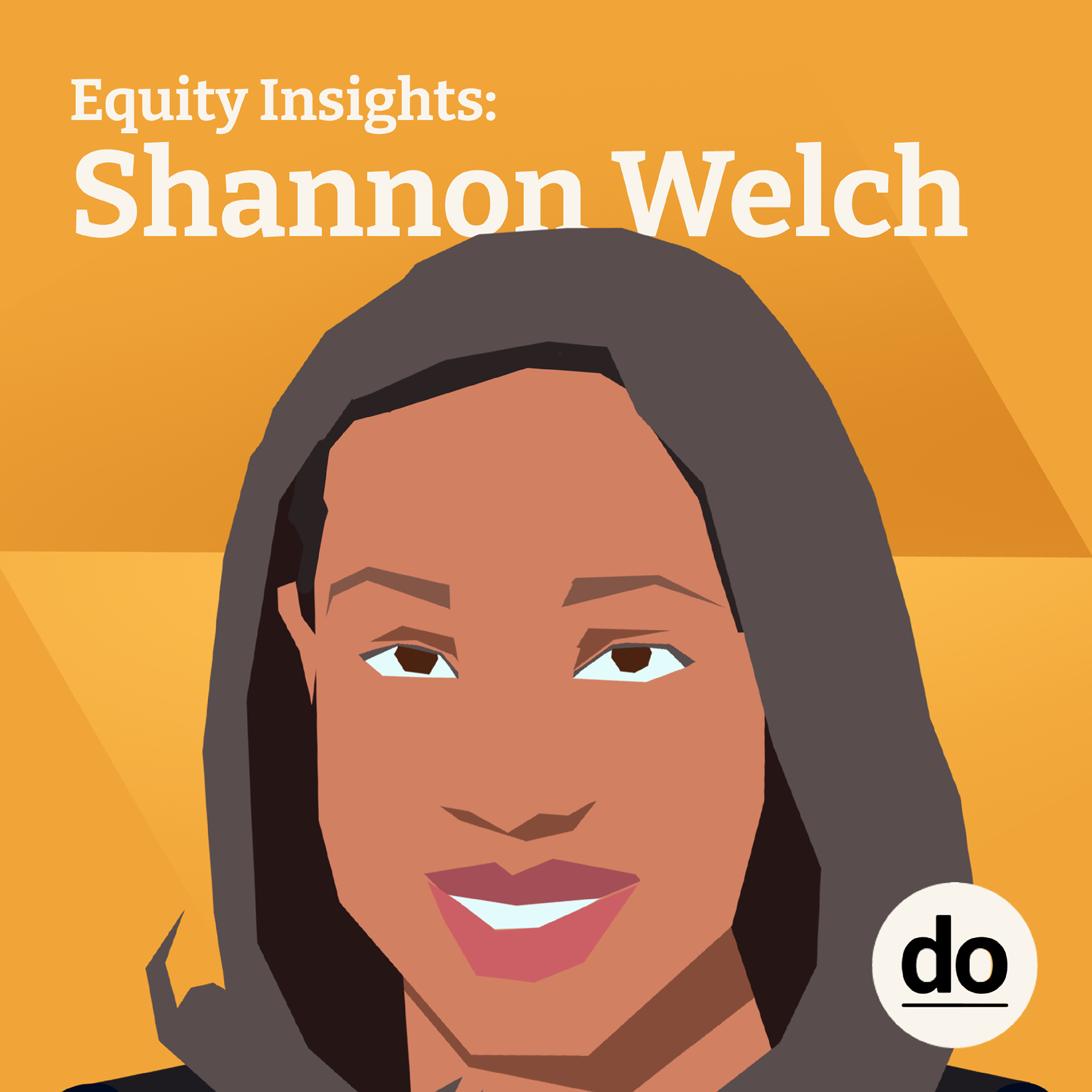
The Equity Insights podcast is a healthcare podcast, where the host brings in multiple professionals in the pharmaceutical industry and medical fields to talk about how they practice, or are working to create, equitable conditions in their practices.
Originally, the podcast had covers on Spotify that were of the DoTank logo, and nothing else. My job was to create something more visually appealing in order to capture a larger audience, and encourage the guests to share the podcast more.
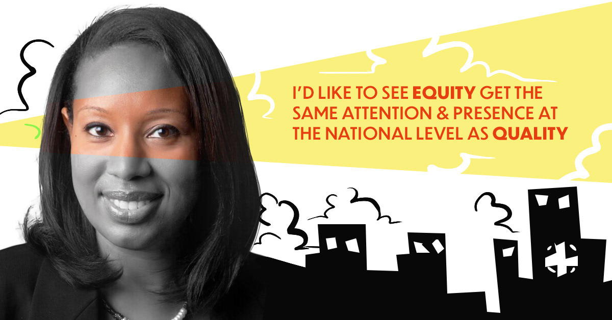
Spotify Podcast Squares
Process Summary
When researching into what business design podcasts typically look like and showcase, common themes were guest images, or some sort of representational object, or a static design that carried across all episodes. They were made of colder colors, and often weren't really popping out on the platform to me.
As a differentiator, I wanted the podcast imagery to showcase the people in a different style than the ubiquitous photography I saw everywhere. This led to exploration with illustration to achieve that. With the small sizing of the potential medium (podcast squares are typically viewed on phones), I knew that the style had to be bright and saturated, but also clean and relatively minimal. Both due to needing to be legible in multiple sizes and to stand out on the platform, but also due to the mature messaging of the episodes. Equity Insights was not some fun, whimsical podcast, and so the imagery needed to be a bit more mature. That being said, it is also an uplifting podcast, so the images couldn't come across as dire or negative either.
Once I locked down a style for the illustration software each guest, I went to work with finding another visual element. Ultimately, I landed on having the gradient hexagon in the background, as it is a representation of the collective mindset of the guests, as well as a connecting visual element between episodes.
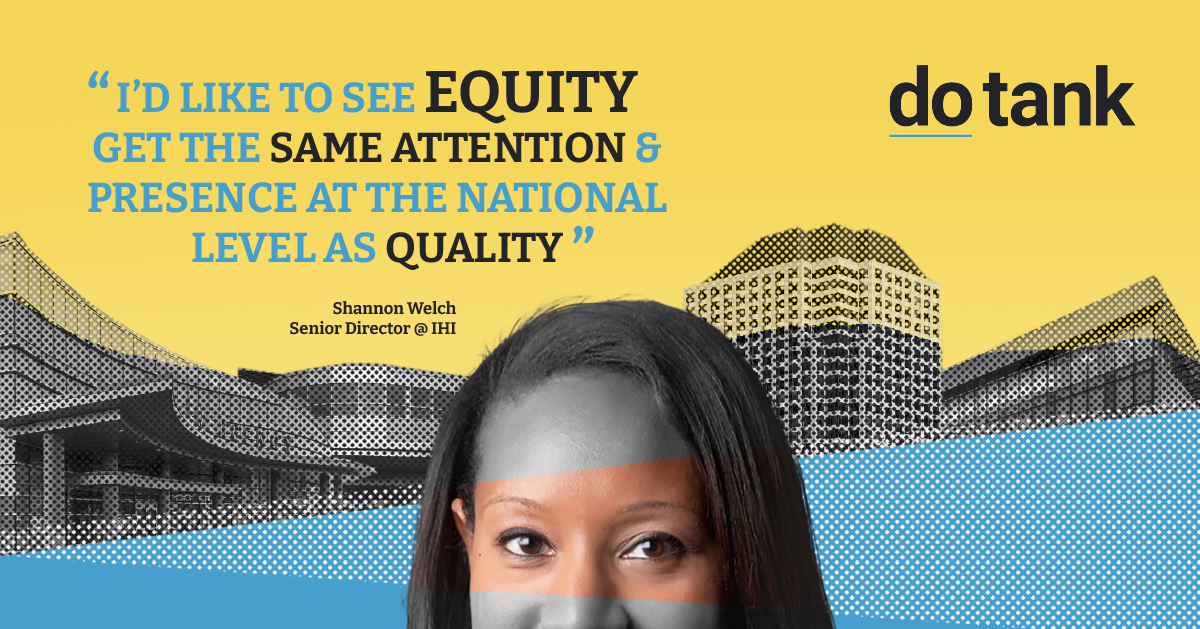
These squares generated an increased viewership, and we were asked by multiple participants if they could use and share their images, which furthered the current reach of the podcast and its content.
Various LinkedIn Banner Concepts
Some Sketches
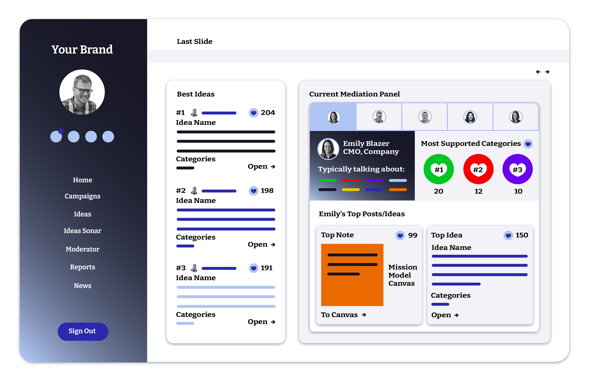
Sales Deck
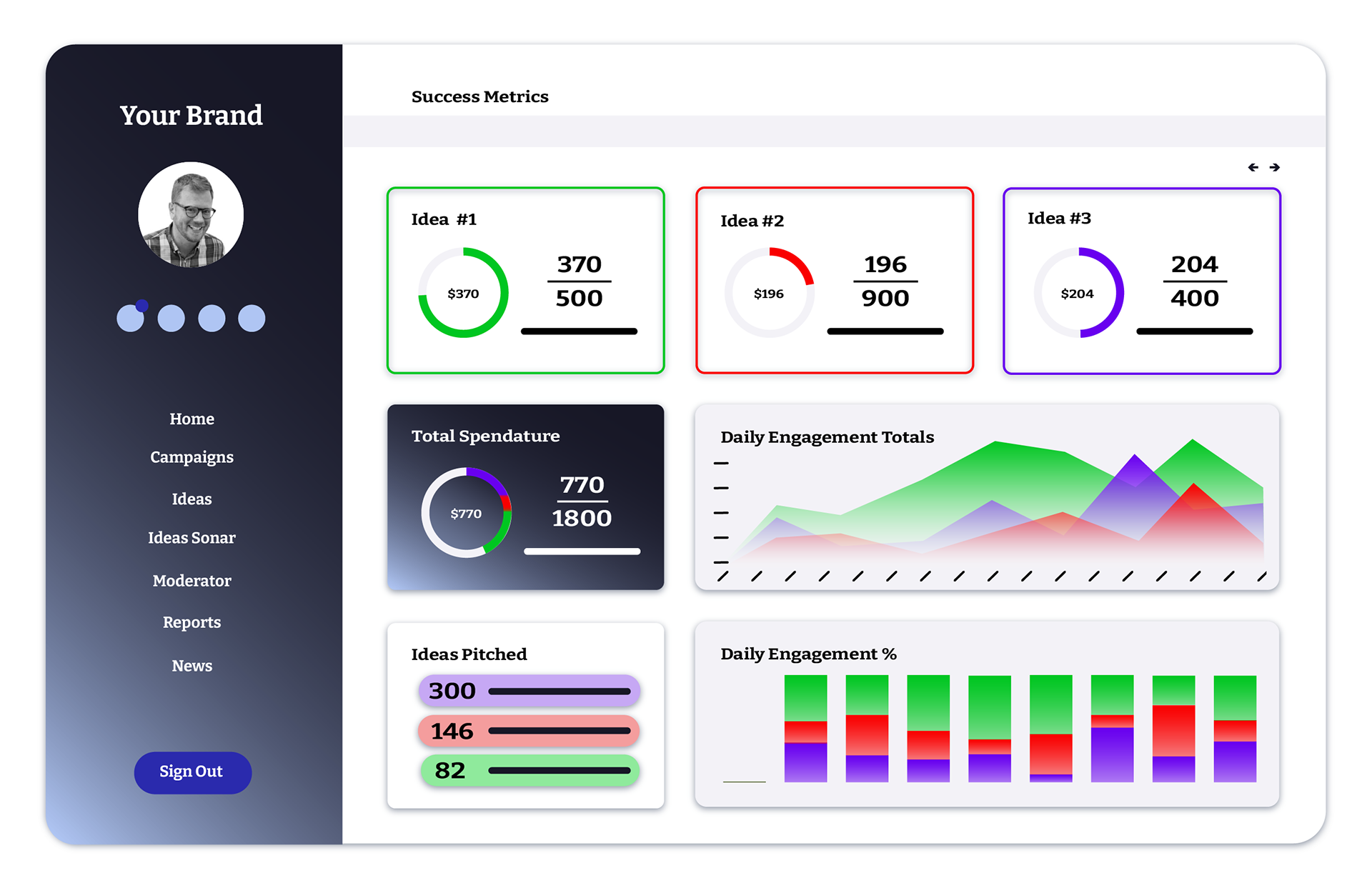
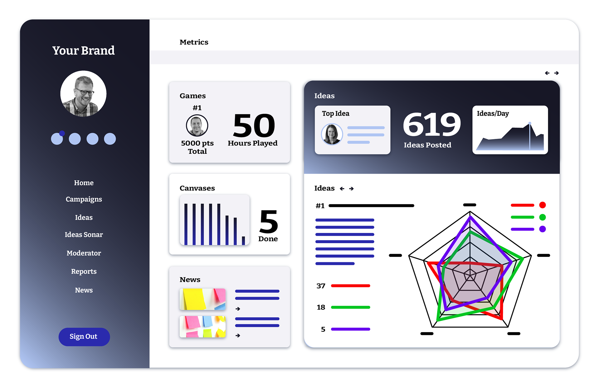
Innovation Hub Mockups
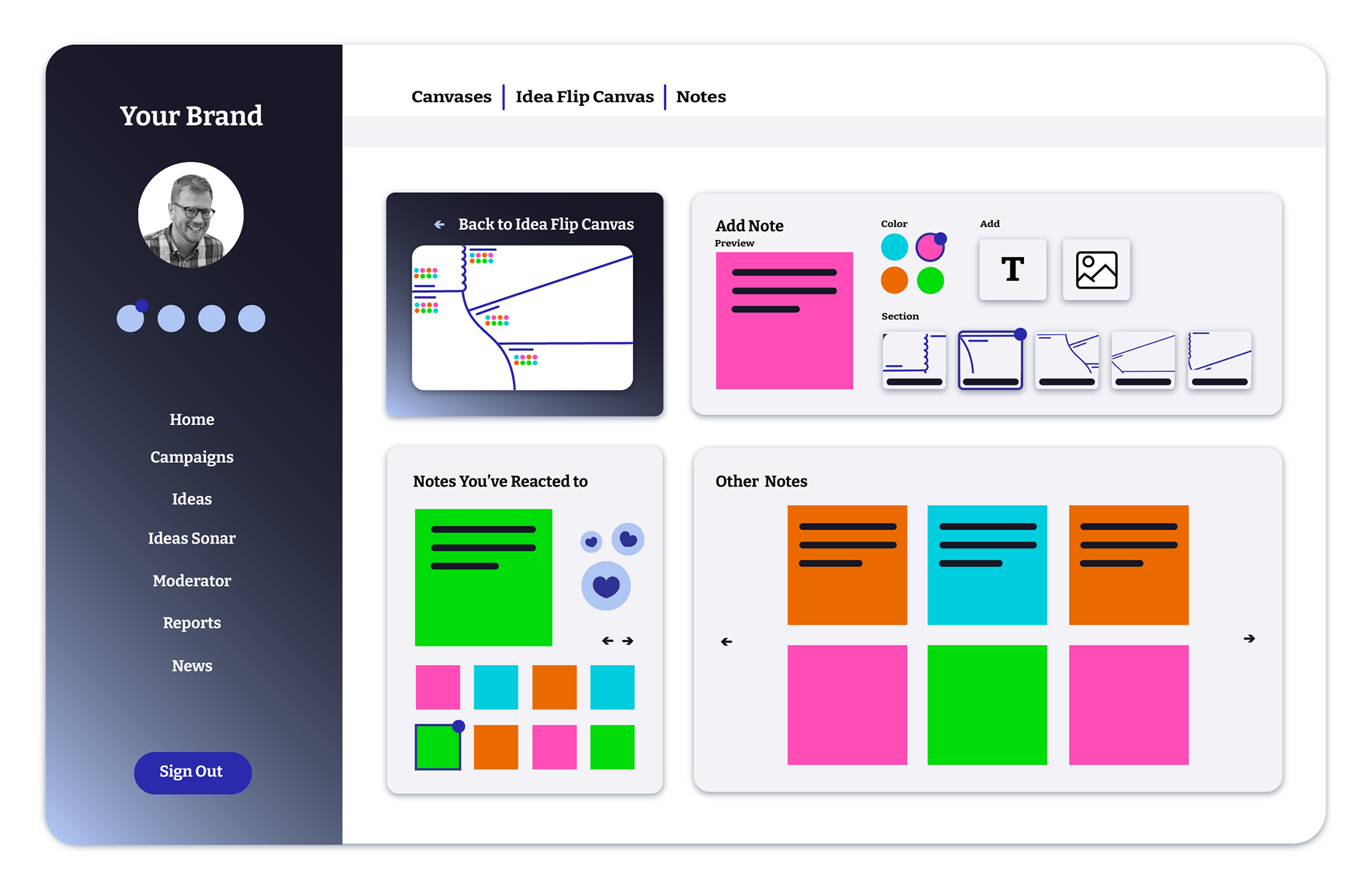
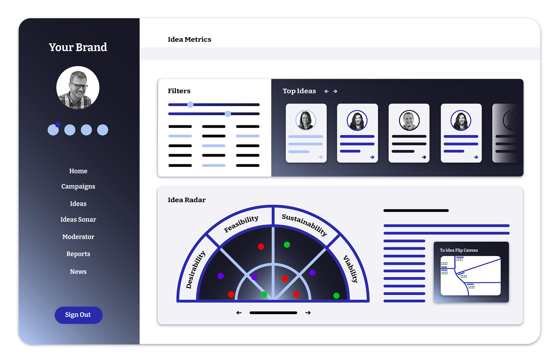
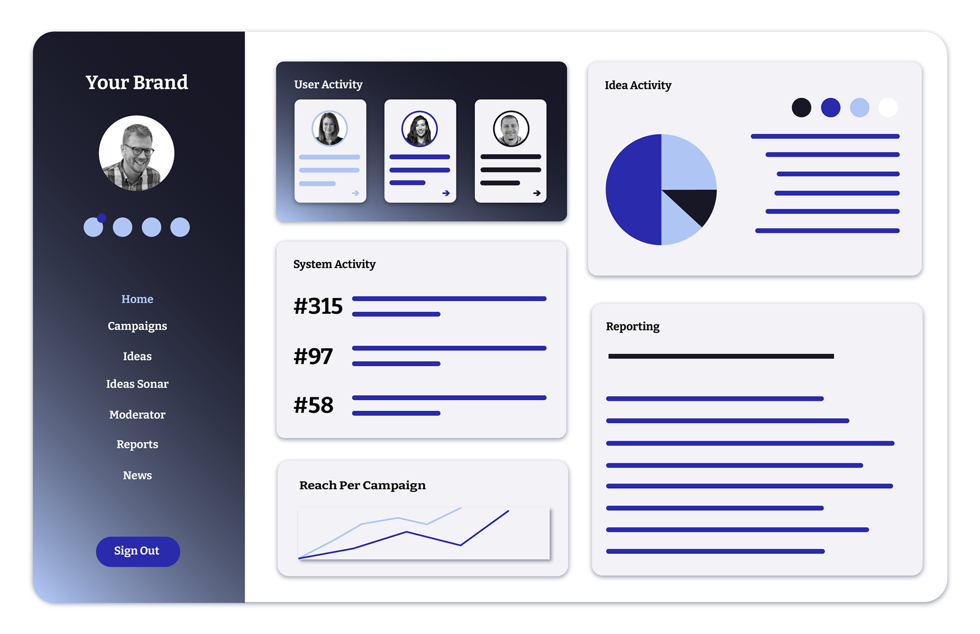
These slides were created as a supplement to a larger sales deck for the creation of an innovation portal. My task here was to look into how various Innovation Hubs were designed, and come up with a fictional interface that featured some of DoTank's common products, such as their canvases and discussion based activities and metrics. These were made for promotional purposes in meetings to establish sales and cross company connection.
For each slide, I did research into the innovation hubs and features advertised by other consultancies, and used those as an informant for general visual looks, and also to determine what parts of DoTanks products stand out. Do Tank typically takes an incredibly personalized, more fun and illustrative approach to business design, so highlighting some of the features that the digital team is working to improve specifically for DoTanks work was crucial.
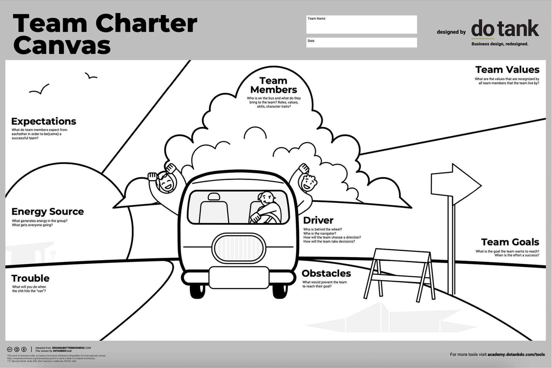
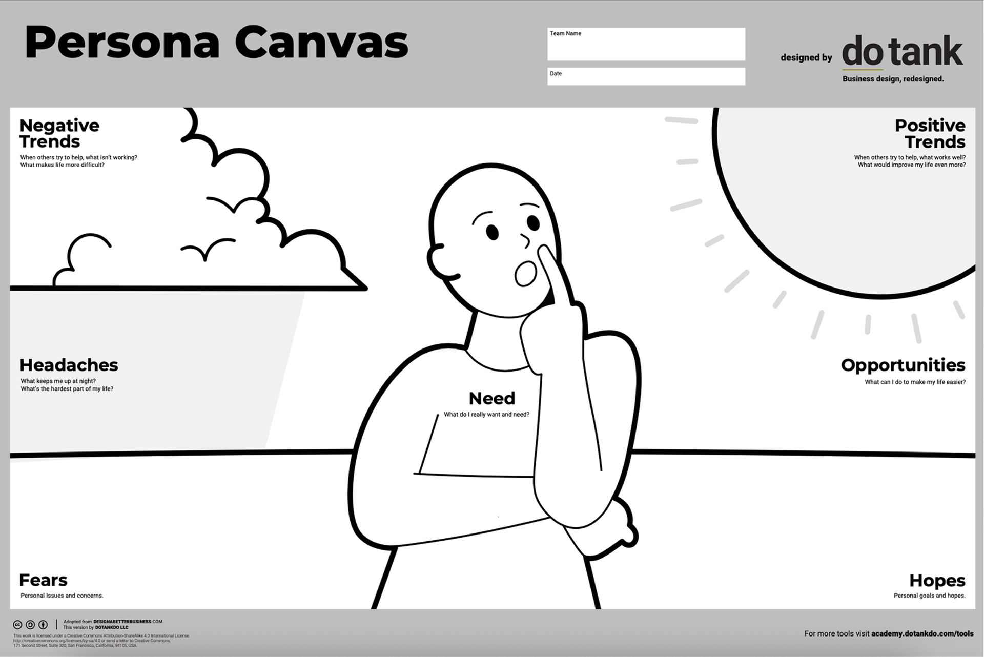
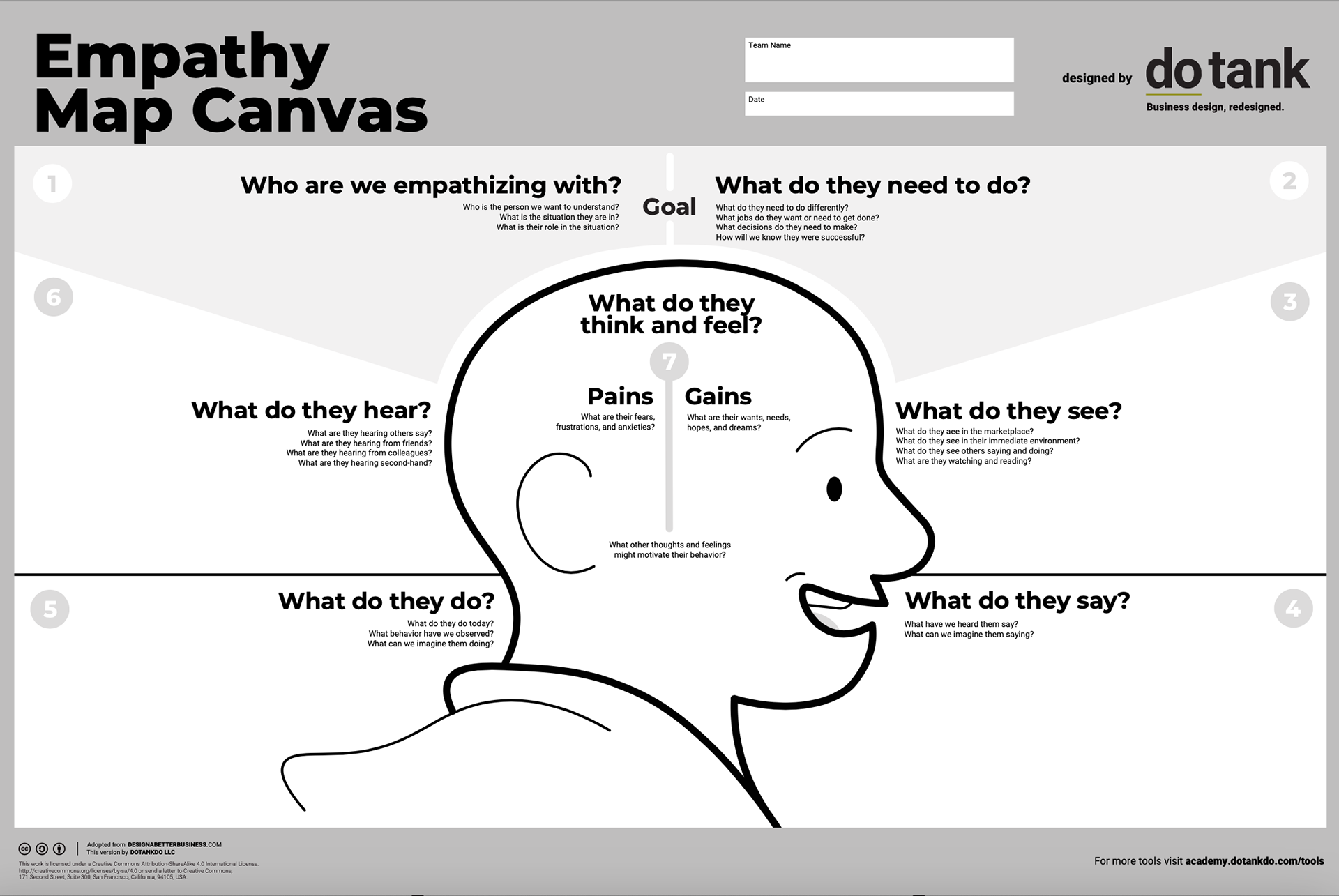
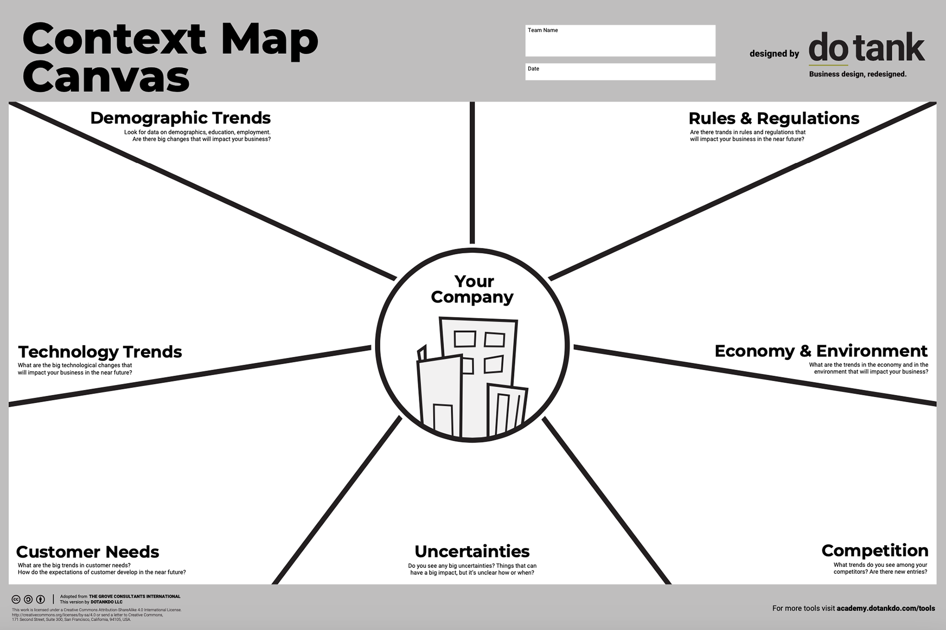
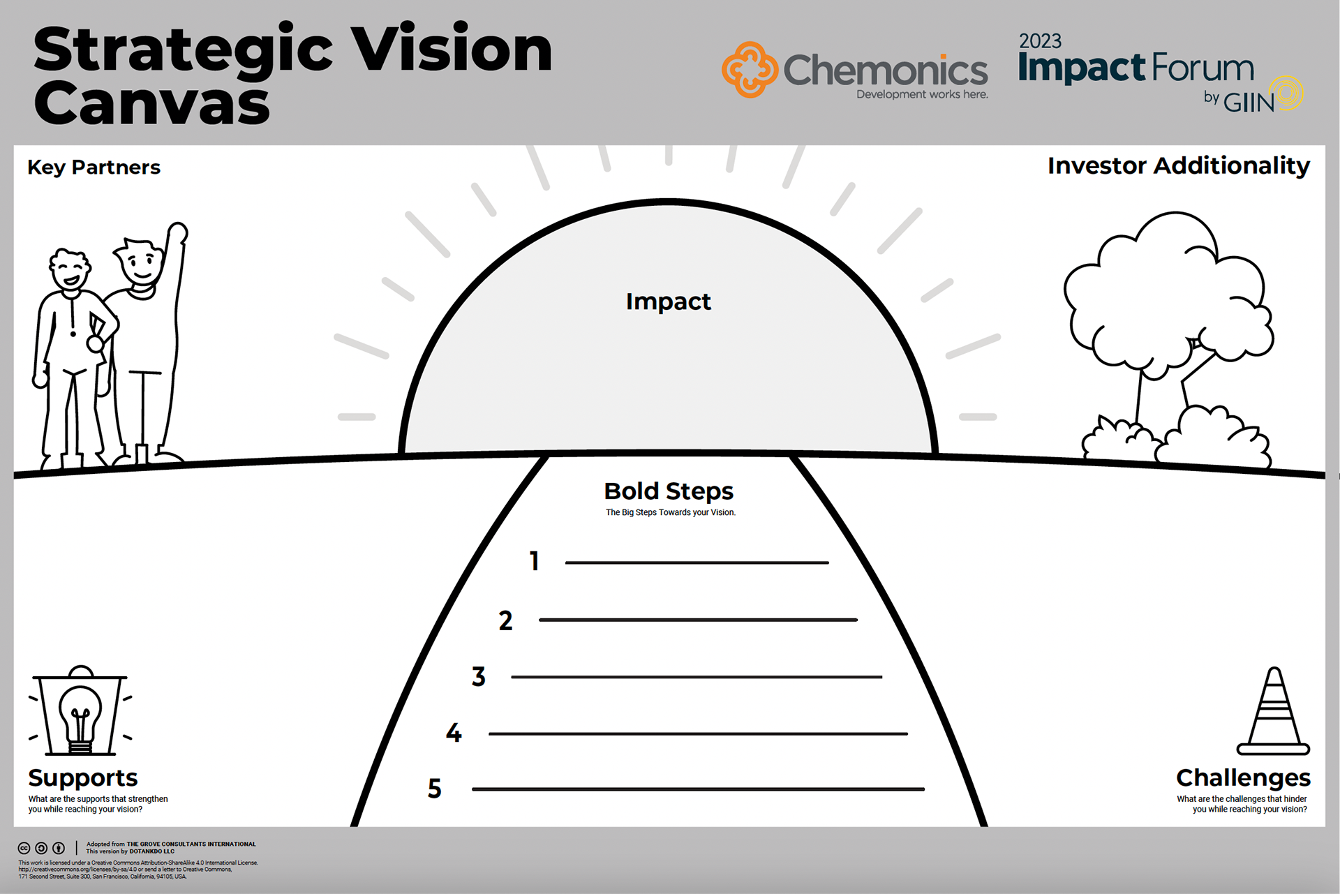
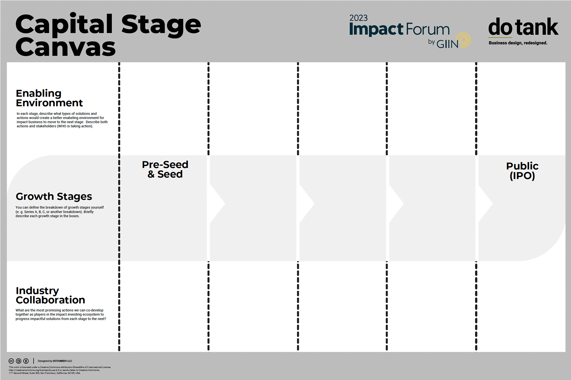
Canvases
Updates & Refresh
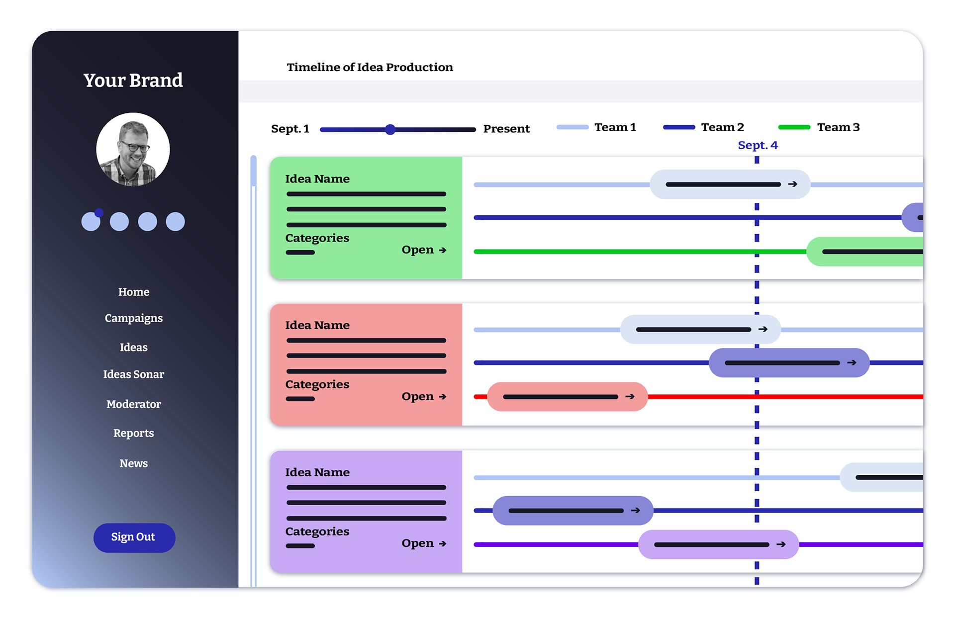
Canvases are a huge part of the business design process, and as a business design consultancy, DoTank wanted to have the canvases they used to be on brand with the rest of their products. So I was tasked with taking each canvas and reformatting it with a new set of icons, illustrations, and in some cases, an entirely new layout. This is a small selection of canvases that were refreshed.
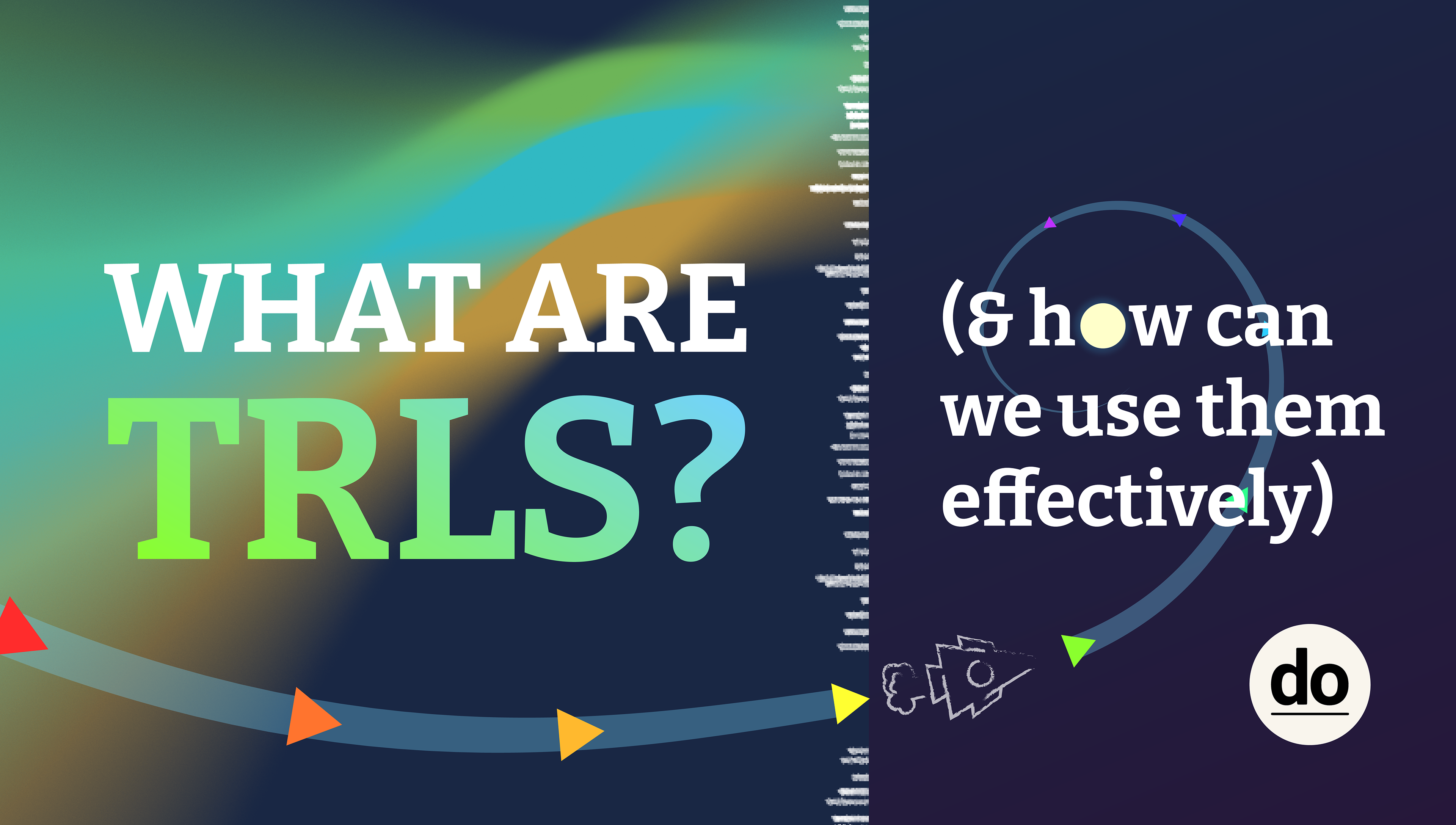
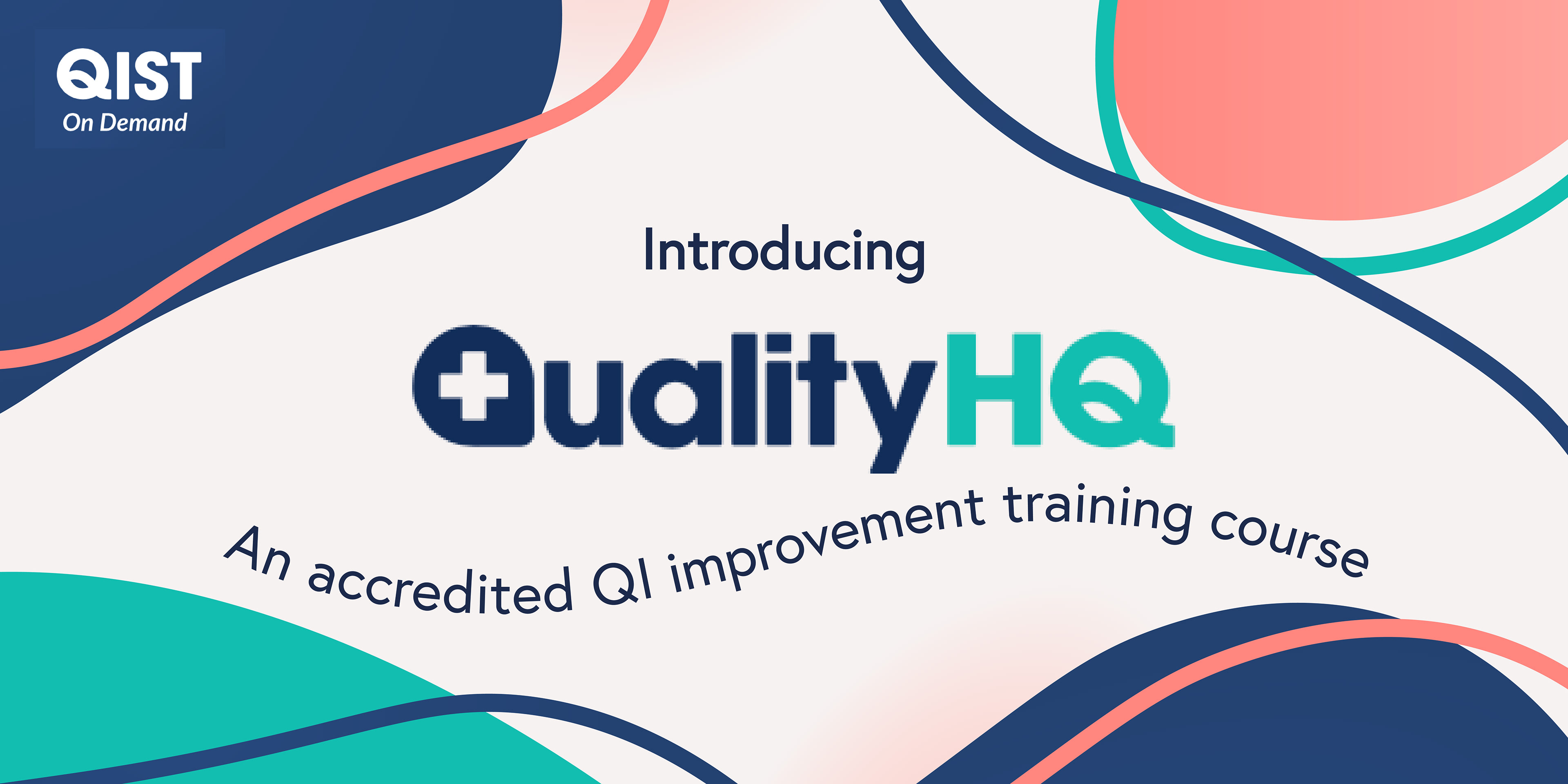
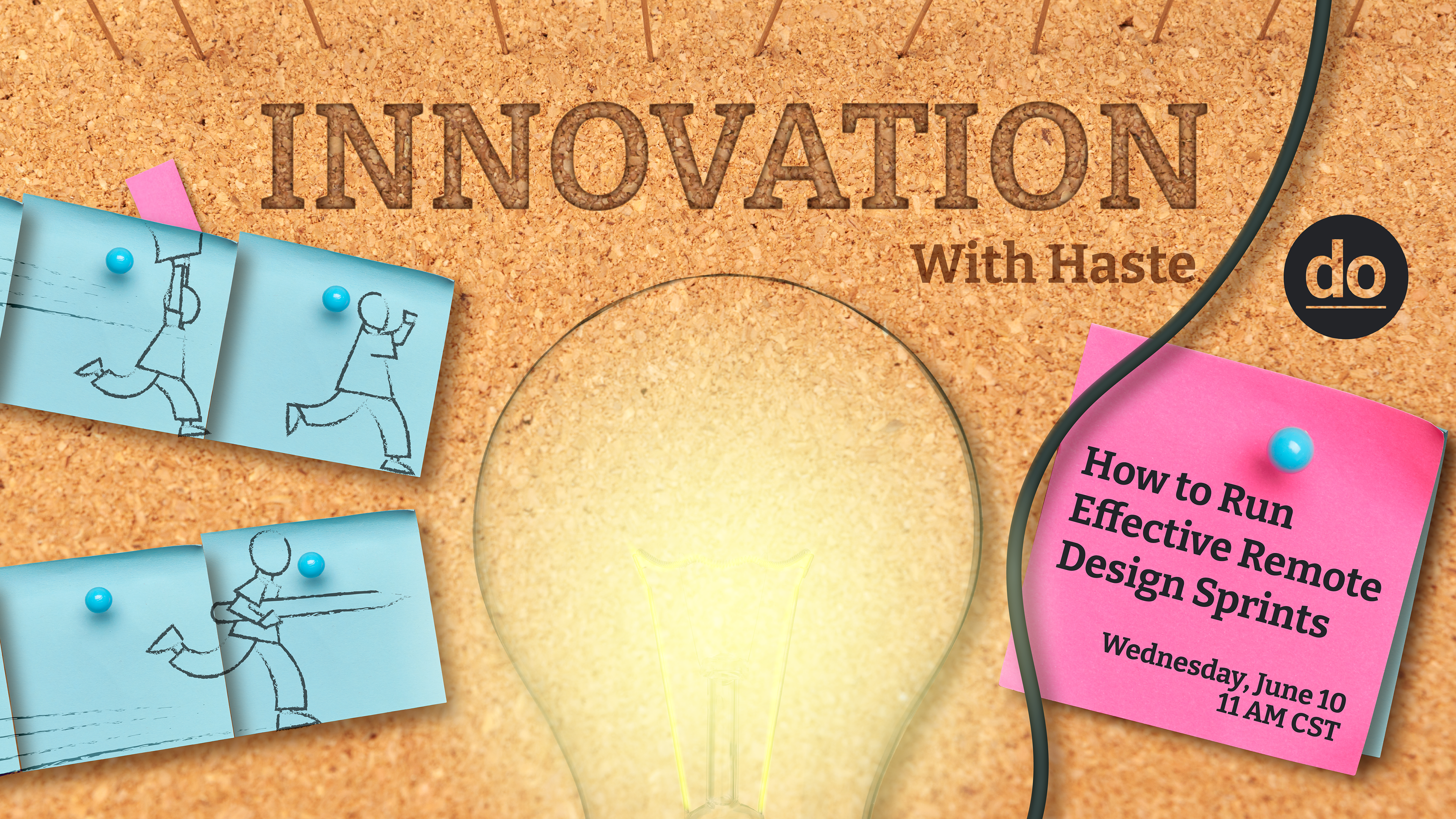
Misc Banners
Learning Hub & LinkedIn
A sampling of other banners made for general social usage to promote articles and projects.