Timeline
August 2022 to October 2022 (About 3 weeks) Mini Update on Feb. 16, 2023
Programs Used
Photoshop, Illustrator, InDesign, Adobe XD, After Effects
Skills & Practices
Logo Design, Icon Design, Advertising, Packaging, Motion Graphics, Research
QuicFix is a hypothetical meal delivery brand that caters to young adult, inexperienced cooks, just beginning to explore the kitchen. It is a brand I made as a case study in Branding design. QuicFix provides tons of tutorials for basic cooking skills, and only includes and delivers recipes that have 9 or less ingredients. The goal is to get people used to cooking, so they can take the simple recipes that Quic Fix provides, and expand them to make more complex dishes in the future.
For this project, my task was to create and design the entire brand. From the purpose of the company, the logo, the materials, to the social media elements.
Base Elements
Base Elements
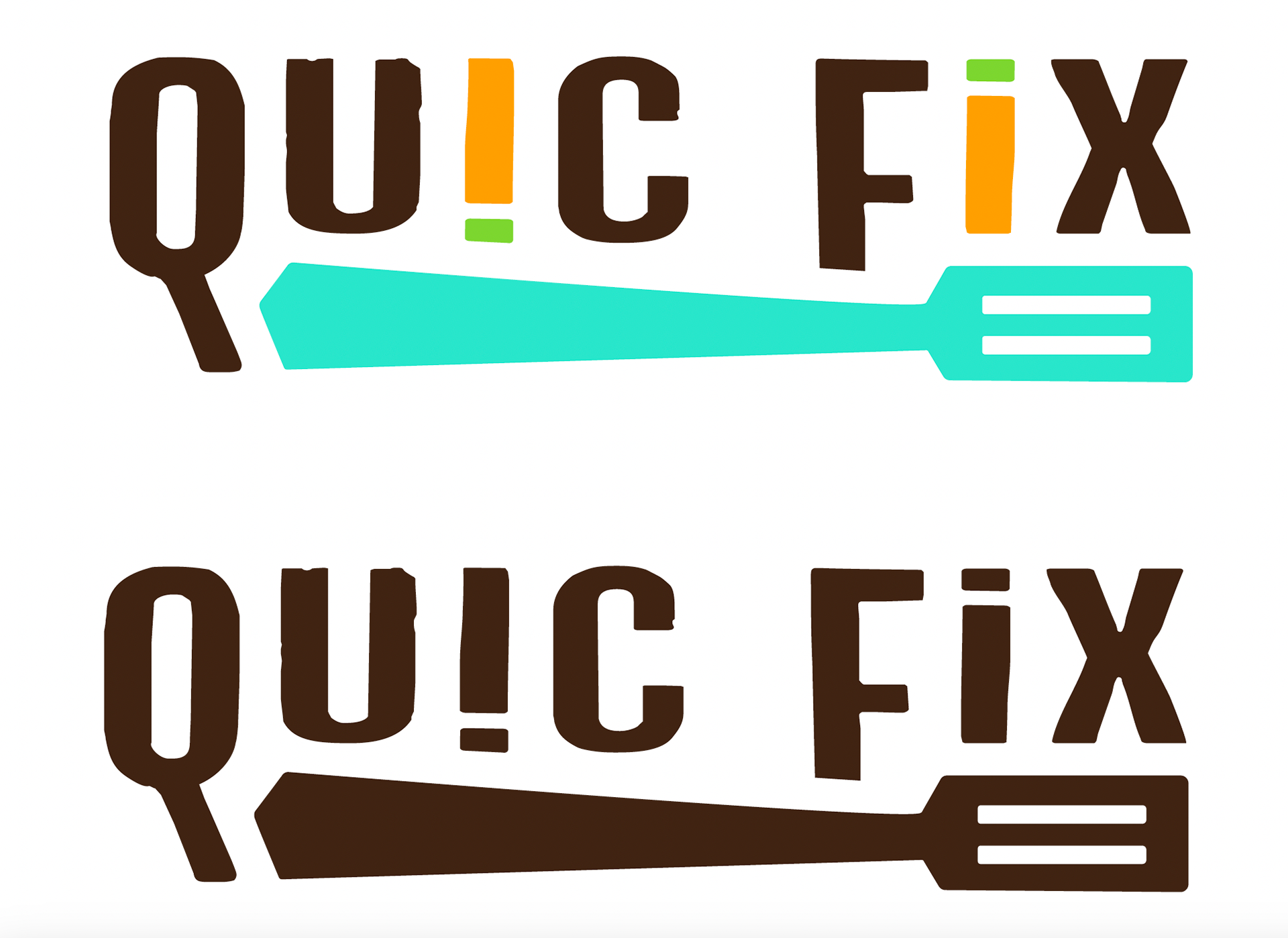
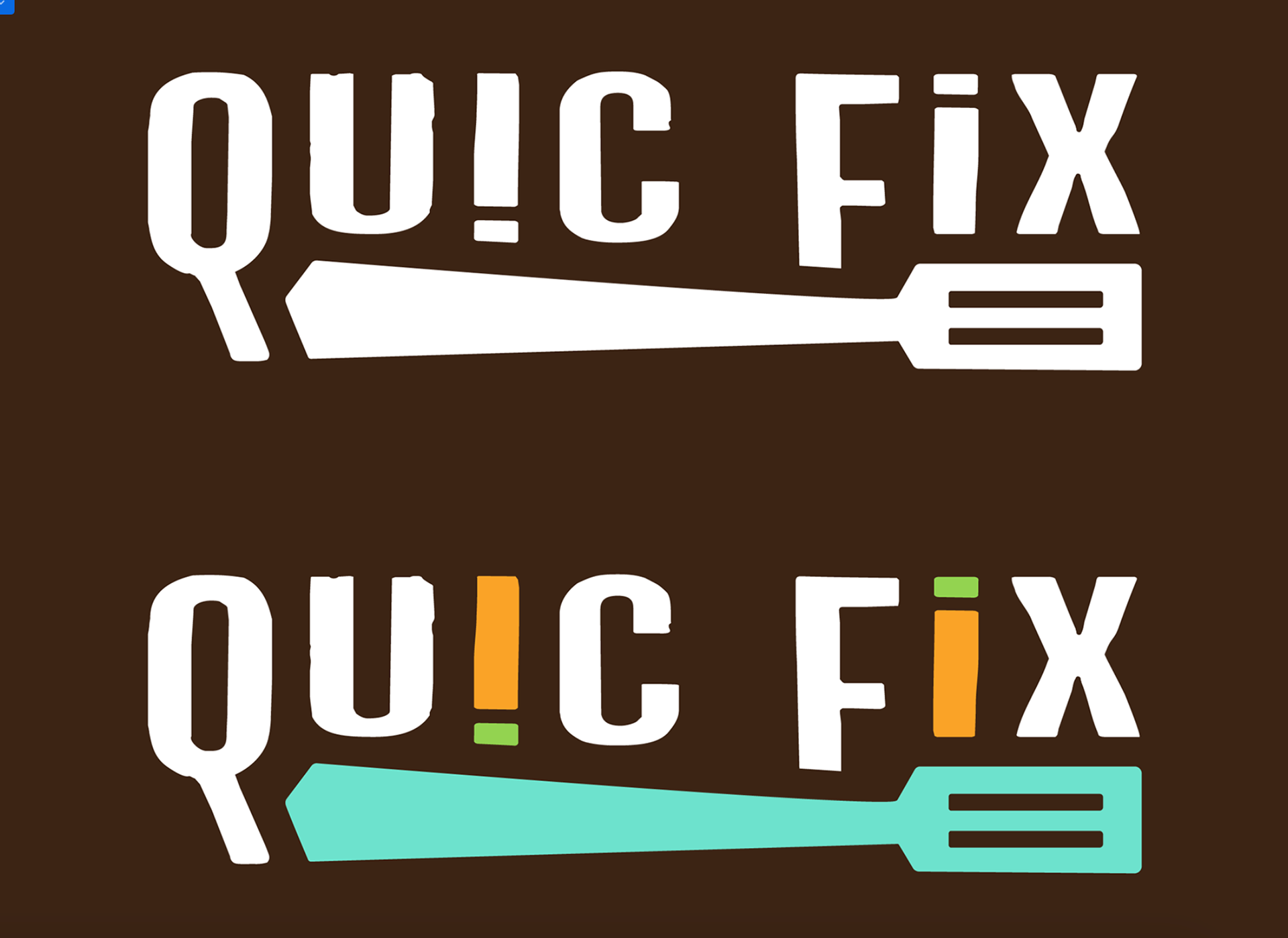
Final Logo
This is the Quic Fix logo. The top is full color, the middle is the less colored version that it is preferred logo for less colored documents/ads/videos, and the last two are similar concepts, but on a dark background.
The logo is supposed to be playful and rough, reminiscent of the beginning process of learning how to cook. The I's are read as carrots. The spatula can be replaced with bold wording depending on the context the logo is used in as well.
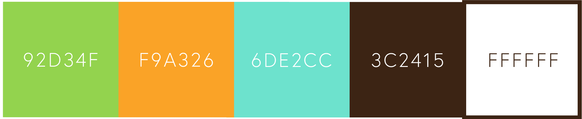
Brand Colors
The colors green, orange, and dark brown are supposed to showcase the vibrant flavors of food, as well as the Earth and grounded nature of the ingredients. The bright teal represents the process of cooking; similar to making and learning a blueprint to get to a good result. White is the encompassing color, for content on or requiring a bright background.
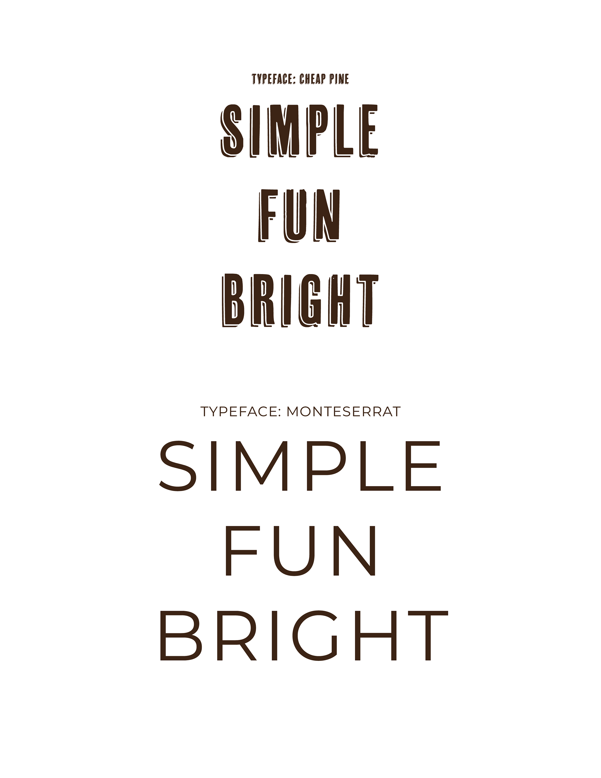
Brand Typefaces
These are the brands typefaces. Cheap Pine is used for large type, and Cheap Pine Sans is used for header elements. Monteserrat is used for body copy, and basic title elements. The goal was for the brand to look simple, but for certain elements to have a roughness to them, reminiscent of imperfect, beginner cooking.
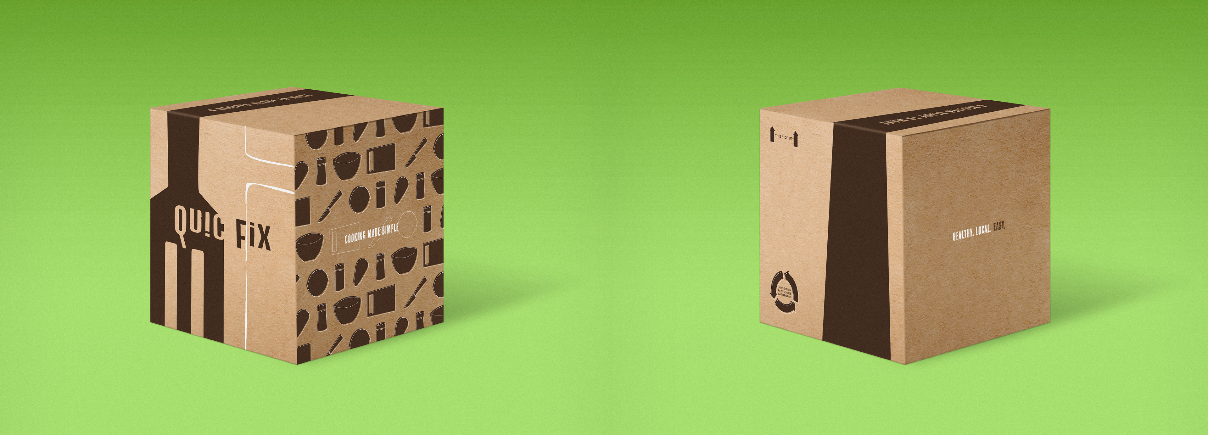
Packaging & Products
Box
The packaging is reduced to 2 colors to save on hypothetical printing costs. It features the company logo (Quic Fix), tagline (Cooking made simple), and custom patterned icons that align with the simple style of the brand.
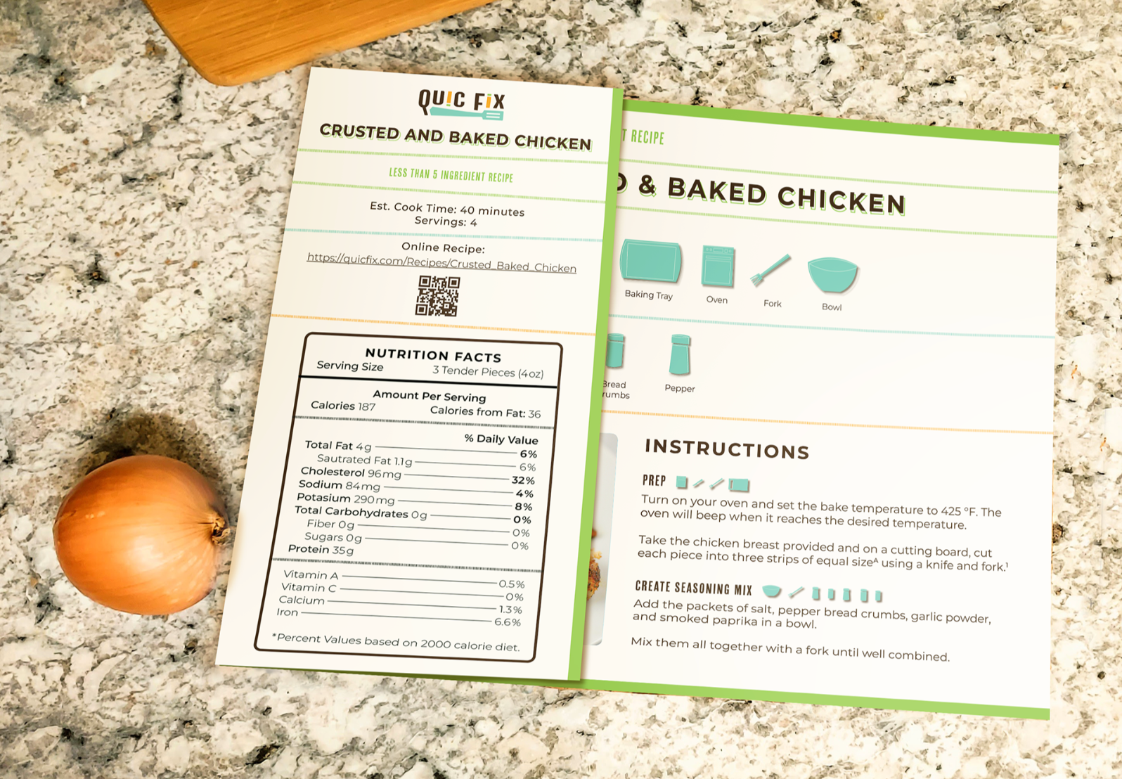
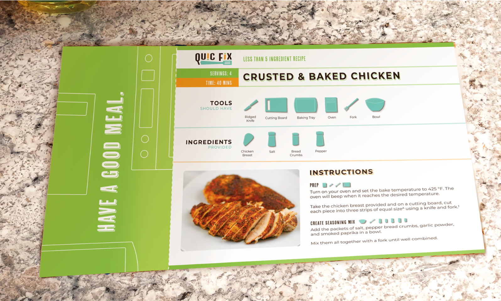
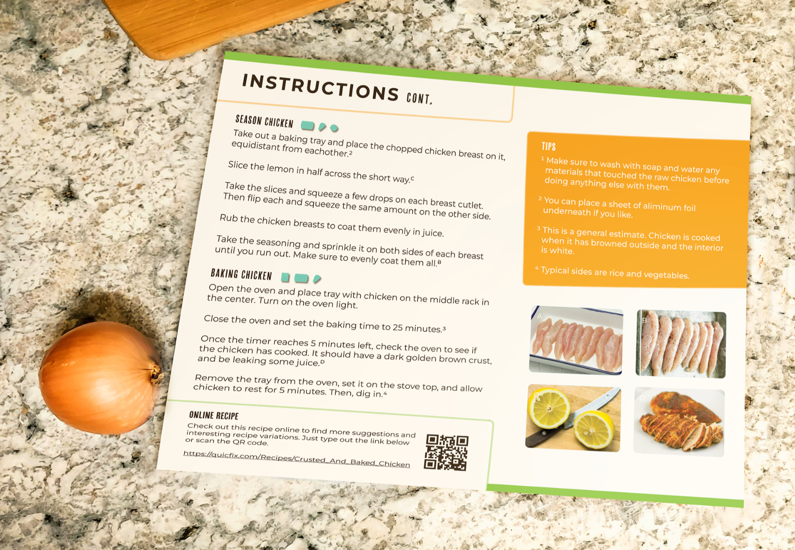
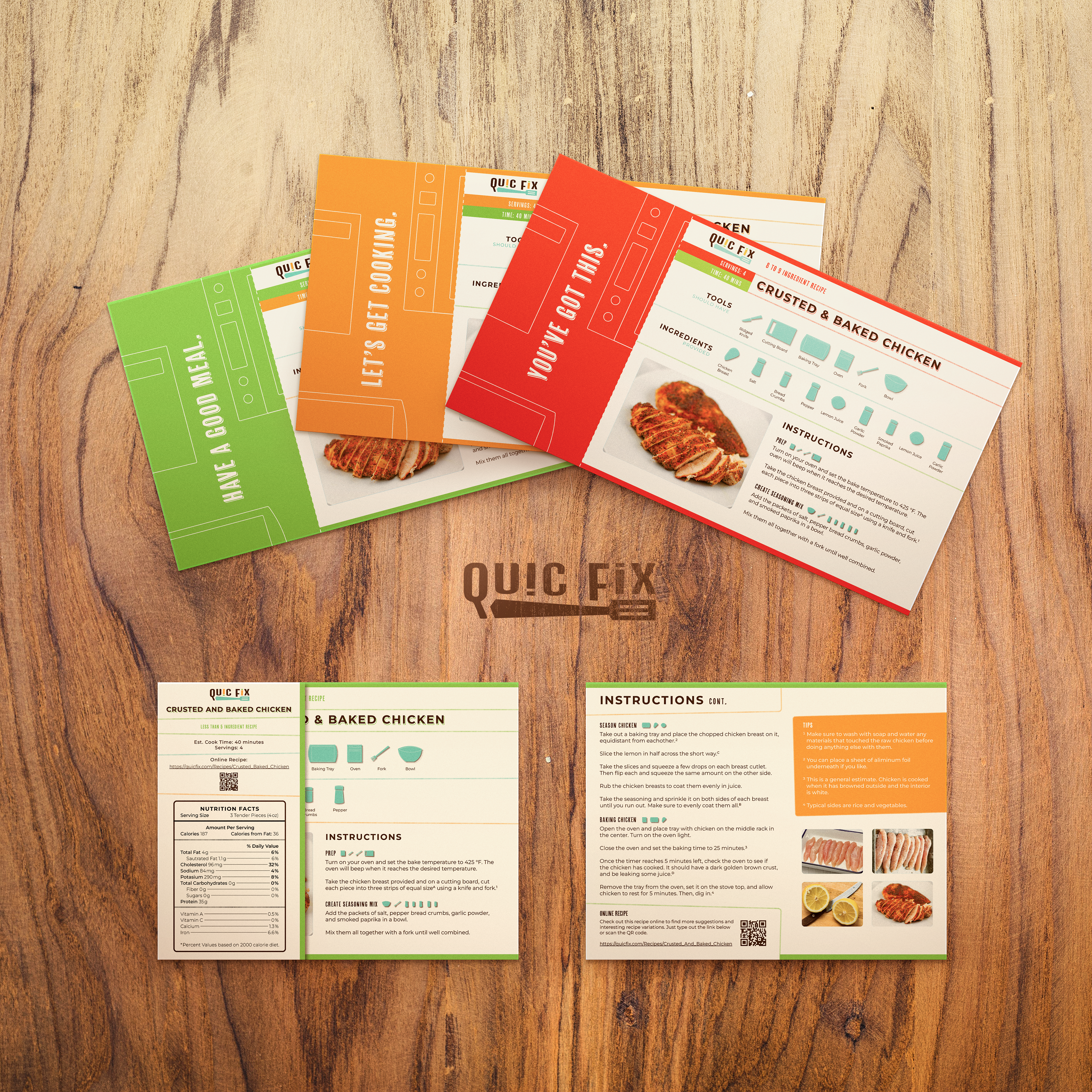
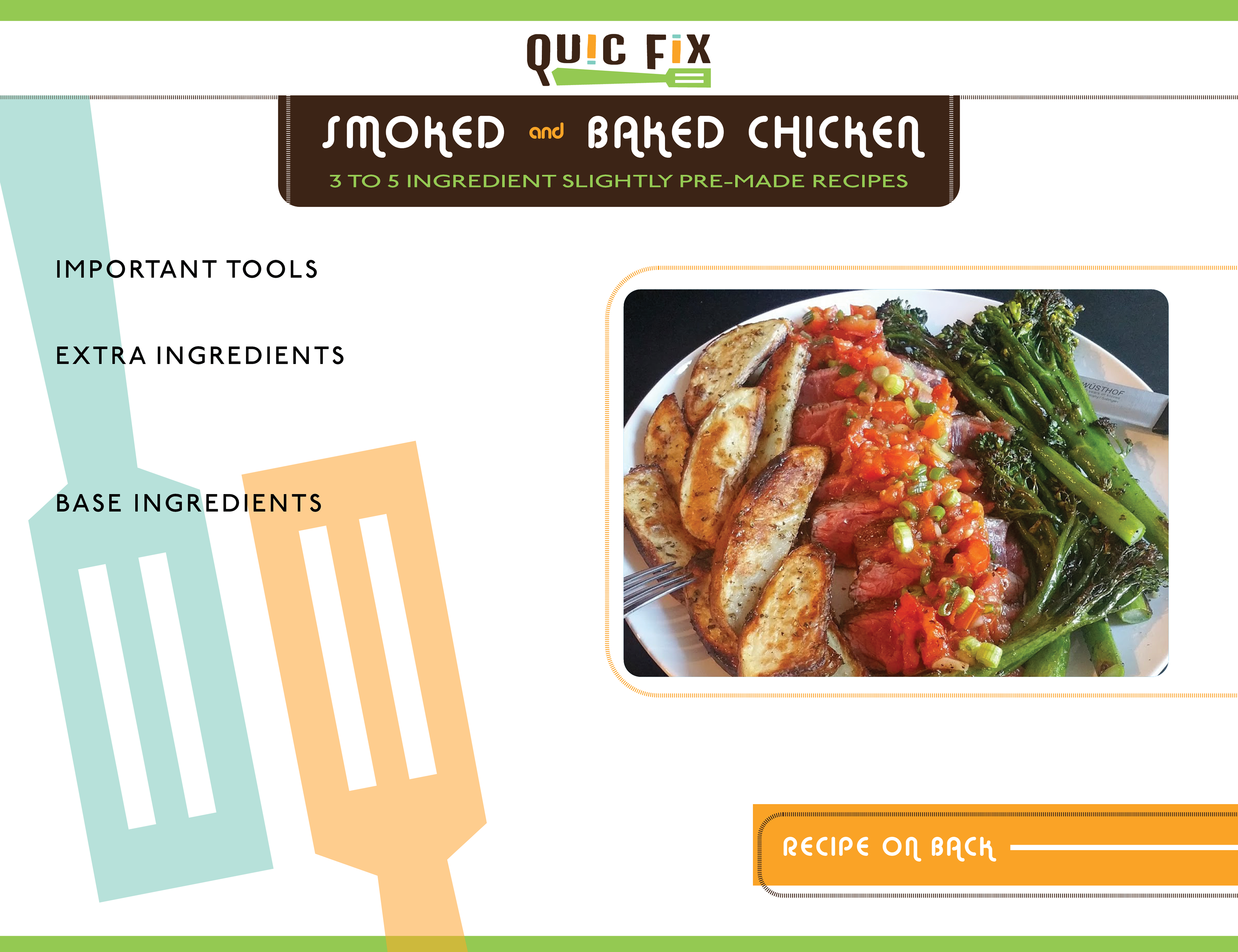
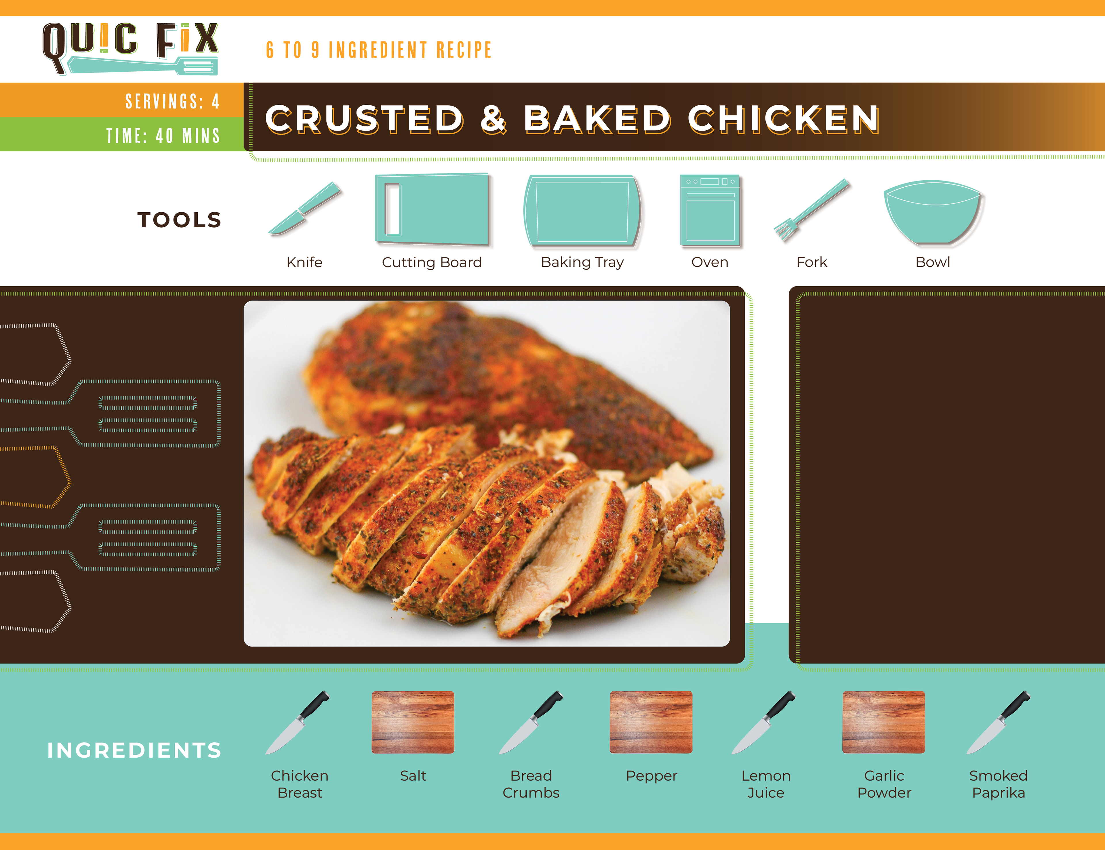
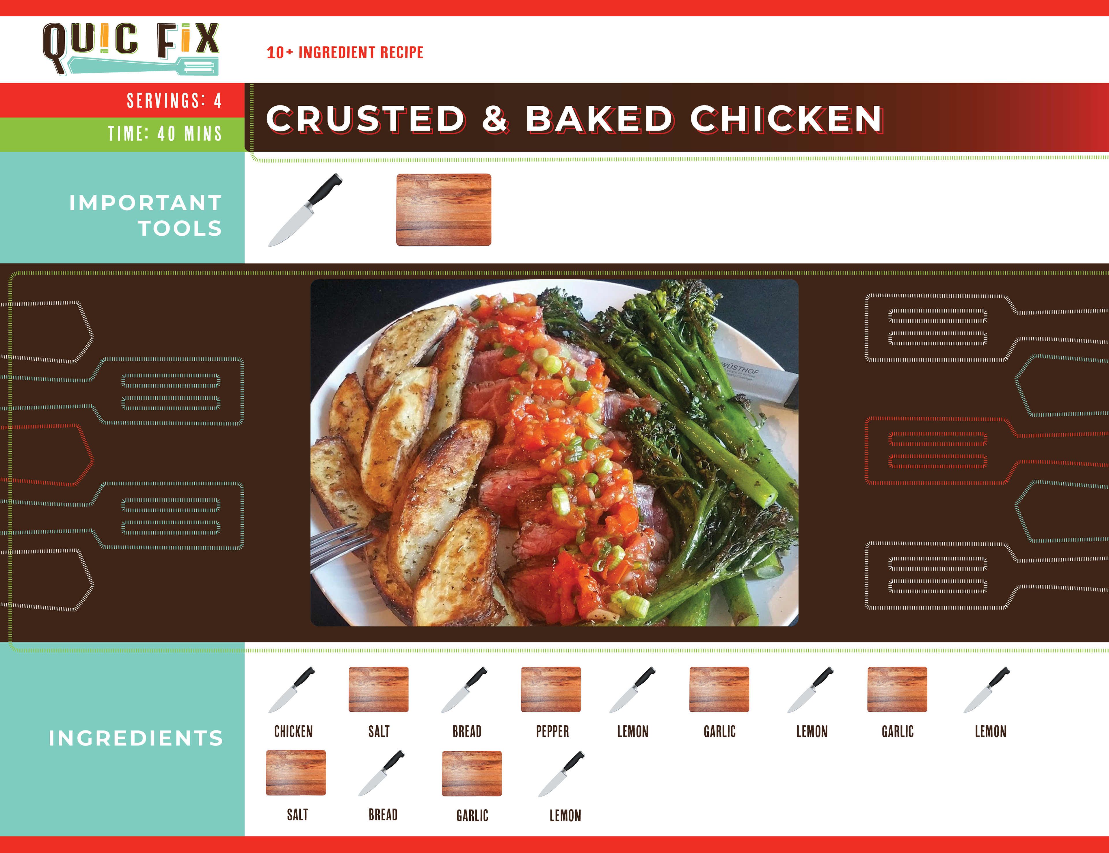
Recipe Cards
Each card has a color to denote the level of difficulty (i. e. number of ingredients) Green is less than 5 ingredients, orange is 5 to 7 ingredients, and red is 8 to 9 ingredients. There is an option to view each recipe online, by using the QR code or typing the link on the card. Customers have the option of using and keeping the analog card, or ripping off the rectangular attachment to keep in order to quickly access the online version of the recipe. Online recipes will contain tutorials embedded into the content to help new cooks learn how to properly use the tools required for each recipe so they can become more efficient in the future.
The cards are designed to be simple, highlight the food and necessary materials for everything, be friendly, but also formal enough to be legible. There's an opening flap, front, and back, to make as much use of space and resources as possible.
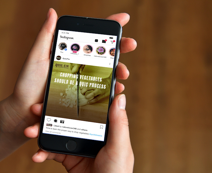
Instagram Post Video Intros
Along with a website, the company aims to help a general audience learn how to cook better, and hopes to reach a wider audience using tutorial videos on various social media platforms. The video here shows 2 intro sequences that a proper tutorial would be added to.
Sketch Work
Ideas & Iterations
This section contains some, but not all, of the iterations and sketches I made throughout the project.
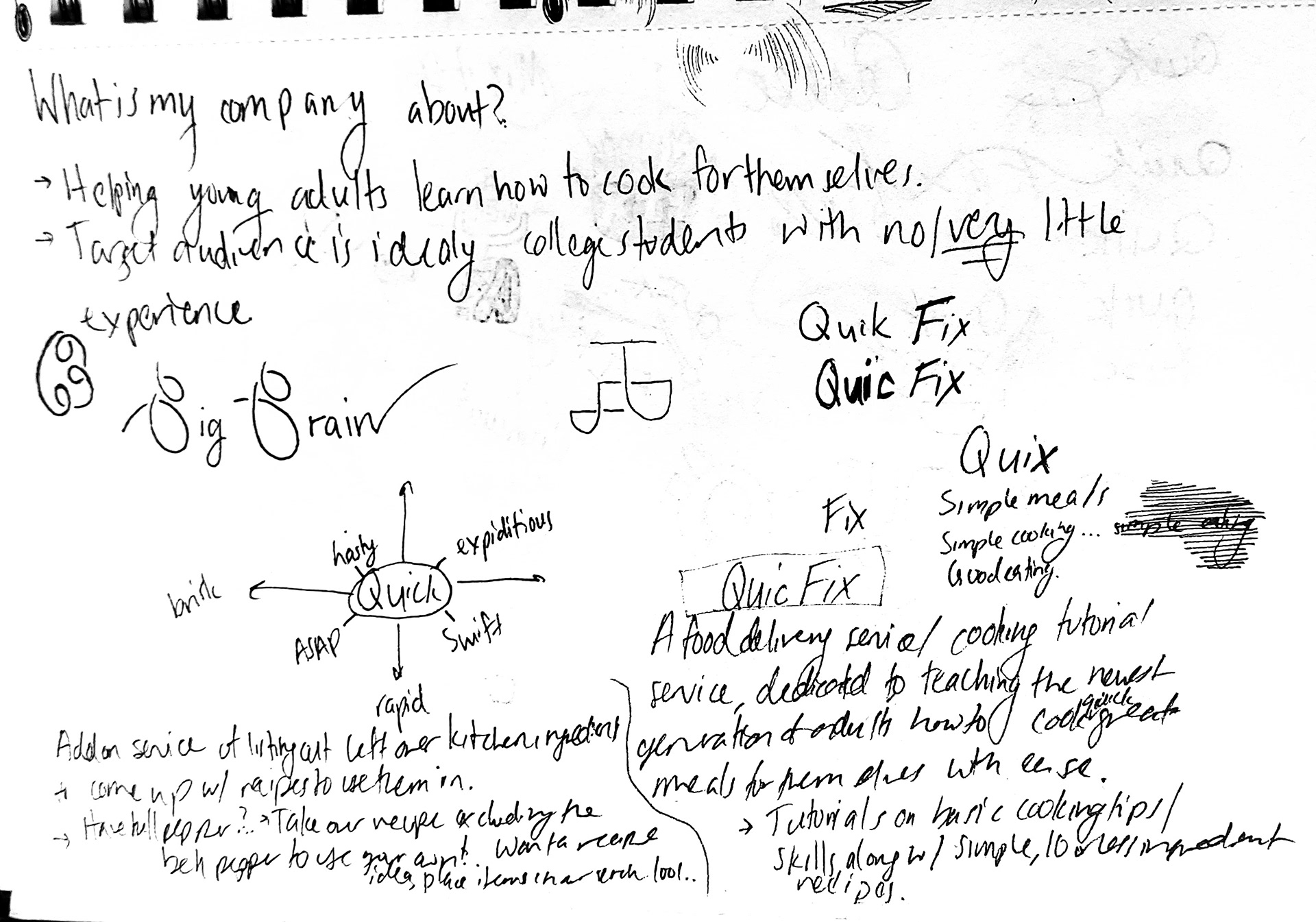
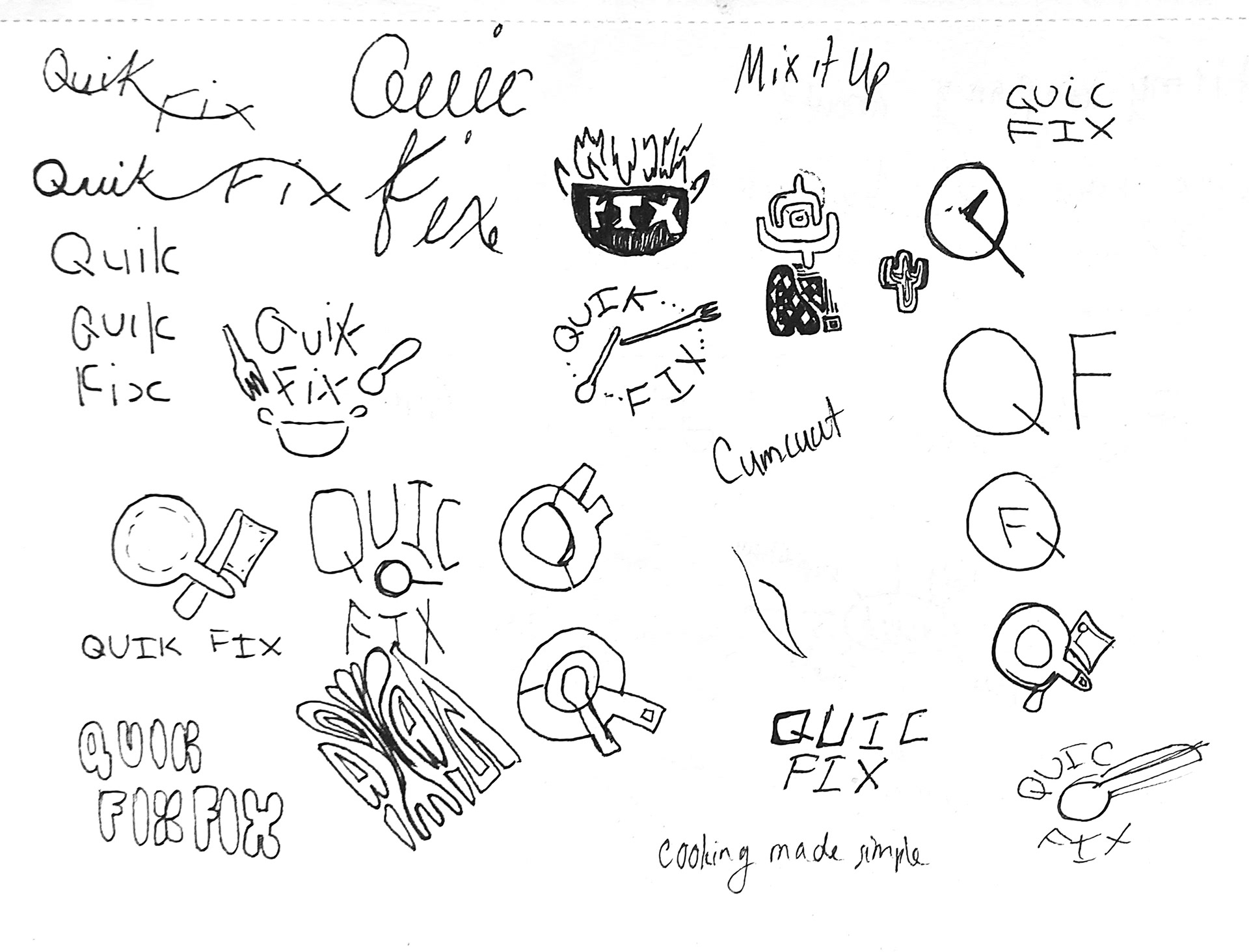
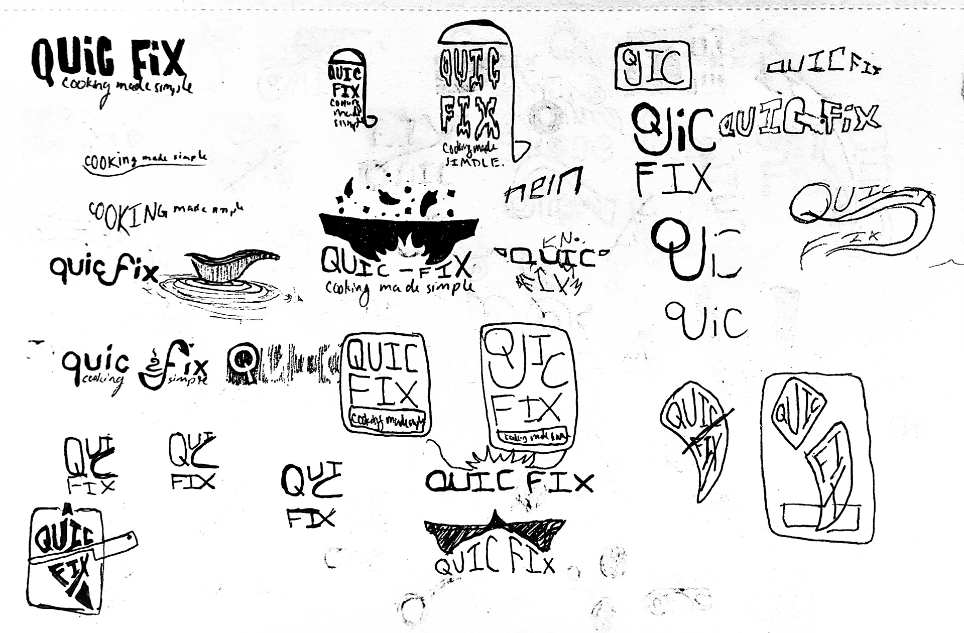
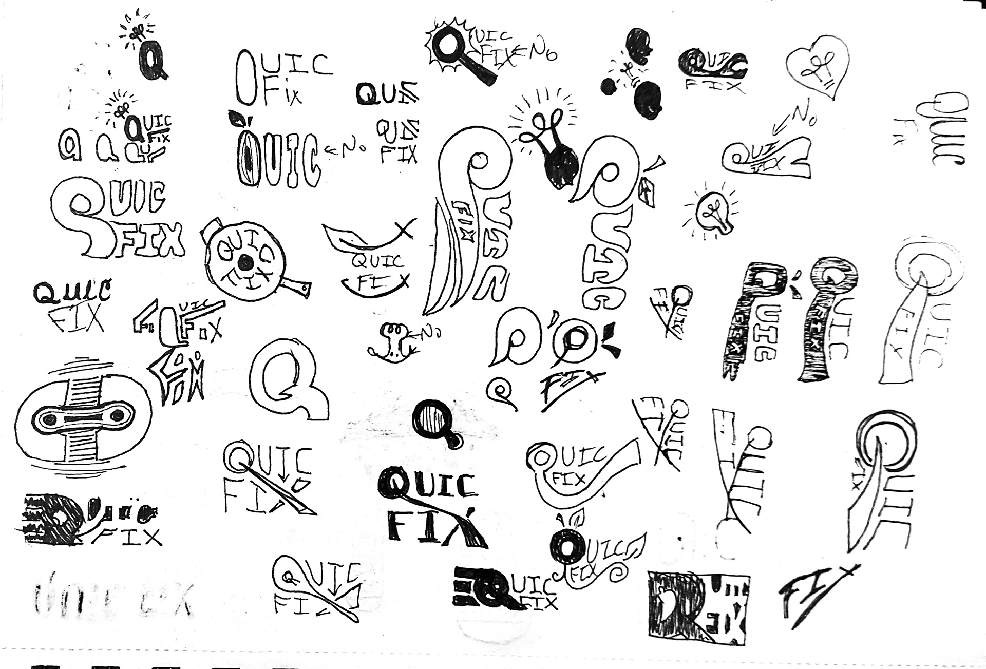
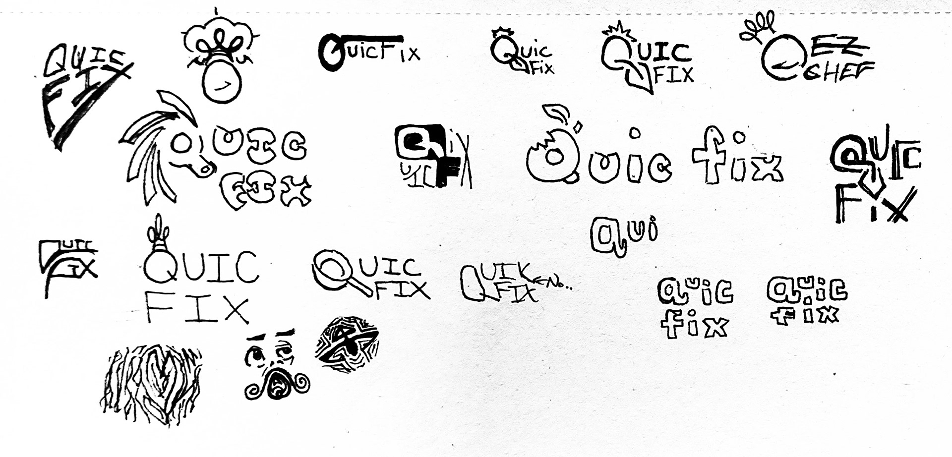
Sketchbook: Logo & Taglines
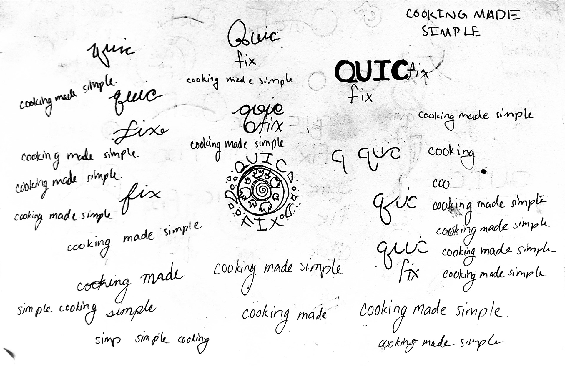
Some of the other iterations of the logo mark that I went through as I found my way to the final design.
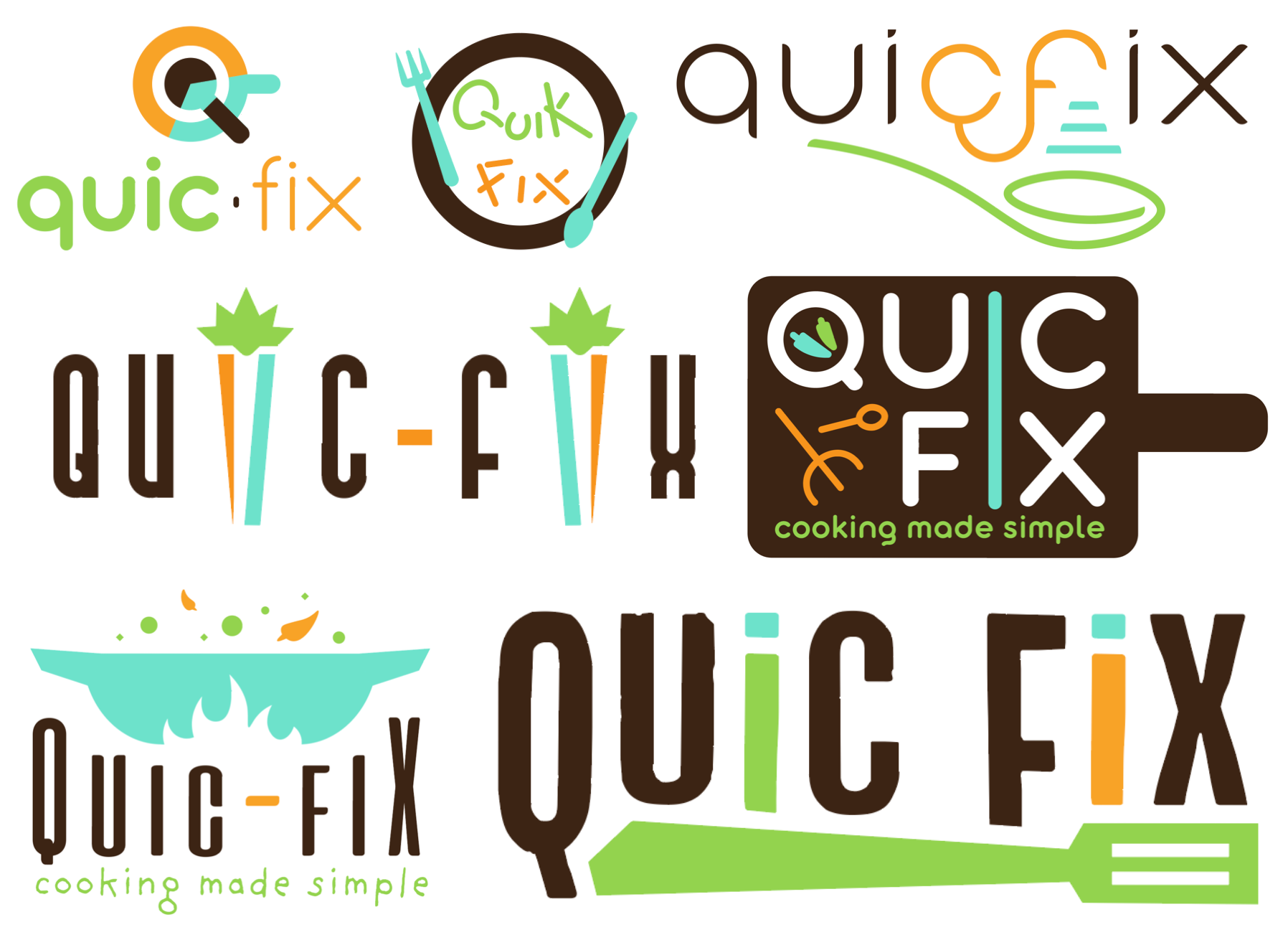
Digital Logo Ideas
These are the digital designs I created based on the sketches I thought were the strongest. As I played around with different fonts, type, and imagery ideas, I came to the finalized logo design.
Recipe Card Sketch Ideas
These are the other recipe cards that I made before coming to the final version. I asked many people about their thoughts on the cards, and they all said that these were a bit too complicated for the simple nature I was going for in the branding. so, I didn't use or further explore any of these ideas.